When a B2B eCommerce product needs a quote, the page has one job, move a buyer from interest to a clear sales conversation. That sounds simple, yet many pages bury the next step behind vague buttons, heavy forms, or too much debate up front.
The best request a quote UX gives buyers a path that feels easy and specific. UX designers must balance speed and context when building these flows. It also helps sales get useful context, which matters when the product is configurable, custom-priced, or sold in volume.
A custom machine, an enterprise SaaS bundle, and a made-to-order part should not use the same flow. The patterns below show what works on complex product pages.
Key Takeaways
- Request a quote UX shines on configurable B2B product pages by keeping forms light, contextual, and visible alongside product details to guide buyers to sales conversations without friction.
- Use progressive disclosure, one- or two-step forms, sticky CTAs, and support elements like FAQs to capture essential details (name, email, company, quantity, timeline) first while deferring extras.
- Craft precise CTA copy matching buyer intent, such as “Get custom pricing” for explorers or “Configure and request quote” for configurators, to build trust and reduce hesitation.
- Measure true success with qualified lead rates, sales handoff quality, and quote-to-opportunity conversion, not just form completion, and review with sales teams for alignment.
When quote requests belong on the product page
B2B purchasing habits show that buyers accept a quote flow when price depends on things they already expect, such as usage tiers, deployment scope, custom specs, service levels, freight, or approval steps. Configurable products often necessitate these flows. In those cases, a fixed price can create more friction than trust.
That is why quoting works best when the product page answers three questions fast, what the product is, what can change, and what happens after the request goes out. For a broader look at when quoting should replace direct checkout, the B2B quoting vs direct checkout article is a useful companion read.
The same logic shows up in broader B2B journey design. Revenue pages work when they reduce doubt and make the next step obvious, which is why the B2B user journey guidance from Directive is relevant here.
| Product situation | What the buyer needs | Best page pattern | Form depth |
|---|---|---|---|
| Configurable SaaS | See options and pricing context | Configure, then request quote | Medium |
| Industrial equipment | Specs, lead time, installation details | Short RFQ with spec capture | Short to medium |
| Enterprise services | Scope, compliance, approval routing | Quote plus contact-sales path | Medium |
| Volume-priced products | Quantity thresholds and delivery notes | Quick request near volume selector | Short |
The pattern is simple. The more variables that shape price, the more the request needs context. Still, the first step should feel light.
Proven patterns that reduce form friction
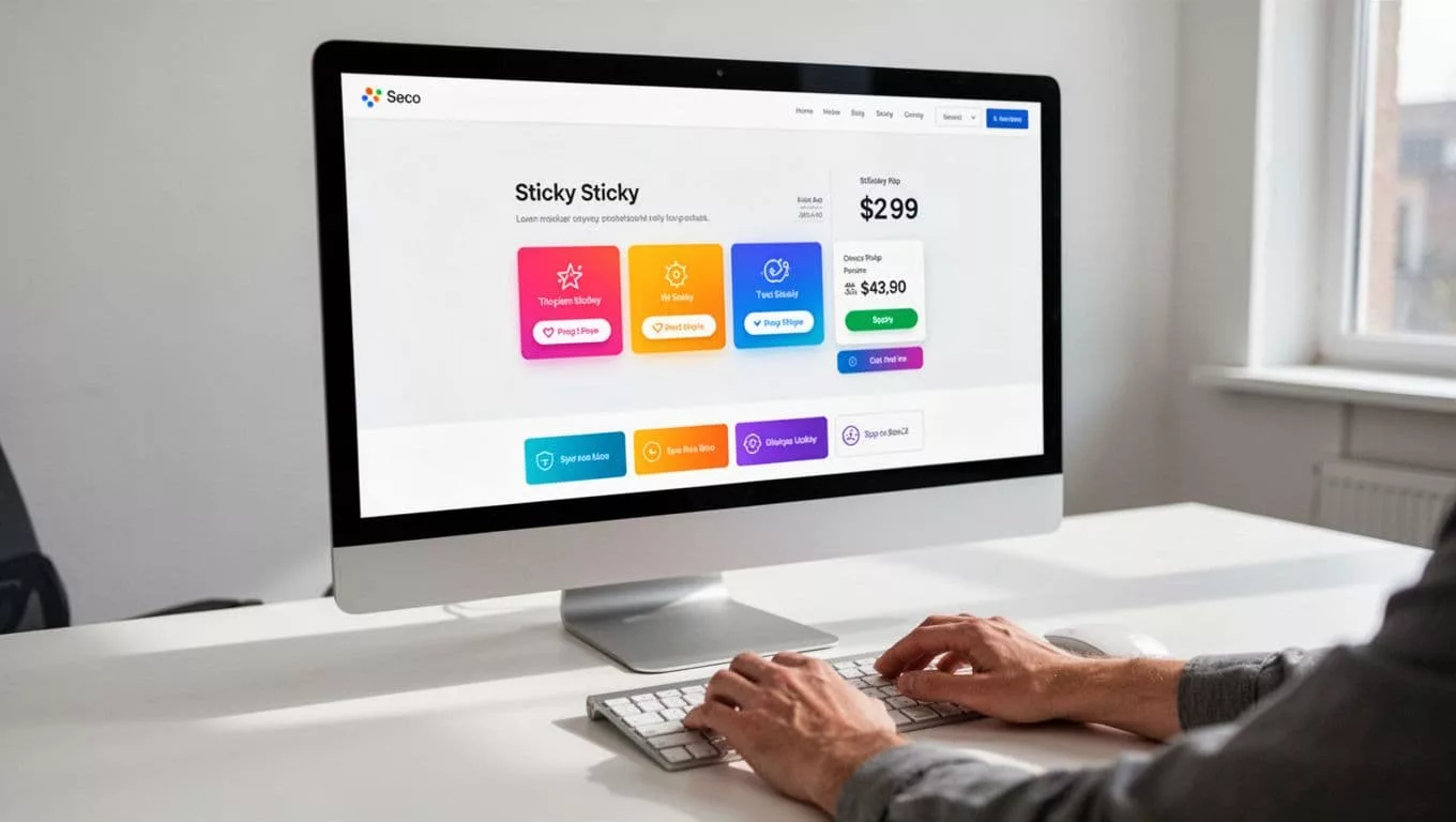
The best pages keep the product visible while the request a quote form starts. Buyers should not feel like they left the product page just to ask a question. A sticky CTA near the price area, a repeated button after configuration, and one clear primary action all help.

If the product has options, the product personalization UX pattern helps buyers lock in choices before they ask for pricing. That matters because a quote request should capture the build, not force the sales team to guess it later.
A good friction test is simple:
- Use one-step forms with a single-column layout when the buyer only needs a basic quote.
- Use two-step forms with a progress bar for a multi-step form when the request needs files, specs, or multiple choices.
- Hide extra fields until they matter, instead of showing everything at once.
That approach keeps the form short without losing detail. It also works better on mobile with a mobile-friendly design, where long forms feel far heavier than they do on desktop and can increase form abandonment.
Some pages also need a support layer next to the form to improve the user experience. If the same objections keep coming up, the product page FAQ UX pattern can answer them before the buyer reaches the point of abandonment. Questions about compatibility, implementation, minimum order size, or shipping are often better handled in a nearby FAQ than inside the form itself.
Qualify leads without making the form feel heavy
To drive effective lead generation, a quote form should collect enough detail to route the lead well, then stop. That usually means name, email, company, quantity, use case, and timing. In other words, ask for what sales needs to respond well, not everything the company could ever want to know.
The best RFQ forms treat extra detail as a second step, not the first gate. If you want field ideas by product type, the B2B RFQ form examples page shows a useful range of structures.
| Ask now | Ask later | Why it matters |
|---|---|---|
| Name and email | Procurement contacts | Starts the conversation fast |
| Company and role | Org chart details | Helps routing without slowing entry |
| Quantity or seats | Full rollout plan | Gives sales a pricing anchor |
| Timeline and region | Shipping or legal specifics | Captures urgency and scope |
| Budget range | Detailed budget info | Qualifies seriousness without friction |
| File upload or notes | Extra custom requirements | Keeps the first step light |
A form like this feels short because it is short. Use radio buttons or drop-down menus for specific form fields to improve data validation. Providing help text near complex inputs can reduce form abandonment and transform the request for quotation into a helpful interaction. The buyer gets moving, and sales still gets enough context to avoid a generic reply.
A quote form that fills up but creates weak leads is a prettier dead end.
This is also where a well-timed chat option can help. If buyers keep hesitating on the same point, the live chat widget UX pattern can catch the question before it becomes a drop-off.
Craft CTA copy that matches buyer intent
The button label shapes the buyer’s next move. A vague CTA asks for trust before it has earned it. A precise CTA tells the buyer what happens next.
The label should match the buyer’s state of mind. If they are comparing options, “Get custom pricing” feels safer than “Submit”. If they are already configuring the product, “Configure and request quote” fits better. For a simple lead handoff, “Talk to sales” can feel more human than a hard quote ask.
The same principle shows up in quote layout design, supporting a seamless quote and buy journey. The why quote design loses B2B deals article makes a strong case for clarity in structure, and the same idea applies to button copy.
| Buyer intent | Better CTA copy | Why it works |
|---|---|---|
| Exploring options | Get custom pricing | Signals that pricing depends on the request |
| Ready to compare vendors | Request a quote | Direct and familiar |
| Needs configuration help | Configure and request quote | Matches the task on screen |
| Wants human contact | Talk to sales | Fits higher-risk buying moments |
| Wants a quick start | Start quote | Short, clear, low pressure |
If your page hides the price, “Request pricing” can work better than “Get started” because it names the goal. If the product shows a base price but varies by volume, “See quote options” can be enough. The button should feel like a bridge from interest to action, not a trapdoor.
Measure success with metrics that matter
A higher form completion rate does not prove the page works. It only proves people could find the form. The real test is whether the quote flow improves overall conversion rates by creating useful sales conversations.
Track the metrics that show both friction and lead quality.
| Metric | What it tells you | What to watch |
|---|---|---|
| Form completion rate | Where the form gets hard | Mobile drop-off or field-specific exits |
| Qualified lead rate | Whether the right buyers submit | Too many leads that sales disqualifies |
| Sales follow-up quality | Whether the handoff is useful | Reps asking for basic info again, quote management issues |
| Quote-to-opportunity rate | Whether the quote supports pipeline | Quotes that never move forward |
| Time to first response | How fast the team reacts | Long gaps after submission |
If completion goes up but qualified lead rate goes down, the form got easier without getting better. If sales follow-up quality is weak, the page may be sending the wrong context, or not enough of it.
That is why quote UX should be reviewed with sales, not only with design and CRO. The page should answer the buyer, but it also needs to help the rep continue the conversation with confidence. B2B eCommerce sites often handle mixed carts, where some items go through a checkout process while others require a quote. For simpler products, a one page design can streamline the entire flow. For products with fixed packages or tiered plans, the subscription pricing page design approach is a good reminder that clear comparison still matters, even when the final price is not public.
Frequently Asked Questions
When should a quote request replace direct checkout on B2B product pages?
Quote requests belong on pages for configurable products where price varies by usage tiers, custom specs, volume, or services. Fixed-price items create less friction with checkout. The page must quickly answer what the product is, what can change, and what happens next to build trust.
How do you reduce friction in request a quote forms?
Keep the product visible with sticky CTAs or modals, use single-column one-step forms for basics or two-step with progress bars for more detail, and hide fields until needed. Add nearby FAQs for common objections like shipping or compatibility. This approach cuts abandonment, especially on mobile.
What essential fields qualify leads without overwhelming the form?
Start with name, email, company, role, quantity/seats, timeline, region, and budget range—these give sales pricing anchors and routing info. Defer procurement details, full plans, or files to later steps. Radio buttons, dropdowns, and help text improve completion while keeping it light.
How should CTA copy match buyer mindset?
Use “Get custom pricing” for option explorers, “Request a quote” for vendor comparers, or “Talk to sales” for high-risk buys. Avoid vague labels like “Submit”—name the outcome to bridge interest to action. This clarity supports seamless quote journeys.
What metrics show if quote UX is working?
Track form completion for friction spots, qualified lead rates for buyer fit, sales follow-up quality for handoff usefulness, and quote-to-opportunity rates for pipeline impact. Rising completions with falling lead quality means easier but weaker forms. Involve sales in reviews for balanced optimization.
Conclusion
Strong quote pages, powered by user-friendly forms, do three things well. They show the buyer the right next step, they ask for just enough detail to accommodate detailed product configuration without overwhelming the user, and they give sales a clean handoff. That balance matters more on complex B2B products than on simple ones.
The best request a quote UX does not try to collect everything at once. It lowers uncertainty, fits the buying moment, and keeps the conversation moving.
When the page feels easier than chasing a sales rep, buyers are more likely to continue. That superior user experience is the real win.