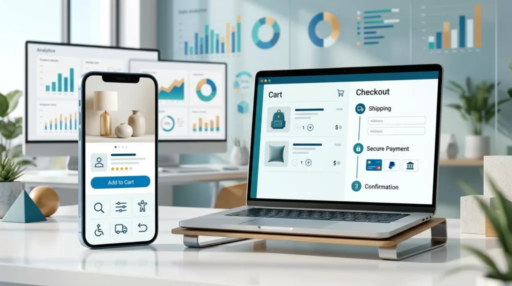
E-Commerce UX Checklist for Higher Conversions
A shopper can want your product and still leave because the website makes buying feel difficult. Slow pages, unclear delivery...
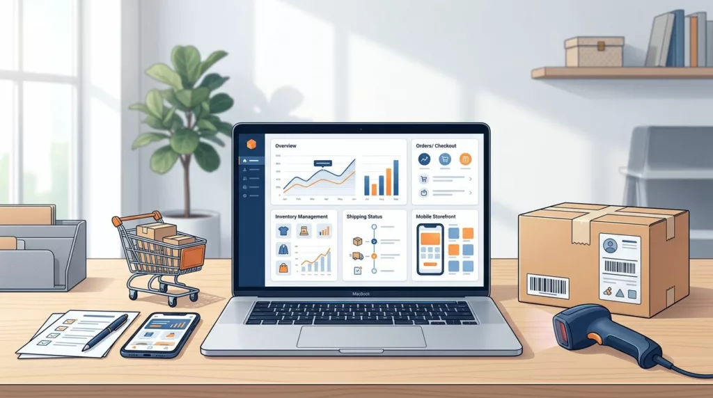
Online Store Launch Checklist for the First 30 Days
Opening an online store is only the beginning. The first orders can reveal broken payment flows, confusing product pages, shipping...

E-commerce Site Setup: A Practical Step-by-Step Launch Guide
A polished store can still lose sales if customers can’t find products, trust the checkout, or understand delivery costs. A...

B2B SSO Login UX for Enterprise Buyer Portals
A buyer may place a large order in your portal, but a confusing login can stop the process before product...

B2B Portal SSO UX for Multi-Location Teams
A buyer at a regional branch shouldn’t need a separate login for every location. Yet a single sign-on flow can...

How to Measure B2B Portal ROI With Real Data
A modern ordering portal is a critical component of digital transformation, designed to reduce customer service costs, increase average order...

Notification Preferences UX for B2B Buyer Portals
A missed order update can delay a shipment, while one unnecessary email can lead to notification fatigue and cause a...

B2B Ecommerce Account Portal Audit Checklist for 2026
A portal can look polished and still fail when a buyer needs to reorder, find an invoice, or get approval...

Invoice Reconciliation UX for Faster PO Matching
Invoice discrepancies can turn a two-minute approval into a long chain of emails, spreadsheets, and repeated data entry. Modern invoice...

B2B Account Hierarchies Buyers Can Actually Use
Managing a complex company structure is a significant challenge for modern businesses. A single organization may have one legal owner,...