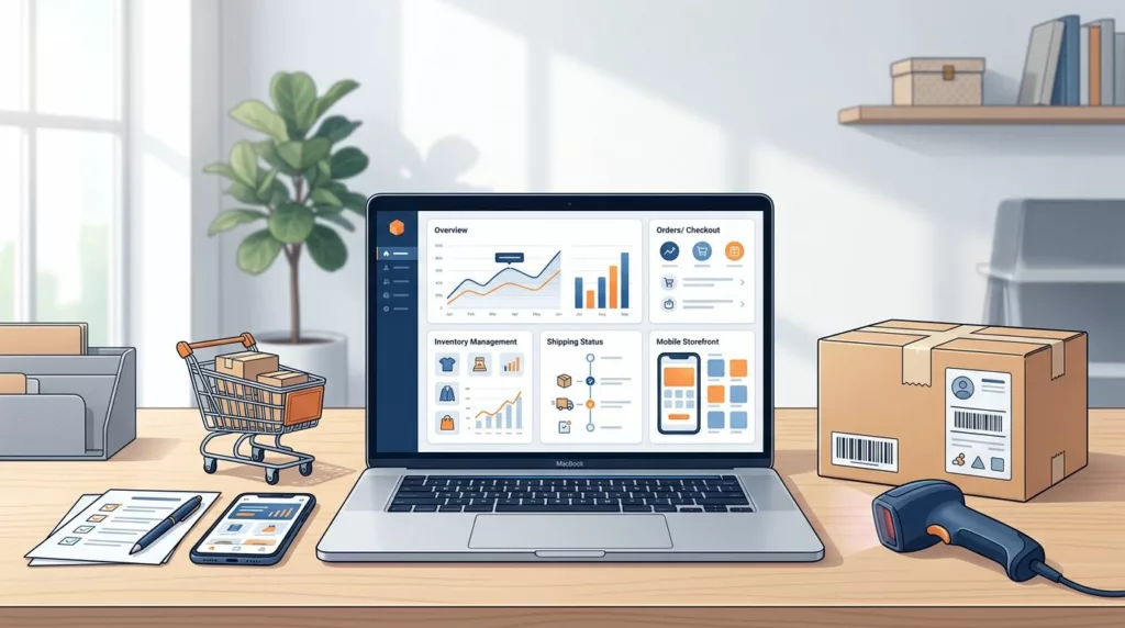
Online Store Launch Checklist for the First 30 Days
Opening an online store is only the beginning. The first orders can reveal broken payment flows, confusing product pages, shipping...

B2B Portal SSO UX for Multi-Location Teams
A buyer at a regional branch shouldn’t need a separate login for every location. Yet a single sign-on flow can...

Invoice Reconciliation UX for Faster PO Matching
Invoice discrepancies can turn a two-minute approval into a long chain of emails, spreadsheets, and repeated data entry. Modern invoice...

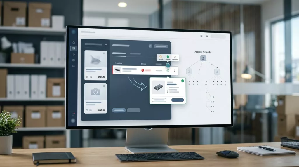
How Partial Quote Acceptance Speeds B2B Orders
Complex B2B orders often slow down when buyers are required to approve every line item at once. One missing item,...
Tax Exemption Renewal UX for B2B Ecommerce Accounts
A pending sales tax exemption can stall a purchase faster than a bad shipping quote. When the account portal hides...
Short Shipment Claim UX for B2B Account Portals
A short shipment claim can turn a small warehouse miss into a long support thread. In B2B account portals, this...

Invoice Aging Dashboard UX for B2B Account Portals
An overdue amount is easy to miss when a portal buries it under generic billing data. A strong invoice aging...
Substitute Item Approval UX for B2B Backorders
Backorders slow down B2B buying, but a weak substitute flow can stall the order even more. The problem is usually...
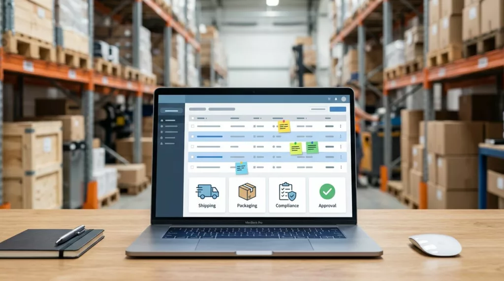
Line Item Notes UX for Complex B2B Orders
One bad note can turn a clean order into a chain of emails, phone calls, and manual corrections. In complex...

Statement Download UX for B2B Account Portals
A statement download can make or break a finance task in under a minute. Business users are not opening a...