Fit Finder UX to Reduce Returns
In apparel e-commerce, returns usually start before checkout, not after delivery. When shoppers can’t tell how a garment will fit,...

Request a Quote UX Patterns for B2B Product Pages
When a B2B eCommerce product needs a quote, the page has one job, move a buyer from interest to a...
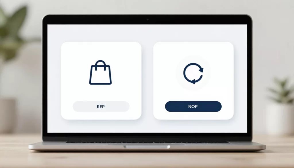
One-Time Purchase Vs Subscription Selector UX On Product Pages
Shoppers can spot a trap fast. If your product page makes the buying model feel slippery, trust drops before price...
Low Stock Messaging UX That Creates Urgency, Not Doubt
Shoppers move fast, but they spot fake scarcity even faster. When low stock messaging feels inflated, urgency turns into doubt,...
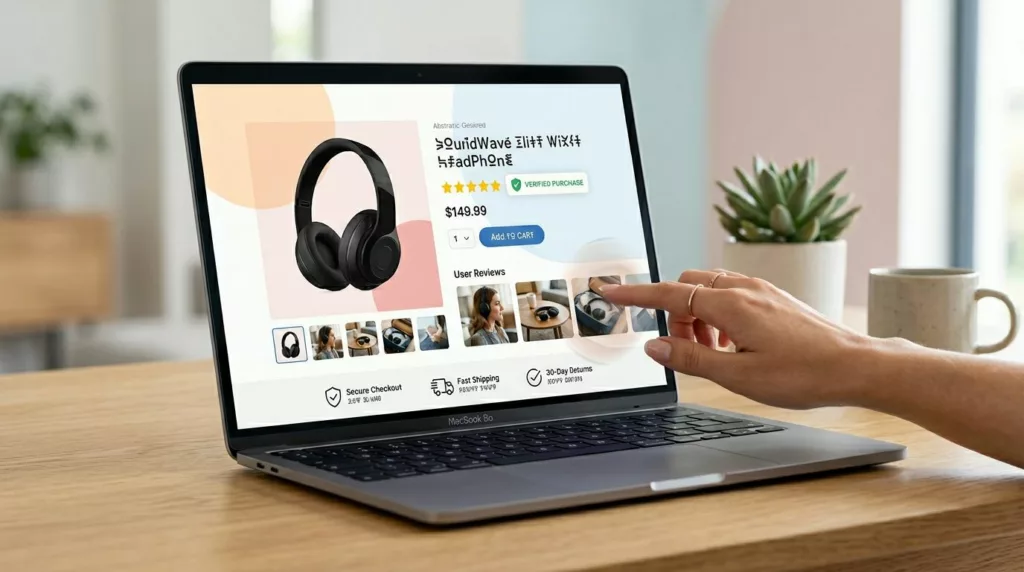
Product Review UX Patterns That Build Trust and Cut Returns
A five-star average can still miss the real question: will this work for me? That gap is where product review...
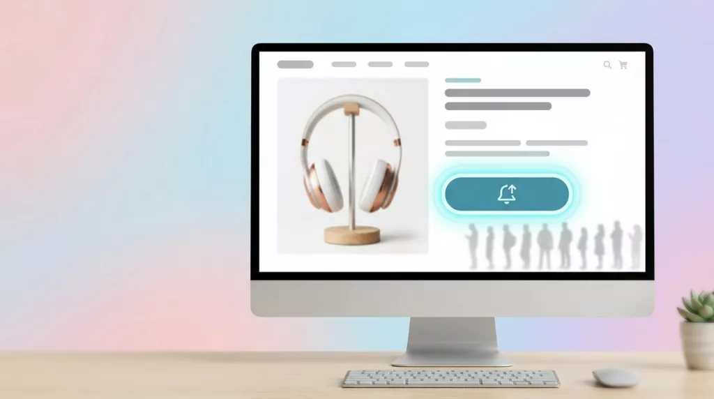
Back In Stock Alert UX That Turns Waitlists Into Orders
A stockout feels like a dead end, but it often marks the highest-intent moment on the page. Shoppers who join...

PDP Tabs vs Accordions UX for Mobile Product Pages
On a phone, every product page choice feels bigger. Space is tight, attention is short, and the wrong content pattern...
Quick View Modal UX Patterns That Increase Product Adds
Shoppers use product listing pages like a shelf scan in a store, fast, selective, and impatient. A quick view can...

Product Page FAQ Section UX That Lifts Conversion
A shopper gets to your product page, likes the photos, and pauses. Not because they’re unsure about the product, but...

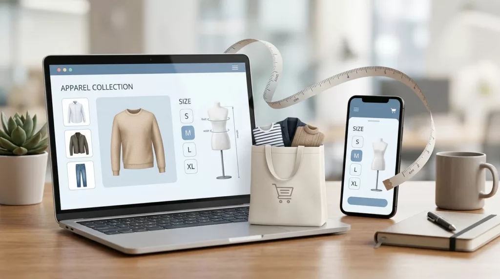
Size Guide UX Patterns That Reduce Returns for Apparel Stores
Most returns for apparel items start as a simple guess. The shopper likes the product, but sizing feels like a...