
Country of Origin UX for B2B Product Pages
B2B buyers notice origin faster than many teams expect. A small line that says where a product is made can...

PDF SEO for Ecommerce Manuals and Spec Sheets in 2026
A PDF can still help a shopper, but it should not be the only place your product details live. In...
Parametric Landing Pages That Rank Without Losing Buyers
Parametric landing pages can pull in search traffic and still help people narrow a purchase, but only when they are...
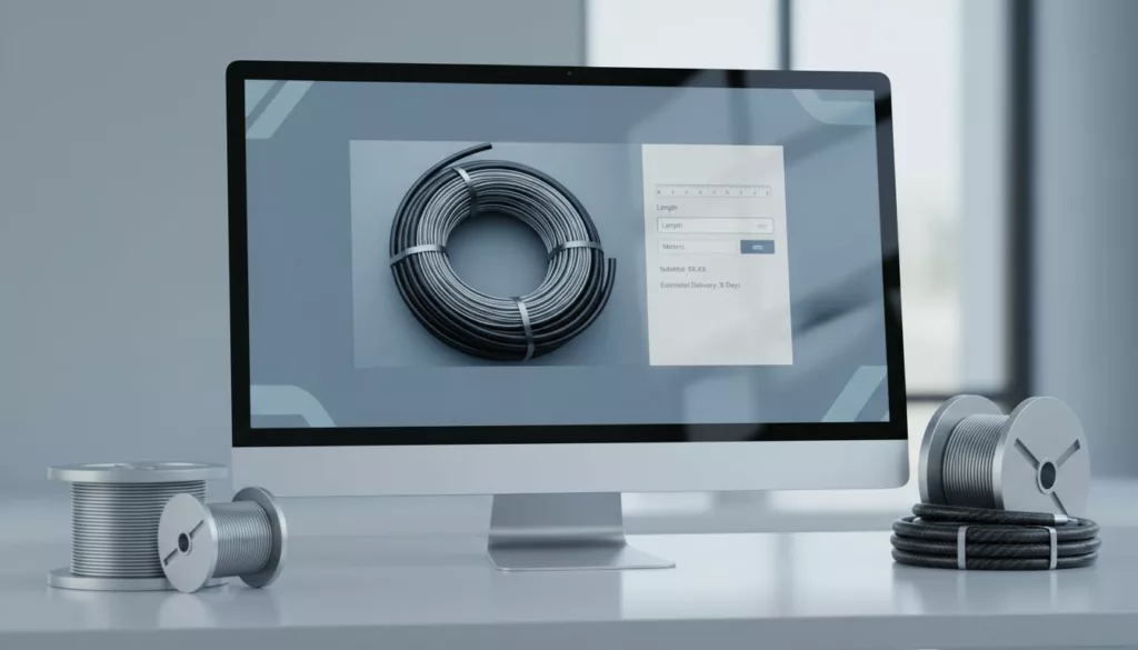
Cut-to-Length Ordering UX for Wire and Hose Pages
One wrong number can turn a wire or hose product page into a support ticket. When buyers need a custom...
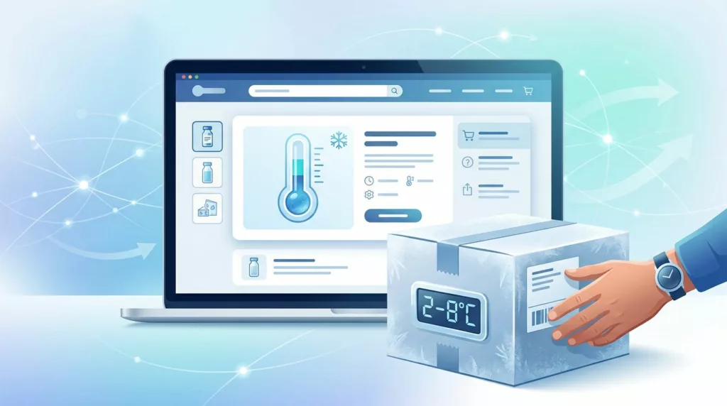
Cold Chain Shipping UX for Product Pages That Convert
Temperature-sensitive products lose trust fast when shipping details stay vague. For cold chain shipping UX, the product page has to...
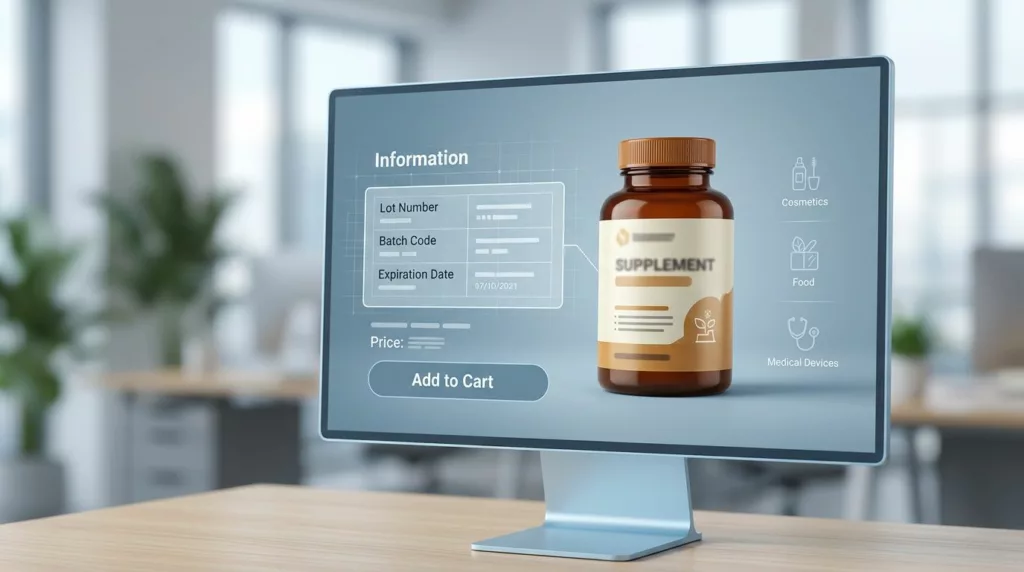
Lot Traceability UX for Regulated Product Pages
Regulated product pages have a harder job than most. They need to sell the product, answer safety questions, and surface...
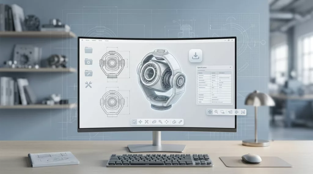
CAD Download UX for Industrial Product Pages
Engineers rarely land on a product page to admire the layout. They want to know if the part fits, which...
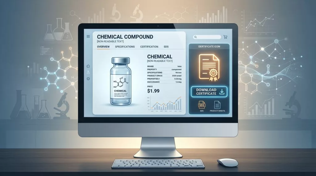
Certificate of Analysis Download UX for Chemical Product Pages
A COA download looks small on a product page, but it often decides whether a buyer keeps moving or leaves...

Core Charge Messaging for Parts Product Pages
A product page can look polished and still lose the sale when the core charge appears too late. Shoppers spot...
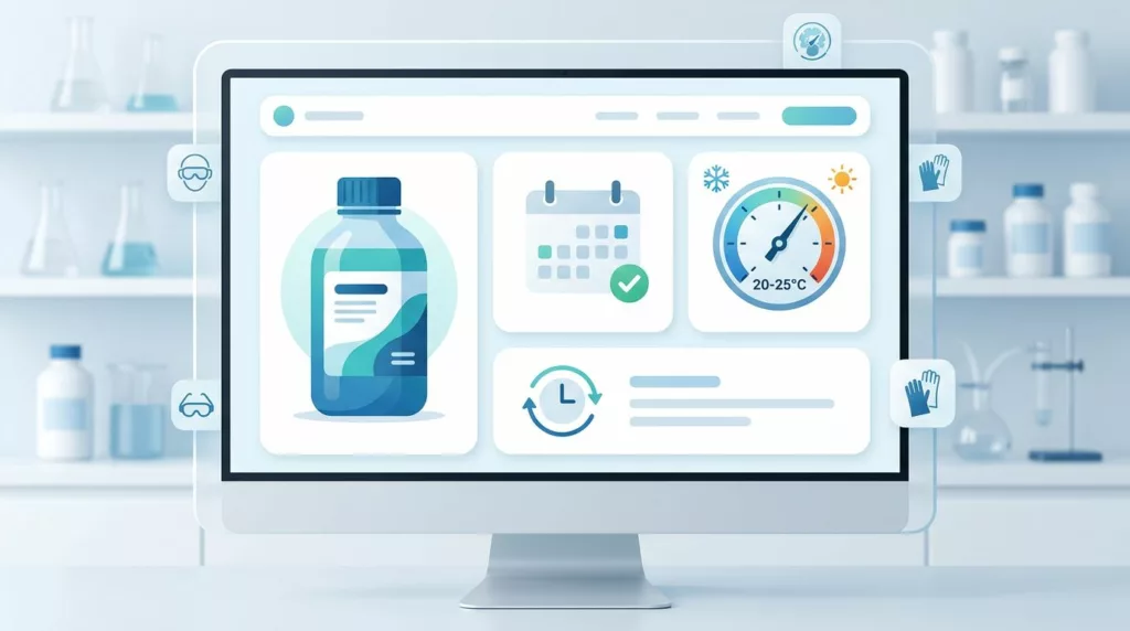
Shelf Life Messaging UX for Chemical Product Pages
Chemical buyers rarely leave because the price is a little high. They leave when they cannot tell whether the product...