

A live chat widget can save a sale or scare one away. The difference is usually live chat widget ux, not the chat tool itself.
On a strong store, chat feels like a good sales associate. It’s nearby when you need help, then invisible when you don’t. On a weak store, it blocks product images, jumps into checkout, and asks for attention before the shopper has a reason to talk.
For ecommerce teams, the goal is simple, remove doubt without adding friction.
Live Chat Widget UX Should Protect Shopper Intent
Shoppers land on a page with a job to do. They want to compare products, check delivery, confirm fit, or finish payment. Your widget should support that job, not compete with it.
That fits the wider rule that better UX lifts conversion rates. It also lines up with research on live chat and traffic-to-sales conversion, which shows chat can help when it appears at useful decision points.
The gap between helpful and harmful chat is usually small:
| Helpful chat behavior | Conversion-killing version |
|---|---|
| Collapsed launcher in a stable corner | Large modal on page load |
| Triggered after hesitation or help signals | Triggered after two seconds for everyone |
| Short, page-specific opener | Generic prompt on every page |
| Easy to close and reopen | Covers Add to Cart or product details |
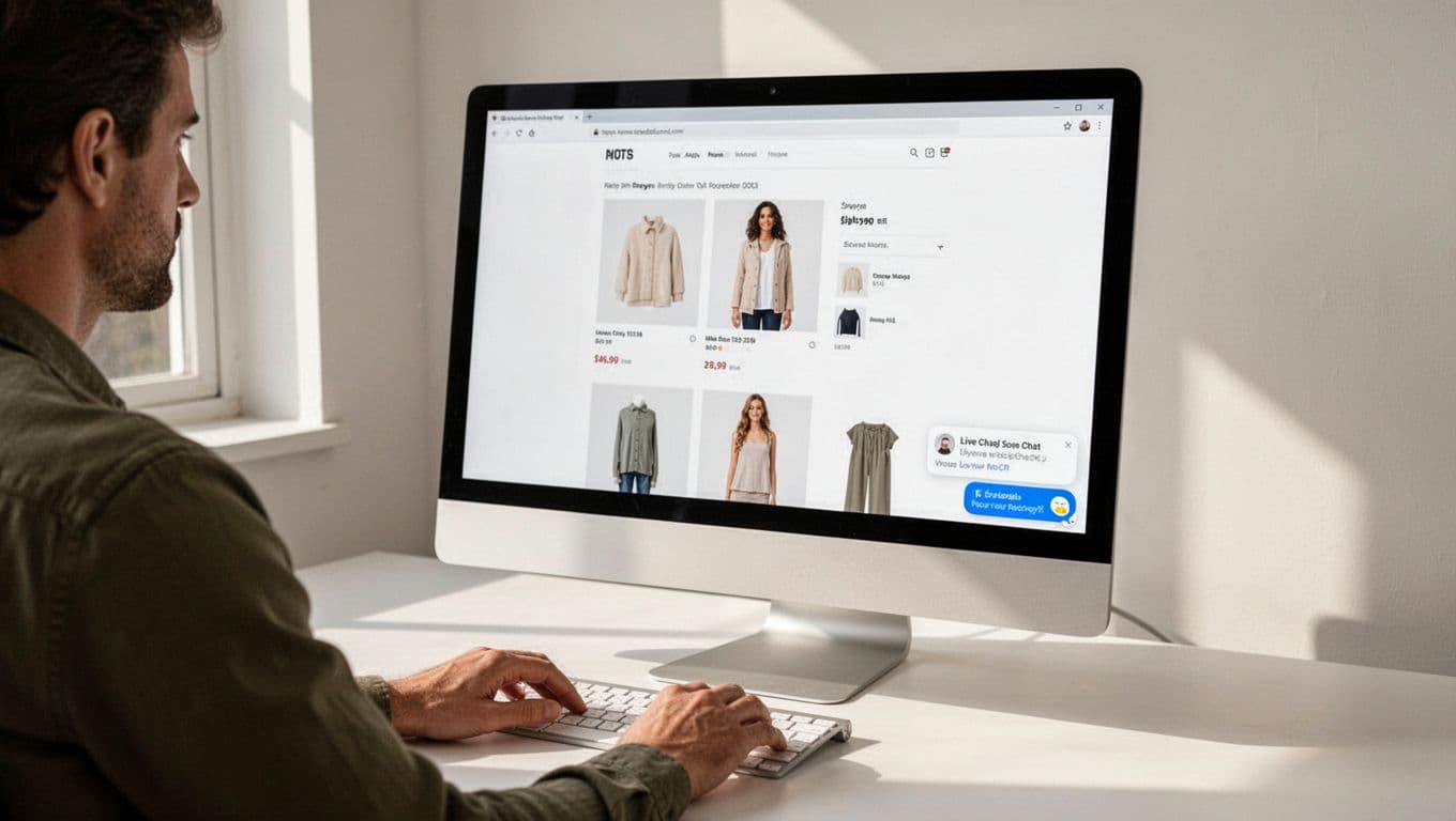
The best version stays quiet until support adds value. A small launcher in the lower corner often works well because shoppers know where to find it. Still, it shouldn’t be the loudest element on the page.
If chat draws more attention than price, shipping, or Add to Cart, it’s no longer support. It’s an intrusive pop-up in disguise.
Place and Trigger Chat Where Friction Appears
Placement matters because context matters. On product pages, chat can answer sizing, stock, shipping, or compatibility questions. In the cart, it can help with delivery timing or coupon issues. At checkout, it must stay out of the way of totals, fields, and payment buttons.
Timing matters even more. Don’t open with a greeting the second the page loads. Wait for real signals, like repeat visits to the size guide, long idle time on a high-consideration product, or repeated form errors in checkout.
When you do trigger chat, keep the first prompt short. Tie it to the page. “Need help with sizing?” works better than a vague greeting. It feels relevant, so it asks for less mental effort.
If chat appears during checkout, follow Shopify’s chat UX guidance on size and mobile states. A widget that hides totals or form fields can damage trust fast.
If the widget interrupts intent, the reply speed doesn’t matter.
You can also reduce chat demand by fixing obvious gaps in the site itself. Many pre-purchase questions belong on clear returns and shipping pages, not in a support queue. When refund rules, delivery windows, and fees are easy to scan, chat can focus on the moments where human help actually moves a sale forward.
Fix Mobile Behavior, Speed, and Prompt Overload
Mobile is where bad chat behavior shows up first. A bubble that looks harmless on desktop can cover half the screen on a phone. Keep the launcher collapsed by default, and keep it away from sticky Add to Cart buttons.
Also test the open state, not only the closed bubble. The chat window shouldn’t fight with the on-screen keyboard, overlap cookie notices, or trap the shopper in a hard-to-close panel. On smaller screens, one awkward overlay can break the whole buying flow.
Speed matters too. Chat scripts add weight, extra requests, and sometimes layout shifts. Load the core page first. Then load chat after the main content is usable, or after the shopper shows intent. If your site still feels heavy on phones, these mobile-first CRO tips for shops are a useful next step.
Prompt design needs the same restraint. One helpful message beats four needy ones. Good prompts are short, tied to a known concern, and easy to dismiss. Think “Need help with delivery dates?” not “Hi there, can we help, offer a discount, and answer your questions?”
If you use automation, keep the path simple. Start with order status, shipping, returns, and product basics. Then hand off to a person when the issue gets messy. This is where integrating AI chatbots for e-commerce can help, as long as the bot supports the journey instead of trapping shoppers in scripted loops. For more practical prompt ideas, these live chat best practices are worth reviewing.
A good live chat widget doesn’t chase attention. It removes friction at the exact moment friction appears.
That means calm placement, smart timing, mobile-safe behavior, and code that doesn’t slow the page. When live chat widget ux respects shopper intent, chat feels helpful. When it doesn’t, conversion pays the price.