Notification Preferences UX for B2B Buyer Portals
A missed order update can delay a shipment, while one unnecessary email can lead to notification fatigue and cause a...
Tax Exemption Renewal UX for B2B Ecommerce Accounts
A pending sales tax exemption can stall a purchase faster than a bad shipping quote. When the account portal hides...
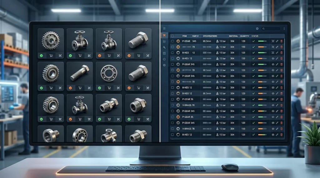
Grid vs Table View for Industrial Category Pages
Industrial buyers do not browse a catalog the way a consumer shopper does. They compare part numbers, specs, availability, and...

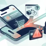
Serial Number Lookup UX for Faster Spare Parts Orders
A slow search field can turn a simple spare parts order into a half-day delay. When a technician, buyer, or...

Accessible Product Gallery UX for Ecommerce Stores
A high-quality image gallery can sell a product or leave shoppers unsure. When images are hard to scan, hard to...
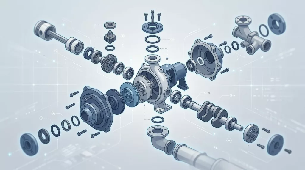
Exploded Parts Diagram UX for Spare Parts Ecommerce Stores
When a shopper knows the machine but not the part name, the wrong interface can slow everything down. A long...

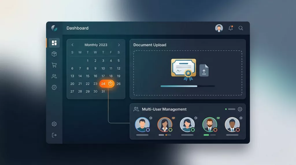
Invoice Payment Portal UX for B2B Ecommerce Accounts
B2B buyers do not open an invoice portal to browse. They open it to find a balance, get approval, or...

Sales Rep Assisted Ordering UX for B2B Ecommerce Stores
Sales rep assisted ordering works best when the rep and buyer share one clear path. In manufacturing, wholesale, and distribution,...
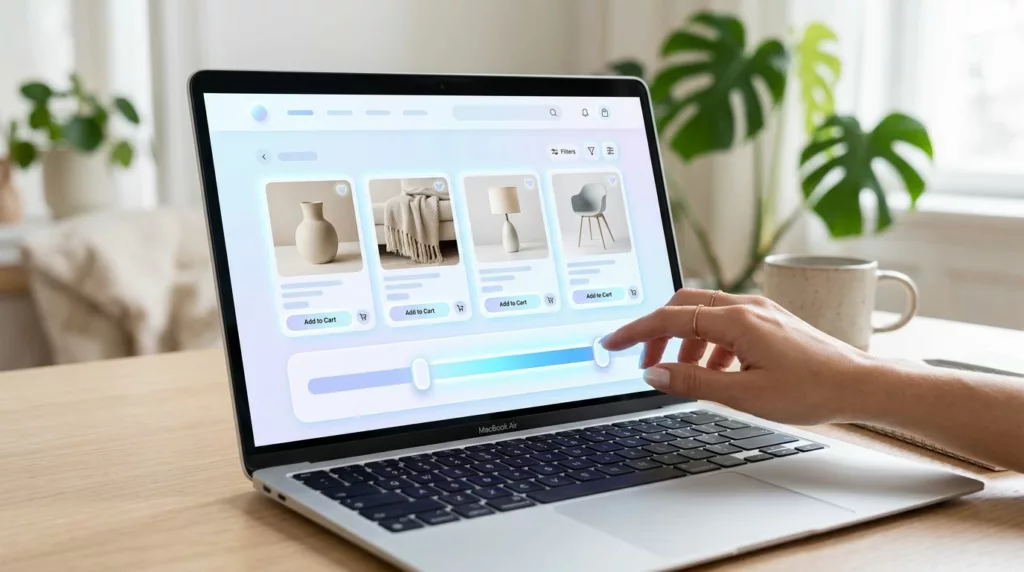
Price Range Filter UX That Helps Shoppers Narrow Faster
A price filter should save time. When it doesn’t, shoppers start second-guessing the whole category. A strong price range filter...
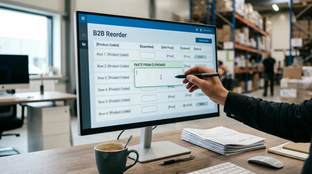
Quick Order Pad UX for B2B Reorders That Buyers Use Fast
A quick order pad UX can save minutes on every repeat purchase, and those minutes add up fast for wholesale...