Backorder Messaging UX That Keeps Shoppers Confident
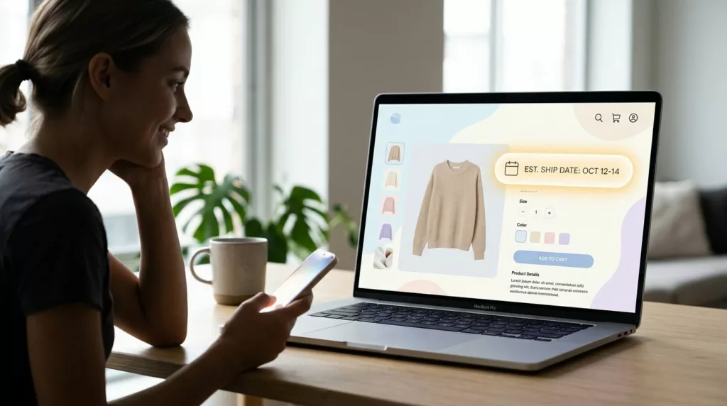
Backorder pages lose trust when they hide the one thing shoppers want most, timing. If people can’t tell whether a...

Request a Quote UX Patterns for B2B Product Pages
When a B2B eCommerce product needs a quote, the page has one job, move a buyer from interest to a...
Empty Cart UX Patterns That Bring Shoppers Back
An empty shopping cart page can feel like a dead end. If it only says your cart is empty, you...
Low Stock Messaging UX That Creates Urgency, Not Doubt
Shoppers move fast, but they spot fake scarcity even faster. When low stock messaging feels inflated, urgency turns into doubt,...
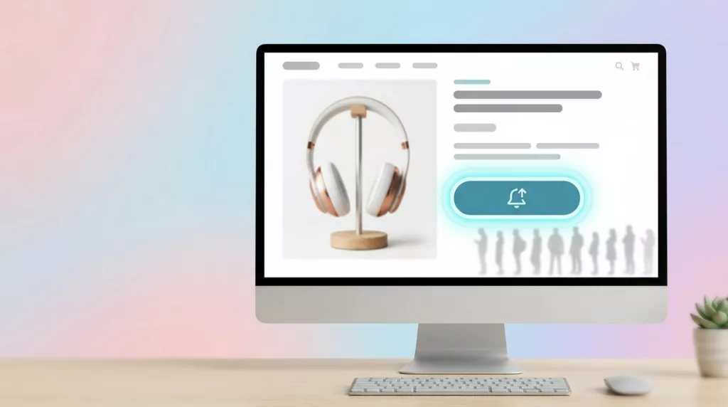
Back In Stock Alert UX That Turns Waitlists Into Orders
A stockout feels like a dead end, but it often marks the highest-intent moment on the page. Shoppers who join...
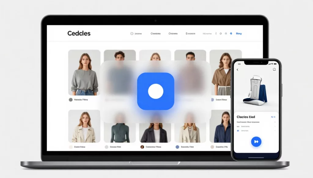
Quick View Modal UX Patterns That Increase Product Adds
Shoppers use product listing pages like a shelf scan in a store, fast, selective, and impatient. A quick view can...
Microcopy for E-commerce UX: 100 Button, Error, and Shipping Lines You Can Copy and Tweak
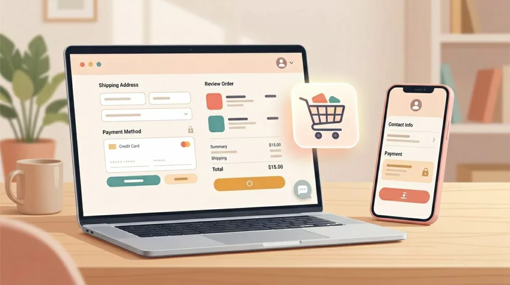
Ever watched a shopper hesitate at checkout like they’re standing at a locked door, key in hand? That door is...
Sticky Add to Cart Bars That Lift Mobile Conversions (2026 Guide)
Mobile shoppers in your online store are ready to buy, but the small screens of mobile devices fight them. Your...

Thank You Page UX Playbook for More Upsells and Fewer Tickets
Most teams treat the thank you page like a receipt. Customers treat it like a front desk. Right after purchase,...
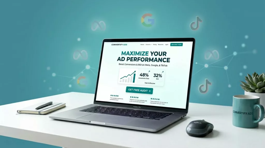
Landing Page Design for Paid Traffic: A Build Template for Meta, Google, and TikTok Ads
Paid traffic is like renting a spotlight. It’s bright, expensive, and it shuts off the moment you stop paying. That’s...