
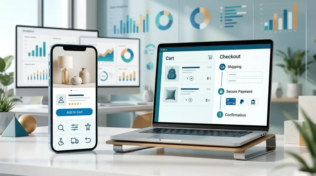
Mobile Optimization Checklist for E-commerce Sites
A slow or awkward mobile store can lose a sale before a shopper sees the product. In 2026, mobile accounts...
E-Commerce UX Checklist for Higher Conversions
A shopper can want your product and still leave because the website makes buying feel difficult. Slow pages, unclear delivery...
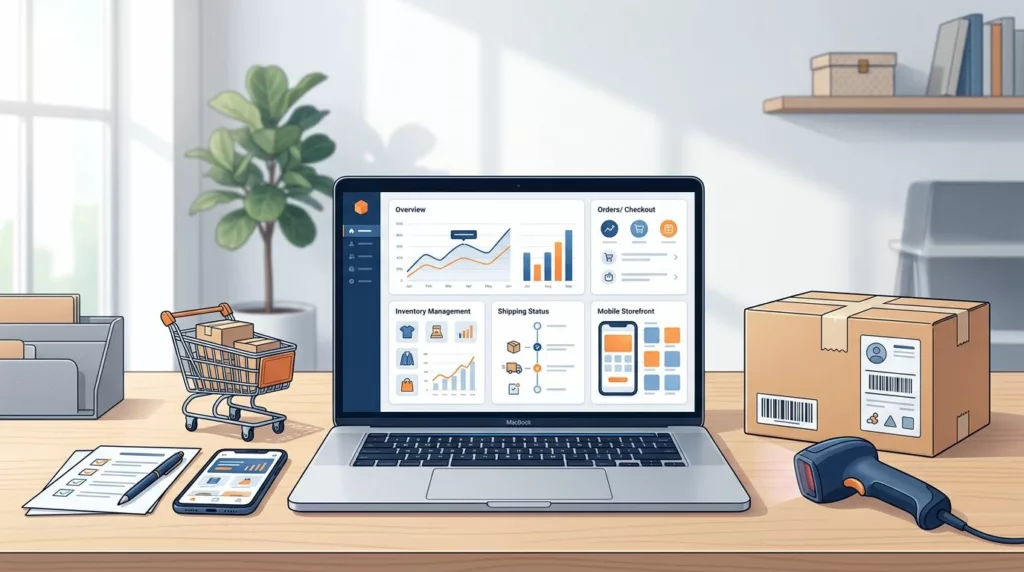
Online Store Launch Checklist for the First 30 Days
Opening an online store is only the beginning. The first orders can reveal broken payment flows, confusing product pages, shipping...

Accessible Product Gallery UX for Ecommerce Stores
A high-quality image gallery can sell a product or leave shoppers unsure. When images are hard to scan, hard to...
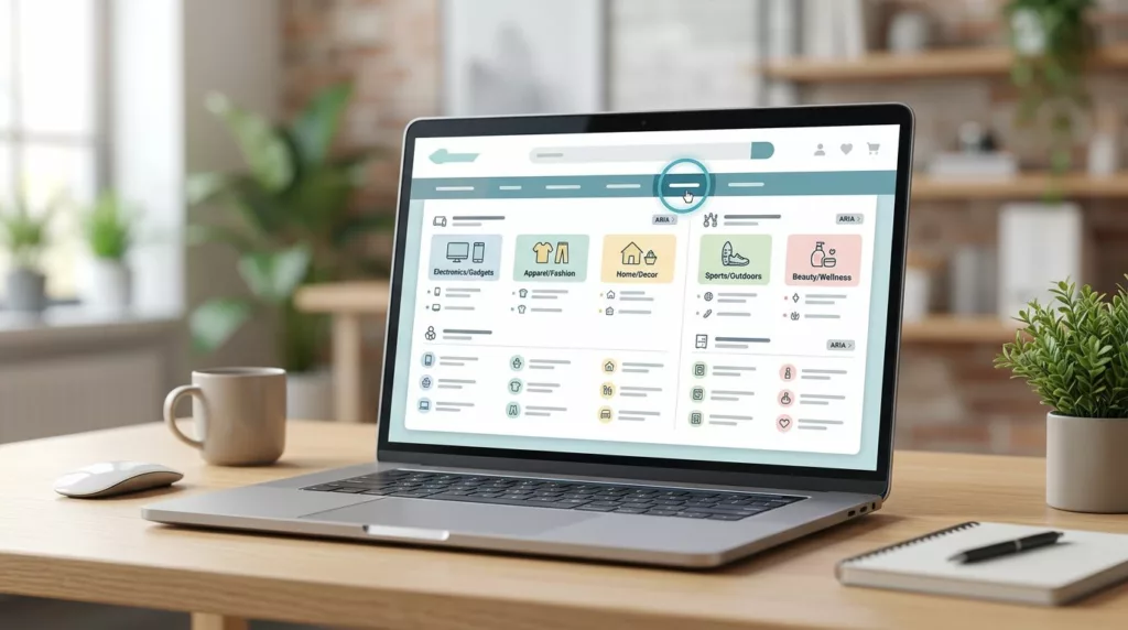
Accessible Mega Menu UX for Large Ecommerce Catalogs
Large catalogs can make navigation feel like a crowded stockroom. Products multiply, categories split, promotions compete, and the menu that...
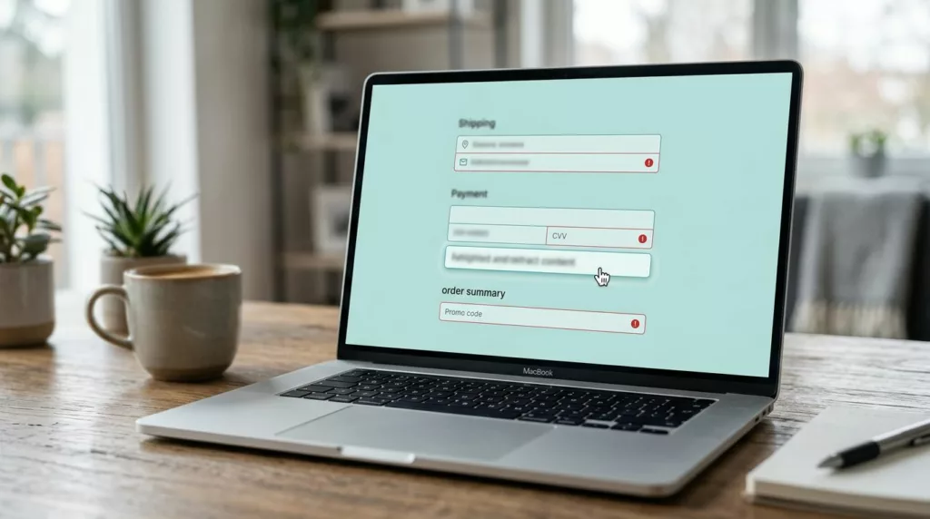
Checkout Error Summary UX That Helps Shoppers Fix Mistakes
Checkout errors happen at the worst moment during the checkout process on an e-commerce site. The shopper has already picked...
Billing Address Toggle UX That Cuts Checkout Errors
A billing address toggle can save more checkout sessions and improve the checkout experience more than a long list of...

Gift Wrap UX Patterns That Raise Average Order Value
A small add-on can change order economics fast and boost average order value. Yet many stores still hide gift wrap...

Address Autocomplete UX That Turns Long Forms Into Faster Checkouts
A shopper can forgive one extra tap. They rarely forgive a long, error-prone address form in the e-commerce checkout. For...

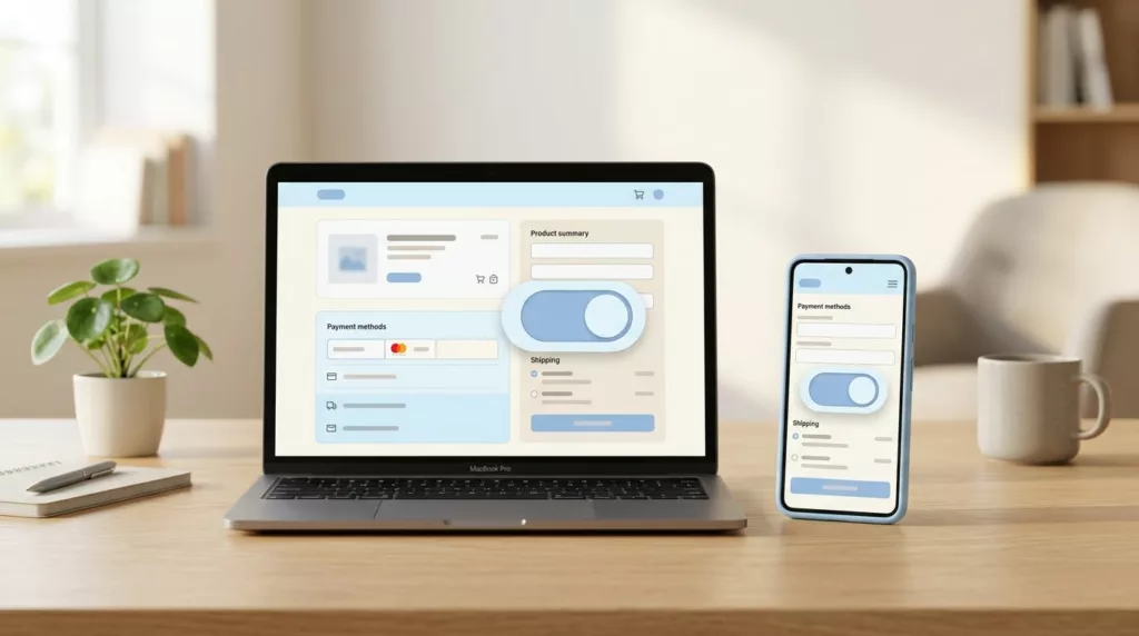
Payment Method Selector UX That Reduces Checkout Hesitation
A shopper can tolerate one more field. They usually won’t tolerate one more decision. That’s why the payment method selector...