

Custom products fail long before the warehouse touches them. Most failures start on the product page.
The usual cause isn’t bad intent. It’s weak product personalization UX: vague fields, hidden limits, and selectors that leave too much room for guesswork. Every wrong engraving, unusable photo, or mismatched material turns into support work, refunds, and lower trust.
Good UX removes doubt before checkout. That starts with the way the page asks for input.
Custom order mistakes start with unclear inputs
When a shopper sees every option at once, they skim. Then they guess. That’s how you get a monogram in the gift-message field, a print-on-demand upload cropped the wrong way, or a metal finish paired with an engraving method that can’t be produced.
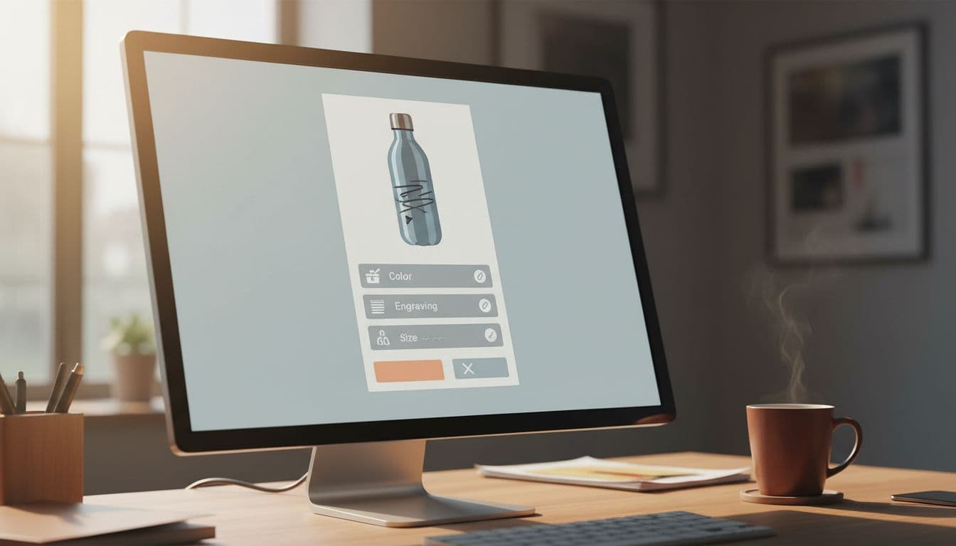
Start with progressive disclosure. Show the base choice first, then reveal only the next relevant field. If a customer picks “Add engraving,” open the text box, character counter, font choices, and placement options in that order. If they skip engraving, keep those controls hidden.
Group related controls inside one decision block. Size, color, and material should sit together when each choice affects the others. Splitting them across tabs or far-apart accordions makes people miss the rule that a velvet finish is only available in certain sizes.
Smart defaults also cut errors. Preselect the most common size, the in-stock color, or the material that works with the selected customization. For guided buying flows, a checkout flow for custom orders often beats one long page because each step answers one clear question.
Defaults should stay editable. Preselecting black ink on a gift card helps; silently forcing it after a paper change does not. Every automatic choice needs a visible reason, especially when it affects price or delivery.
Field labels need plain language. “Text line 1” tells people nothing. “Name to engrave” does. Separate “Gift message” from “Personalization” so buyers know which text appears on the product and which goes in the package. Shopify’s form UX guidance also backs simple, single-column input patterns, which are easier to scan on mobile.
If shoppers need support to place a custom order, the interface has already failed.
Catch mistakes while the shopper is typing
Validation works best in real time, not after “Add to cart.” If an engraving fits 12 characters, show “0/12” from the first keystroke. If a monogram requires three initials, enforce that pattern in the field. If uppercase is standard, format the input as the user types and explain why.
Good error copy names the fix. “Use 3 letters” beats “Invalid input.” “Numbers are not allowed in engraving” beats a red border with no explanation.
The same rule applies to option dependencies. A cotton tee may support full-color print, while a recycled nylon bag may not. If a shopper switches material, update the compatible print methods, lead times, and price at once. Don’t let them build an impossible product and discover the problem in the cart.
For apparel, combine size and print-position rules. Oversized front prints may work on XL but not youth sizes. Disable impossible combinations early, before the shopper invests time in color or art selection.
File uploads need even tighter controls. State the accepted file type, minimum resolution, aspect ratio, background rules, and maximum file size before upload. Then run inline checks after upload. When the file fails, say what to fix in plain words. The guidance in order management best practices for custom options aligns with this, especially for character limits and compatibility rules.

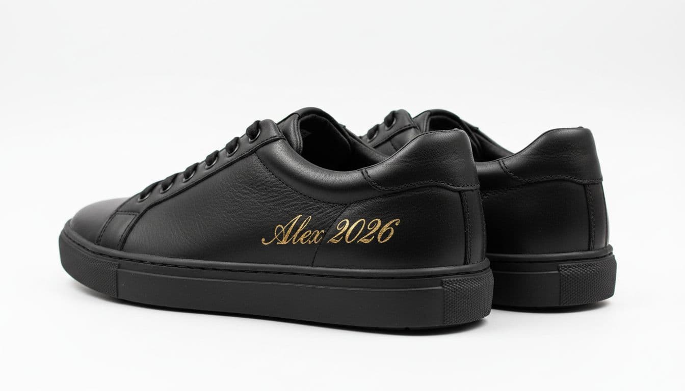
Photo upload previews are part of validation, too. A mug, poster, or phone case should show the crop area, safe zone, and bleed so buyers know what will print. Shopify’s advice on product customization makes the same point: clear labels and example mockups reduce friction and bad orders.
Show the finished product before payment
People trust what they can see. Live previews turn abstract choices into a product someone feels safe buying. That matters for engraving, monograms, color combinations, and print-on-demand art, because the risk feels personal. If the preview updates with the chosen size, material, and customization placement, shoppers stop guessing.
A preview does not replace clear constraints. It should sit beside them. Show placement limits, font examples, and production notes near the control that caused them. If red leather is unavailable in size 13, disable that combination and explain it next to the selector. Hidden incompatibilities are expensive because they raise abandonment and send buyers to support.
Before checkout, add a review step that lists every custom choice in plain text and with a product thumbnail. Include size, color, material, engraving text, uploaded art, gift message, lead time, and any added fee. Then give shoppers easy edit links. Many of the same patterns found in checkout UX fixes to cut abandonment apply here, especially editable summaries and clear return paths.
The same summary should pass cleanly into the order record so support and fulfillment see the exact options the buyer approved.
Keep merchandising out of the way at this moment. If you add offers in the cart, follow non-intrusive cart upsell strategies so the custom review stays visible and easy to confirm. Confidence drops fast when the final check is buried under promotions.
Measure whether the UX is reducing mistakes
Track outcomes by product type, device, and input type. A gift-message field behaves differently from a photo upload, and a ring engraver behaves differently from a custom sofa fabric picker.
This short scorecard helps teams tie UI changes to business results:
| Metric | What to watch | Why it matters |
|---|---|---|
| Input error rate | Validation failures per session | Shows where shoppers get stuck |
| Personalization abandonment | Drop-off after opening custom options | Reveals overload or weak guidance |
| Support contacts | Tickets and chats tied to custom orders | Exposes confusion the UI didn’t solve |
| Returns, refunds, and remakes | Orders corrected after purchase | Captures the true cost of bad inputs |
Set a baseline before launch. Then compare one or two weeks of traffic with a similar product mix. Tag events for option open, validation error, preview interaction, edit click, and support-contact reason.
Look at the change after each UX update, not only at overall conversion. A new live preview may raise conversion and lower support contacts. A longer review step may cut remakes but hurt mobile completion. The best result is a lower error rate with stable or better revenue.
Conclusion
The best product personalization UX makes the right order feel like the easy order. It guides input, blocks bad combinations, shows the final result, and gives shoppers one last chance to edit before they pay.
That lowers support work, refunds, and avoidable remakes. More importantly, it gives buyers confidence, which is often the last thing missing before a custom product converts.