
Contract Pricing Visibility UX for B2B Product Pages
B2B buyers do not mind complex pricing. They mind unclear pricing. When contract pricing visibility is handled well, the product...

Final Sale Messaging UX That Prevents Surprise Returns
A shopper who sees that all sales are final only after clicking the purchase button often feels trapped. That frustration...

Product Specifications Table UX for Faster Buying Decisions
Shoppers don’t read product pages top to bottom. They scan, compare, and look for the one detail that removes doubt....

Request a Quote UX Patterns for B2B Product Pages
When a B2B eCommerce product needs a quote, the page has one job, move a buyer from interest to a...

Product Personalization UX That Stops Custom Order Errors
Custom products fail long before the warehouse touches them. Most failures start on the product page. The usual cause isn’t...
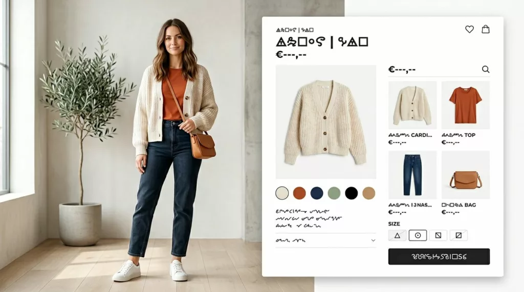
Shop the Look UX Patterns That Increase Outfit Adds
A shopper sees a styled outfit and wants the whole thing, not a scavenger hunt. Yet many Shop the Look...
One-Time Purchase Vs Subscription Selector UX On Product Pages
Shoppers can spot a trap fast. If your product page makes the buying model feel slippery, trust drops before price...

Discontinued Product Page SEO and UX in 2026: What to Keep, Redirect, or Remove
Deleting a retired SKU feels tidy. It can also wipe out links, rankings, and customer trust when the page still...

A Smarter Ecommerce Internal Linking Strategy for Products, Collections, and Guides
A strong store structure works like clear signs in a good shop. Shoppers move from aisle to shelf to advice...

Product Review UX Patterns That Build Trust and Cut Returns
A five-star average can still miss the real question: will this work for me? That gap is where product review...