
Pickup Point Selector UX That Cuts Delivery Friction
Pickup point selection looks simple until shoppers have to use it. Then the clock starts, because every extra search, vague...
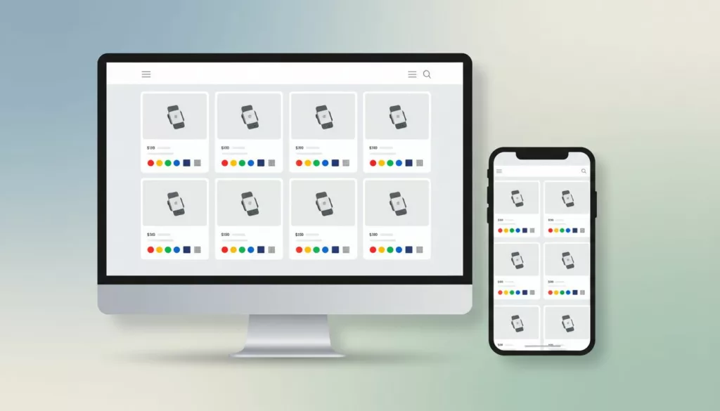
Product Card Swatch UX That Helps Shoppers Compare Variants
Shoppers compare variants in seconds. If your product cards hide the difference, they slow down or guess. Strong product swatch...

Phone Number Field UX for Ecommerce Checkout in 2026
The phone number field can make checkout feel smooth or stubborn in one screen. On mobile, that choice often shows...
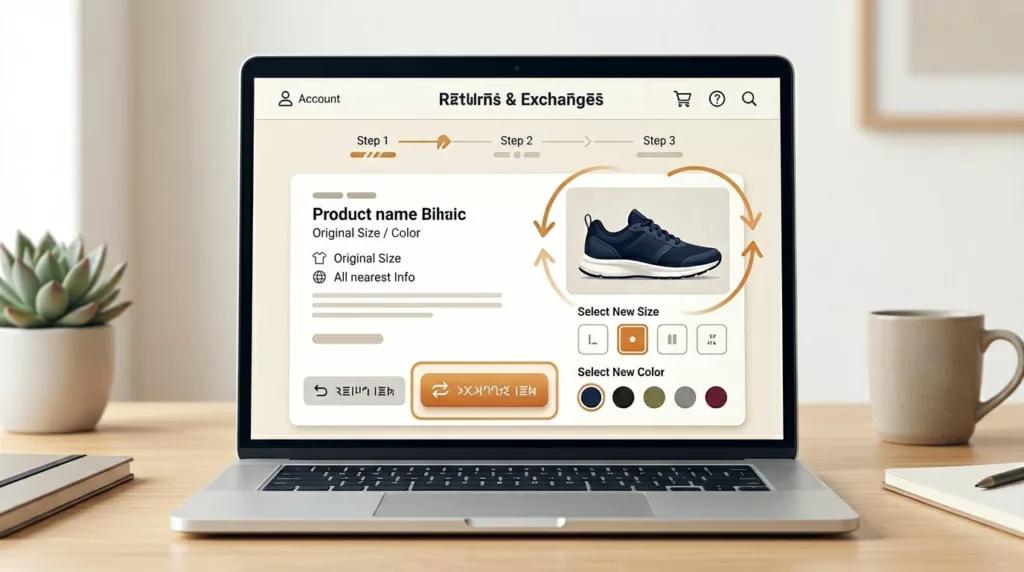
Exchange Offer UX That Recovers Revenue in Returns Portals
A return request doesn’t always mean the sale is lost. In many cases, the shopper still wants the product, only...
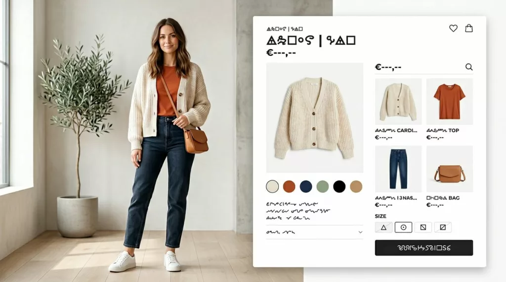
Shop the Look UX Patterns That Increase Outfit Adds
A shopper sees a styled outfit and wants the whole thing, not a scavenger hunt. Yet many Shop the Look...

Order Cancellation UX That Cuts Chargebacks and Support Tickets
Bad cancellation UX turns a simple request into a trust problem. When people can’t tell if an order can still...
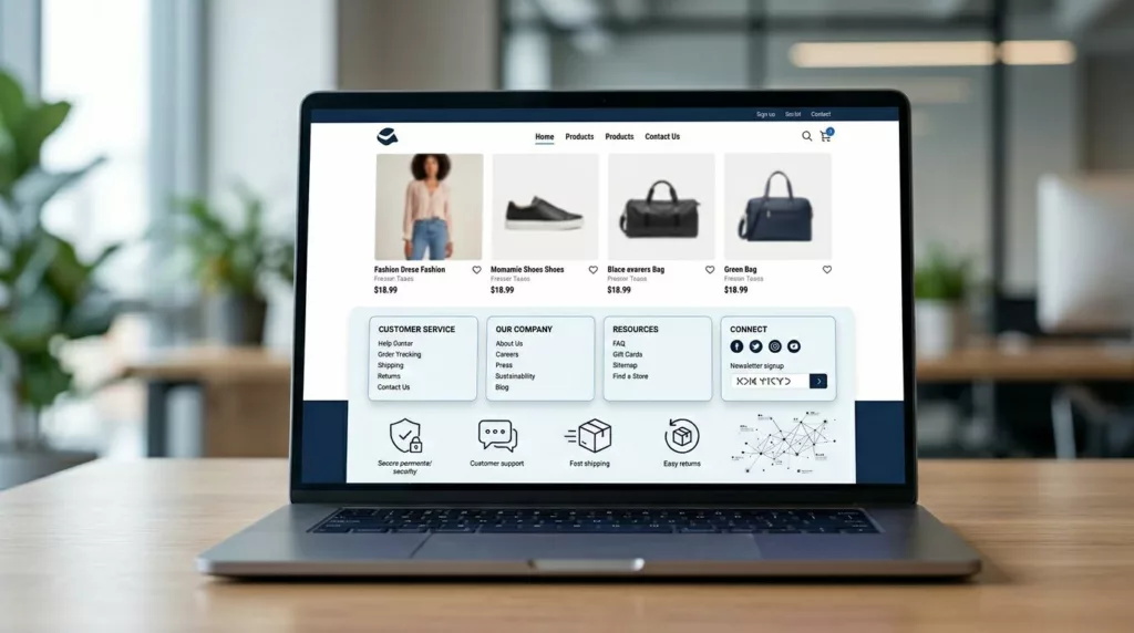
Ecommerce Footer UX for Trust, SEO, and Faster Support
Most footers get designed last. Yet a smart ecommerce footer ux setup can calm doubt, guide support, and strengthen internal...
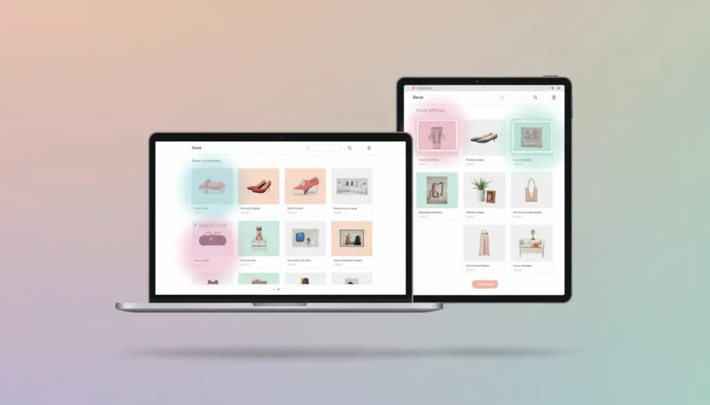
New Arrivals Page UX That Earns More Repeat Visits
A new arrivals page has one job: show change fast. If a returning shopper lands there and can’t tell what’s...
Category Page No-Results UX That Keeps Shoppers Moving
An empty category page looks small, but it can waste high-intent traffic fast. Shoppers have already chosen a path, applied...

Address Autocomplete UX That Turns Long Forms Into Faster Checkouts
A shopper can forgive one extra tap. They rarely forgive a long, error-prone address form in the e-commerce checkout. For...