

Bad cancellation UX turns a simple request into a trust problem. When people can’t tell if an order can still be stopped, how much they’ll get back, or what happens next, they don’t wait around. They email support, open chats, and sometimes go to their bank.
Good order cancellation UX doesn’t trap people. It makes the rules clear, offers fair save options, and closes the loop fast. That mix lowers first-contact volume, reduces friendly fraud, and protects the brand when the answer is “yes, you can cancel.”
Clear order cancellation UX lowers first-contact support
Most cancellation tickets start before the customer submits anything. The order email has no manage link. The account area hides the action. The status label says “processing,” but nobody knows whether that means cancelable or already packed.
That gap creates expensive guessing. Customers ask support to interpret internal states they should never have to decode. If they still can’t get a clear answer, some file a dispute instead, especially when the card charge is fresh and the order status feels uncertain.
Make the honest path easier than the dispute path.
The fix starts upstream. Put one self-serve entry point in the confirmation email, account area, and shipment updates. For pre-orders and long lead times, these self-serve cancellation UX patterns show why timing and payment rules need to appear before frustration builds.
Status language matters too. Use labels tied to real outcomes, such as “Cancel available,” “Stop request sent,” “Too late to cancel, return after delivery,” and “Refund in progress.” When words match reality, support volume falls because the page already answers the question.
Design the flow for clarity, not friction
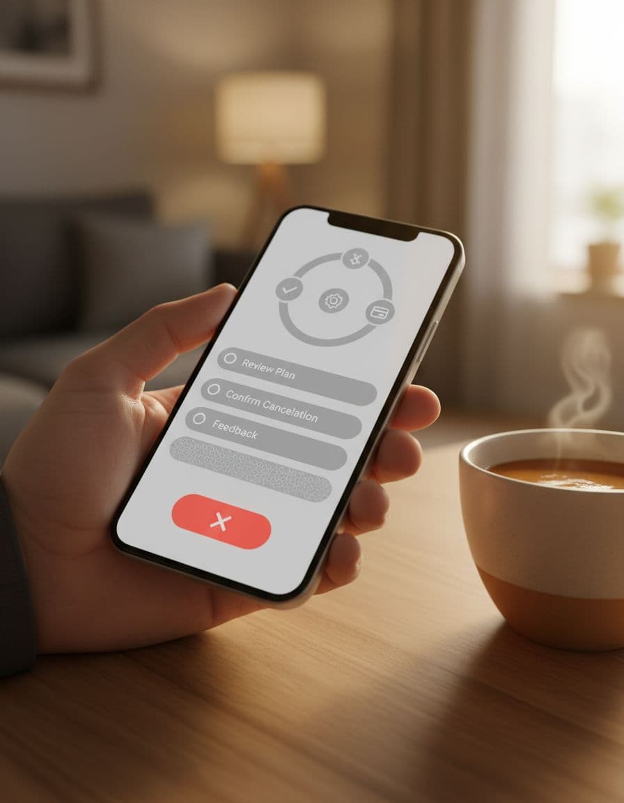
A strong cancellation flow answers four things before the final click: eligibility, refund amount, timing, and next steps.

Make the confirmation screen do real work
Your confirmation screen is a receipt, not a speed bump. Show the order number, canceled items, payment method, refund value, and expected timeline in one view. If the warehouse must approve the stop request, say that before the customer leaves the page.
Useful microcopy is plain and specific. “Order canceled. Refund started today.” works better than “Request submitted.” If fulfillment is uncertain, use “We’re trying to stop this order now. We’ll email you within 30 minutes.” That sentence cuts repeat contacts because it sets a clock.
Then give one clear next action. “Track refund,” “View updated order,” or “Start a return if it still ships” all work. What fails is dumping the customer back on the homepage with no proof that anything happened.
Put refund rules and policies before the final click
Don’t hide policy logic inside a tiny link or a last-second modal. Put the outcome beside the action: “Full refund before fulfillment,” “Shipping is refunded only if the package hasn’t shipped,” or “Custom items can’t be canceled after production starts.” Clear policy snapshots reduce the feeling that rules changed after purchase.
This is also where fair save options belong. For a physical goods order, that might be “Change address,” “Swap size,” or “Delay shipment.” For subscriptions, it could be “Skip next order,” “Pause for 30 days,” or “Move to a lower plan.” The save offer should sit below the primary cancel action, never hide it. Many of the same patterns appear in these cancellation flow examples.
Keep the full policy easy to inspect, too. A strong returns page UX cutting refunds helps because it gives customers one trusted place for timelines, exclusions, and next steps. When policy, order status, and cancellation outcome all agree, brand trust goes up even when the order ends.
Handle physical goods and subscriptions differently
Physical goods and subscriptions share a goal, but the friction points are different. One is about fulfillment state. The other is about ongoing billing and future value.
This quick comparison keeps the flow grounded:
| Area | Physical goods order | Subscription cancellation |
|---|---|---|
| Critical message | Cutoff time and shipment status | Next renewal date and end of access |
| Best save option | Edit address, swap item, change speed | Pause, skip, change frequency, cheaper plan |
| Refund copy | “Refund to original payment method in 3 to 10 business days” | “No future renewals. Access stays until May 31” |
| Post-cancel step | Return path if parcel still ships | Easy reactivation from account |
For physical goods, order status communication does most of the heavy lifting. If ETA shifts, reflect that early with the same logic used in estimated delivery date UX. Customers cancel less often when the timing story stays believable from checkout to post-purchase.
For subscriptions, save options can work well because intent is often softer. Still, relevance matters. Offer pause for timing issues, plan downgrade for price concerns, and skip for stock-up behavior. Subscription teams can compare their patterns to cancel flow best practices, but the rule stays simple: make cancel possible, and make alternatives genuinely helpful.
Track the right KPIs and ship with a checklist
Measure this flow like an operations surface, not a copy tweak. Watch:
- Cancellation start-to-complete rate
- Support contacts per 100 cancellation attempts
- Chargebacks after cancellation attempts, by reason code
- Refund completion time, seen from the customer’s side
- Save-offer acceptance rate, plus re-contact rate after acceptance
Before launch, use this short checklist:
- Add “Manage order” in email, account, and delay messages.
- Show cancel eligibility and refund outcome before confirmation.
- Match status labels to real fulfillment or billing states.
- Send a confirmation email with timeline and next step.
- Log events for cancel start, cancel complete, refund issued, and support contact.
Cancellation is a trust moment. When customers can see the rule, the outcome, and the next step in plain language, they stop guessing and stop escalating.
The best order cancellation UX treats people fairly while protecting support capacity, dispute rates, and the chance of a future order.