

A shopper sees a styled outfit and wants the whole thing, not a scavenger hunt. Yet many Shop the Look modules turn that spark into extra taps, hidden choices, and stalled intent.
Good shop the look ux keeps the styling story intact while making the buying path feel short. That means clear item visibility, low-friction variant selection, and add flows that work on both desktop and mobile.
Make the outfit feel shoppable in one glance
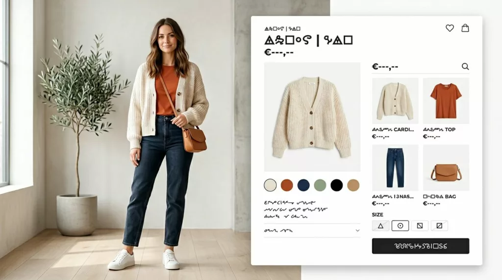
Shop the Look fails when the layout asks people to decode the outfit. The editorial image can sell the mood, but the buying panel has to sell clarity. Shoppers should see each included item, its price, and whether it needs a size or color before they commit.
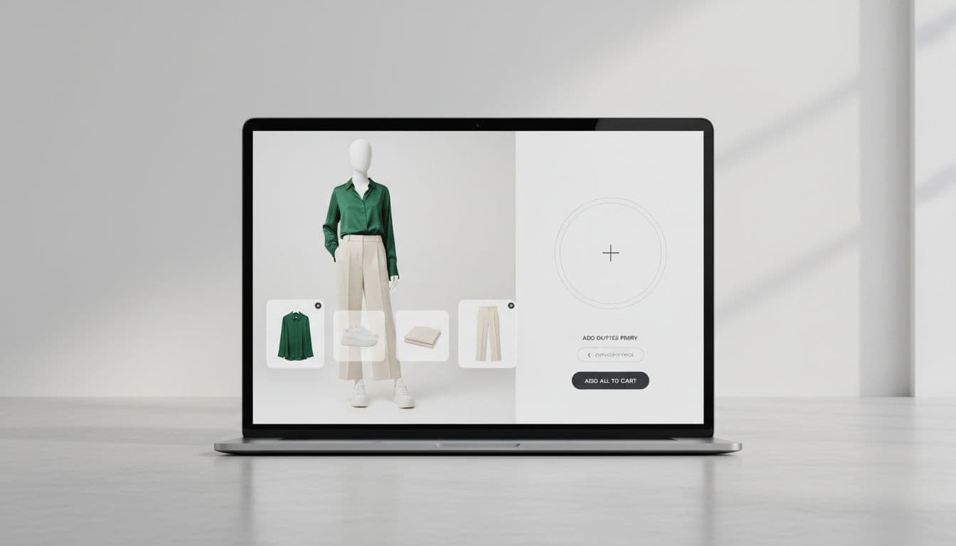
A strong desktop pattern puts the outfit image on the left and a fixed item panel on the right. That panel should stay visible as people inspect the look. Show item thumbnails, a running total, and one clear primary action such as “Add selected items.” If you offer discounts, show the math in plain view.
The best modules also reveal state early. Preselect an in-stock default variant when confidence is high, for example a one-size belt or the most common shoe color. When confidence is low, mark the item as incomplete with a short cue such as “Size needed.” That keeps the shopper informed without blocking the whole outfit.
Price feedback matters, too. If a shopper removes an accessory, the total should update at once. If one item is optional, label it that way. Fashion teams often treat these experiences like visual bundles, so patterns from confusion-free Shopify bundling UX can help when you need group pricing, item-level controls, or partial selection logic.
If shoppers need to open three product pages to understand one outfit, the styling story is already broken.
Above all, keep one look tied to one decision space. The moment the module sends people wandering, outfit adds fall.
Reduce decision cost when shoppers add the outfit
Most outfit add failures happen at the variant step. A shopper likes the look, taps the CTA, then hits a wall because one size is missing, one color changed the image, or the whole module resets. That friction feels small to a team and large to a shopper.
Keep variant editing inside the same surface. On desktop, use inline dropdowns or quick-expand rows. On mobile, use a bottom sheet that preserves the outfit behind it. Never kick users to separate PDPs unless the item needs deep education. Even then, offer a fast way back to the saved look state.
Sizing support should sit next to the decision point, not in a tab or footer. For apparel teams, the same placement logic from apparel size guide UX patterns applies here. Fit help lowers doubt, and lower doubt lifts multi-item adds.
Small fixes here often lift attach rate fastest.
| Friction point | Better pattern | Likely effect |
|---|---|---|
| One unavailable size blocks the full look | Allow partial add, then flag the missing item | Saves revenue that would otherwise disappear |
| Generic CTA hides missing choices | Show per-item completion status in the panel | Cuts false starts |
| Variant changes reset the outfit | Persist selected items and scroll position | Reduces abandonment |
| Redirecting to each PDP for details | Use inline quick view or expandable details | Keeps momentum high |
The add confirmation needs the same care. After “Add selected items,” show a clear summary with added pieces, skipped pieces, and one-tap edit or undo. A quiet cart drawer usually works better than a full-page jump because it confirms success without ending the outfit browsing session.
Copy also changes outcomes. “Add full look” works when every item is selected and available. “Add 3 selected items” works better when the outfit is partially complete. Shoppers respond well when the button tells the truth.
Mobile and desktop patterns that keep momentum high
Desktop gives you room for comparison. Mobile gives you almost none. The goal stays the same, but the patterns have to change.
On larger screens, hover hotspots can help people discover products on the model image. Pair that with a stable side panel so the list never disappears. On phones, stacked product cards and bottom sheets work better because they keep taps in reach and choices readable.
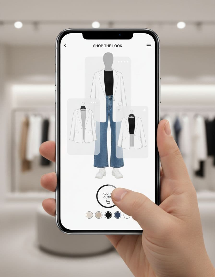
A mobile Shop the Look flow often benefits from the same thumb-zone logic used in sticky add-to-cart bars mobile. Keep a sticky summary bar with selected item count, running total, and one primary CTA. Put save, share, or wishlist behind secondary controls so they don’t compete with the add action.
Common mobile mistakes are easy to spot. Tap targets are too small. The sticky bar covers content. Size pickers open full-screen and lose context. The look image loads slowly, then the widget shifts the page. Each one chips away at completion.
Measure the module like its own funnel step. Track outfit add rate per look impression, items per outfit add, partial-versus-full look adds, variant error rate, and revenue per look exposure. Then split results by device, because mobile usually gets more exposure while desktop often closes at a higher rate.
For testing, change one variable at a time. Good starting tests include CTA label, total price placement, optional item treatment, and whether partial adds stay allowed. Implementation also matters. Keep inventory, pricing, and variant state synced across the PDP, the Shop the Look module, the sticky bar, and the cart. When those states drift, trust drops fast.
Shoppers don’t add outfits because the module looks polished. They add when the interface keeps momentum from inspiration to confirmation.
The strongest shop the look ux pattern is simple clarity. Show what’s in the look, make edits easy, keep the CTA close, and don’t punish shoppers for one missing size. When the path feels short, outfit adds usually follow.