


Pickup point selection looks simple until shoppers have to use it. Then the clock starts, because every extra search, vague map pin, or unclear store detail gives them one more reason to leave.
A strong pickup point selector removes that hesitation. It shows nearby options fast, explains the tradeoffs, and keeps the next step obvious.
When the flow works, shoppers feel in control instead of stuck. That matters even more on mobile, where a small decision can fill the whole screen.
Why pickup point choice creates friction in checkout
The hard part is not the map. The hard part is the decision.
Shoppers need quick answers to three things, where the pickup point is, when they can get there, and whether it fits their order. If the selector hides opening hours, distance, stock limits, or pickup fees, people start guessing. Guessing slows checkout. It also raises the chance of a wrong choice, which leads to edits, support questions, or abandonment.
Pickup friction often shows up in small ways. A map loads before the list. Search appears only after the user scrolls. The selected store does not stay visible. The pickup option changes after the shopper reaches the review page. Each one adds doubt.
If your checkout already has other rough spots, checkout UX fixes to cut abandonment can help you spot the rest of the flow. Pickup selection should feel like one more clear step, not a side quest.
A useful rule is simple, show only what helps the decision. The selector is not there to impress people with dense location data. It is there to help them pick the right place with the least effort.
What a low-friction selector needs to show first
The first screen matters most. It should answer the shopper before they need to explore.
Start with the nearest valid pickup options, then show the details that affect choice. Distance or travel time comes first. Opening hours come next. After that, show anything that changes the real cost of the choice, such as pickup fee, parcel size limits, or collection window. If a store is closed today, do not bury that in a small note.
For many catalogs, a search-first flow works better than a map-first flow. That is especially true when the shopper knows the area but not the exact store name. If your team is building that type of search and autofill flow, checkout address form UX patterns gives a useful model for reducing typing and errors.
A pickup selector should also remember context. If the shopper already entered a city, use that. If they previously chose a location, keep it near the top. If the customer is on mobile data, avoid a heavy map as the only way forward.
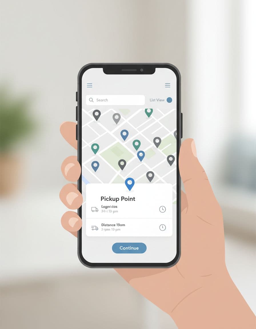
The best selectors make comparison easy. Shoppers should be able to scan, tap, and confirm without opening extra screens. If they need to read every card before choosing, the interface is asking too much.
If a shopper has to zoom, pan, and backtrack to choose a pickup point, the selector is doing the job of a map app instead of a checkout tool.
Mobile and desktop patterns that feel natural
The same selector can work on both devices, but the layout should change with the screen.
Mobile users need speed and thumb access. A bottom sheet, sticky search field, and tap-friendly list are usually easier than a full-page map. Desktop users can handle more comparison at once, so a split view or side panel often works well. The goal is the same on both, reduce scanning time.
If the team is still deciding how much checkout should fit in one step, one-page vs multi-step mobile checkout is a helpful companion read. Pickup choice often changes that decision more than teams expect.
Here is a simple comparison that shows the difference in focus.
| Device | Better pattern | Why it works |
|---|---|---|
| Mobile | Bottom sheet with list first, map second | Faster to scan, easier to tap, less scrolling |
| Desktop | Side panel with map and list together | Supports comparison without hiding details |
| Both | Clear selected state and short summary | Reduces doubt before checkout continues |
The takeaway is straightforward, the selector should match the device’s strengths. Mobile should minimize movement. Desktop should support comparison without losing clarity.
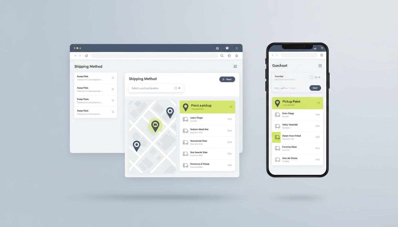
One practical pattern is to keep the chosen pickup point visible after selection. That way, the shopper sees the result without reopening the selector. Another is to let them edit the choice from the order summary, not send them back through the whole flow.
Accessibility and localization can make or break trust
Pickup selection needs to work for more than one kind of shopper. It also needs to work in more than one market.
Start with the basics. Every control needs a clear label. Keyboard users should be able to open the selector, move through results, and confirm a store without getting trapped. Focus should move in a logical order, and the selected point should be announced to screen readers. Touch targets need enough space for thumbs, especially around map pins and tiny close buttons.
Color matters too. Do not rely on color alone to show which location is selected. Add shape, weight, or a clear status label. That helps users with low vision, color blindness, or tired eyes at the end of checkout.
Localization is just as important. Pickup names, opening hours, postal codes, and distance units should match the shopper’s region. If the store closes early on weekends or has holiday hours, surface that before selection. If geolocation permission fails, give a clean manual search path instead of a dead end.
If your broader design system needs a stronger accessibility baseline, accessible e-commerce store design guide is a useful companion reference.
A good test is simple. Can someone choose a pickup point without using a mouse, without relying on color, and without reading tiny copy? If the answer is no, the selector still has too much friction.
Metrics that tell you whether the selector works
Good UX work needs numbers, not guesses.
The right dashboard should show whether the pickup point selector helps the checkout flow or slows it down. Start with checkout completion rate. Then track selector engagement, delivery option conversion, abandonment after the selector opens, and the time it takes to make a choice. Those numbers show where shoppers hesitate.
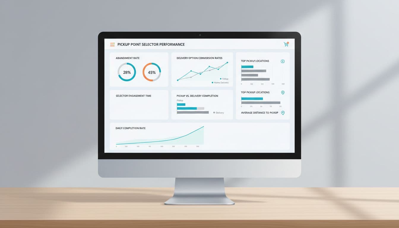
A few metrics are worth watching together:
- Checkout completion rate tells you whether the change helps shoppers finish.
- Selector engagement shows whether people use the feature or skip it.
- Delivery option conversion shows how often pickup wins over home delivery.
- Abandonment after selector open points to confusion or slow performance.
- Back-and-forth edits reveal uncertainty, especially when shoppers change stores after review.
If the selector adds 10 seconds, it needs to return more than 10 seconds of value.
Test the flow with A/B experiments, session replays, and support ticket review. Try map-first versus list-first. Compare auto-detected locations with manual search. Check whether shoppers in different regions need different defaults. You will learn fast if the selector is helping or asking for too much effort.
Conclusion
A pickup point selector is not a small checkout add-on. It is a decision point, and decision points create friction when they are unclear.
The strongest flows show the right details early, stay easy to use on mobile, and respect accessibility and local context. When the selector does that well, shoppers pick faster and move on with less doubt.
If checkout feels like a line at the counter, the selector should feel like a clear sign above the options. That is what cutting delivery friction looks like in practice.