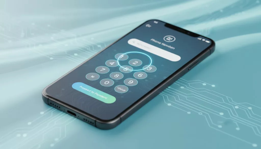

The phone number field can make checkout feel smooth or stubborn in one screen. On mobile, that choice often shows up as an extra tap, a bad keyboard, or an error message that makes people give up.
In 2026, shoppers expect faster forms, cleaner autofill, and fewer surprises. They also expect stores to respect privacy and regional formats. That means the phone number field UX has to work harder than a basic text box.
What a good phone field does in 2026
If you ask for a phone number, the field should earn its place. The best checkout teams use it for delivery updates, fraud checks, or account recovery, then say so in plain language.
| Decision | Better choice | Why it matters |
|---|---|---|
| Input type | type="tel" or inputmode="tel" | Gives the right mobile keyboard without forcing a numeric control |
| Format | Accept flexible entry | People paste numbers with spaces, plus signs, and parentheses |
| Requirement | Optional unless there is a real need | Required fields add friction fast |
| Validation | Check on blur and submit | Constant red errors slow people down |
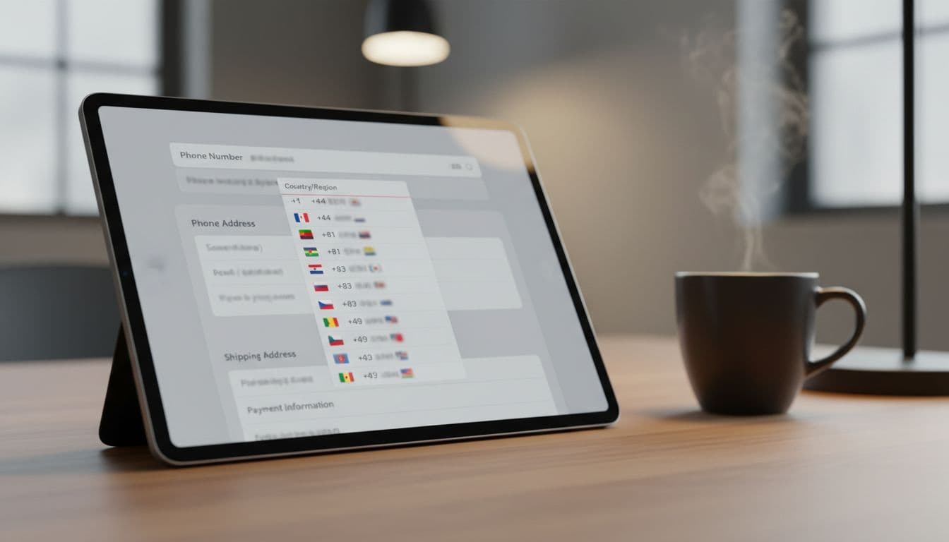
| Country handling | Default to the shopper’s market, allow change | International buyers should not fight the form |
| Autofill | Use autocomplete="tel" | Saved data cuts typing and mistakes |
Google’s payment and address form best practices still make one point very clear, use the right keyboard and avoid treating phone data like a numeric quantity.
If your checkout also has address friction, the broader checkout UX fixes that reduce cart abandonment page is a good companion reference. Phone fields rarely fail alone. They usually fail as part of a messy form.
A good setup is simple. Use one visible field, keep the label short, and add one line of helper text when the number is required. Do not split local numbers into tiny boxes unless your audience truly needs that structure.
Mobile-first behavior that lowers friction
Mobile users feel every extra tap. That is why placement, keyboard choice, and autofill support matter more than visual polish.
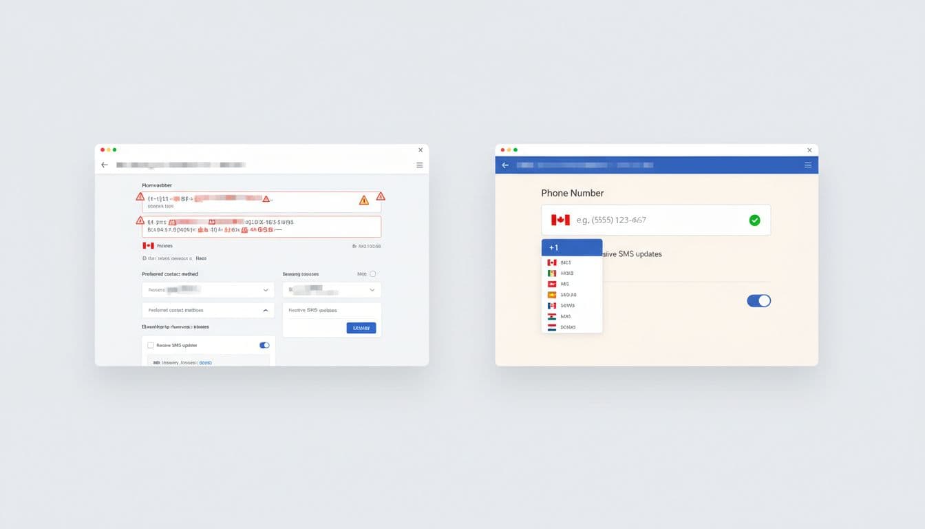
Put the field where the thumb can reach it easily. Keep it full width, and avoid side-by-side layouts on small screens. If you serve mostly one market, default the country code quietly. If you sell across regions, make the country selector obvious and persistent.
Phone fields also need to play nicely with paste. A lot of shoppers copy a number from contacts, messaging apps, or past orders. Strict masks can break that flow. They also punish valid punctuation. A flexible parser is safer than a rigid template.
If the shopper has to explain a phone number requirement to themselves, the form is already losing.
For teams that standardize form behavior, mobile-friendly checkout address fields is a useful reference. Phone and address inputs share the same keyboard, autofill, and mobile spacing rules.
The mistakes that still hurt conversion
The worst pattern is still the old type="number" field. It looks technical, but it behaves badly for phone data. Browsers can show spinners, strip leading zeros, and reject real-world formats. That is a bad trade for checkout.
Another common mistake is making the number required without context. Baymard’s phone number masking and explanation research matches what many audits still show, shoppers accept friction more easily when they know why it exists. A short note under the label is better than a tooltip that appears too late.
Avoid these habits:
- Forcing a strict mask that blocks paste or international symbols.
- Hiding the country code inside a tiny dropdown with poor contrast.
- Throwing an error after every keystroke.
- Asking for a phone number and giving no reason.
Good validation is quiet until it needs to speak. Bad validation shouts too early, then makes the shopper fix the same field twice.
International checkout needs a different ruleset
Phone formatting gets messy fast outside one-country stores. A UK, German, or Dutch number may not match a US pattern, and length rules vary more than many teams expect. That is why an E.164-friendly approach is safer. Accept the plus sign, normalize after submit, and do not block valid entries because they look unfamiliar.
For EU-heavy stores, the EU checkout optimization notes are worth a look. They make the same practical point many European teams learn the hard way, phone fields should accept international formats and stay optional unless there is a real operational need.
That optionality matters. Many shoppers do not want to share a phone number unless they get a clear benefit. If you need it for delivery updates, say so. If you use it for SMS marketing, separate that consent from checkout. GDPR and CCPA both push teams toward clearer data use, and that is good UX too.
Validation, privacy, and SMS use cases
Validation should happen on blur and again on submit. The message should say what is wrong and how to fix it. “Enter a valid phone number” is weak. “Include your country code” is better, if country code is truly required.
If your store sends SMS delivery updates or uses phone-based login, keep the checkout field aligned with that flow. The same country rules, labels, and parsing logic should appear everywhere. That consistency helps users trust the form, and it helps your team avoid support issues later. The passwordless login via SMS OTP article is a useful follow-on if phone numbers also power account access.
Keep privacy language short. Tell shoppers why the number matters, who will see it, and whether it will be stored. That single line often does more for completion than another visual accent or a stronger CTA button.
Conclusion
A phone number field is small, but it can carry a lot of checkout friction. In 2026, the best version is flexible, mobile-friendly, and honest about why it exists.
Use the right keyboard, accept real-world formats, and explain any requirement next to the label. When the field respects the shopper’s device and market, it stops feeling like a hurdle and starts feeling like part of a well-run checkout.