
Most footers get designed last. Yet a smart ecommerce footer ux setup can calm doubt, guide support, and strengthen internal linking from every page.
When shoppers reach the bottom, they often want proof before they buy. They may look for returns, shipping, tracking, payment safety, or a real way to contact you. If the footer feels messy or thin, trust drops fast.
A good footer doesn’t need more links. It needs better paths.
Why the footer still matters after the product page
Your header helps people browse. Your footer helps them confirm. That difference matters because bottom-of-page visitors often have high intent and low patience.
A strong footer does three jobs at once. First, it reassures people that the store is real, reachable, and clear about policies. Next, it gives support-minded users a short route to answers such as order tracking page UX. It also creates sensible sitewide links that help search engines understand your store structure.
That last point has limits. Sitewide links are useful when they match real tasks. They become noise when they dump dozens of low-value pages into every template. LogRocket’s guide to website footer design practices makes the same case. Navigation, trust, and utility need balance.
If a shopper reaches your footer looking for help, each extra click feels larger than it should.
So, treat the footer like a service desk, not a storage closet.
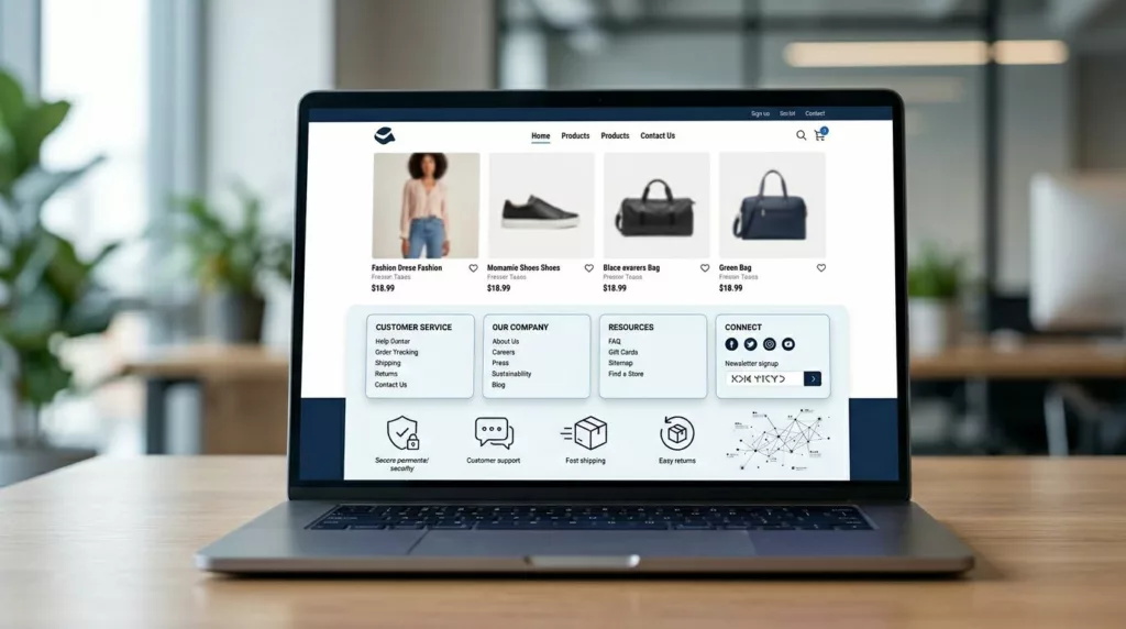
What to place in the footer, and what to leave out

Start with the links people expect. Then stop. The best footer UX patterns are short enough to scan and rich enough to answer common doubts.
| Footer area | What belongs there | Why it helps |
|---|---|---|
| Help | Contact, FAQ, returns, shipping, tracking | Reduces support friction |
| Trust | Privacy, terms, payment info, security notes | Removes risk signals |
| Company | About, reviews, store info, careers if relevant | Confirms legitimacy |
| Shopping | Top collections or key categories | Supports discovery and crawl paths |
| Utility | Account, gift cards, store locator, language or currency switcher | Helps repeat visitors finish tasks |
Use plain labels. “Returns & Shipping” beats “Resources.” “Track Order” beats “Support Center” when the real task is obvious. If your policy pages are hard to scan, the footer won’t save them, so build better returns and shipping policy page design.
Leave out huge link dumps, duplicate header menus, fake badge farms, and oversized newsletter blocks that push support links too low. Legal links matter, but they should not crowd out customer tasks. Keep privacy and terms in a smaller group, then make help links easier to spot.
The footer is also the wrong place for product-specific questions. Those belong in a product page FAQ UX module closer to the buy button. For Shopify teams, this matches the advice in this Shopify footer optimization guide. Clear groups beat long columns every time.
Small stores and large catalogs need different footer logic
A footer for a 20-product shop should not look like one for a 20,000-SKU catalog. The goal stays the same, but the link depth changes.
For a small store, keep it tight. Eight to 12 links is often enough. Put support first, then policies, then a few shopping shortcuts. One contact path, one returns path, one tracking path, and one simple email signup can do the job. When every link matters, the footer feels calm.
Larger catalogs need more structure, not more clutter. Group links by intent, such as “Customer Care,” “Shop,” and “Company.” Add only top-level category links, not hundreds of subcategories. If SEO is a concern, link to major hubs and an HTML sitemap, but keep the visible footer focused on pages people may genuinely use. Footer links done right makes the same point from a search angle.
The support model changes too. Small stores can link straight to email and policy pages. Bigger brands often need a tracking hub, self-service returns, store finders, country selectors, and wholesale or B2B paths. The footer should mirror the business model, not force one template onto every store.
A quick footer audit that improves trust and findability
You don’t need a redesign sprint to fix most footer problems. Start with a short audit:
- Pull your top support questions from chat logs, tickets, and on-site search. If “Where is my order?” and “Can I return this?” show up every day, those paths belong in the footer.
- Review footer clicks by device. Mobile users often need bigger tap targets, shorter link labels, and fewer columns.
- Cut links that get no traffic or duplicate the header without adding value. Then group what remains by task, not by internal team ownership.
- Check crawl logic and page quality. Link only to pages that are useful, current, and worth landing on.
Track a few metrics after the change. Watch footer clicks to support pages, visits to policy pages, exit rate from bottom-of-page sessions, and ticket share for returns or tracking. If clicks rise and tickets fall, the footer is doing its job. If clicks rise and tickets stay flat, the landing pages still need work.
One last rule keeps things tidy. The footer should route people to answers, not contain every answer itself. When it tries to do both, it turns into a junk drawer.
Clear footers earn confidence
A footer is small, but its job is not. It is where trust, support, and search structure meet on every page.
When the footer feels clear, shoppers don’t have to wonder where to go next. They can find help fast, confirm the store is trustworthy, and keep moving toward purchase with less friction. That is what good ecommerce footer ux looks like.