
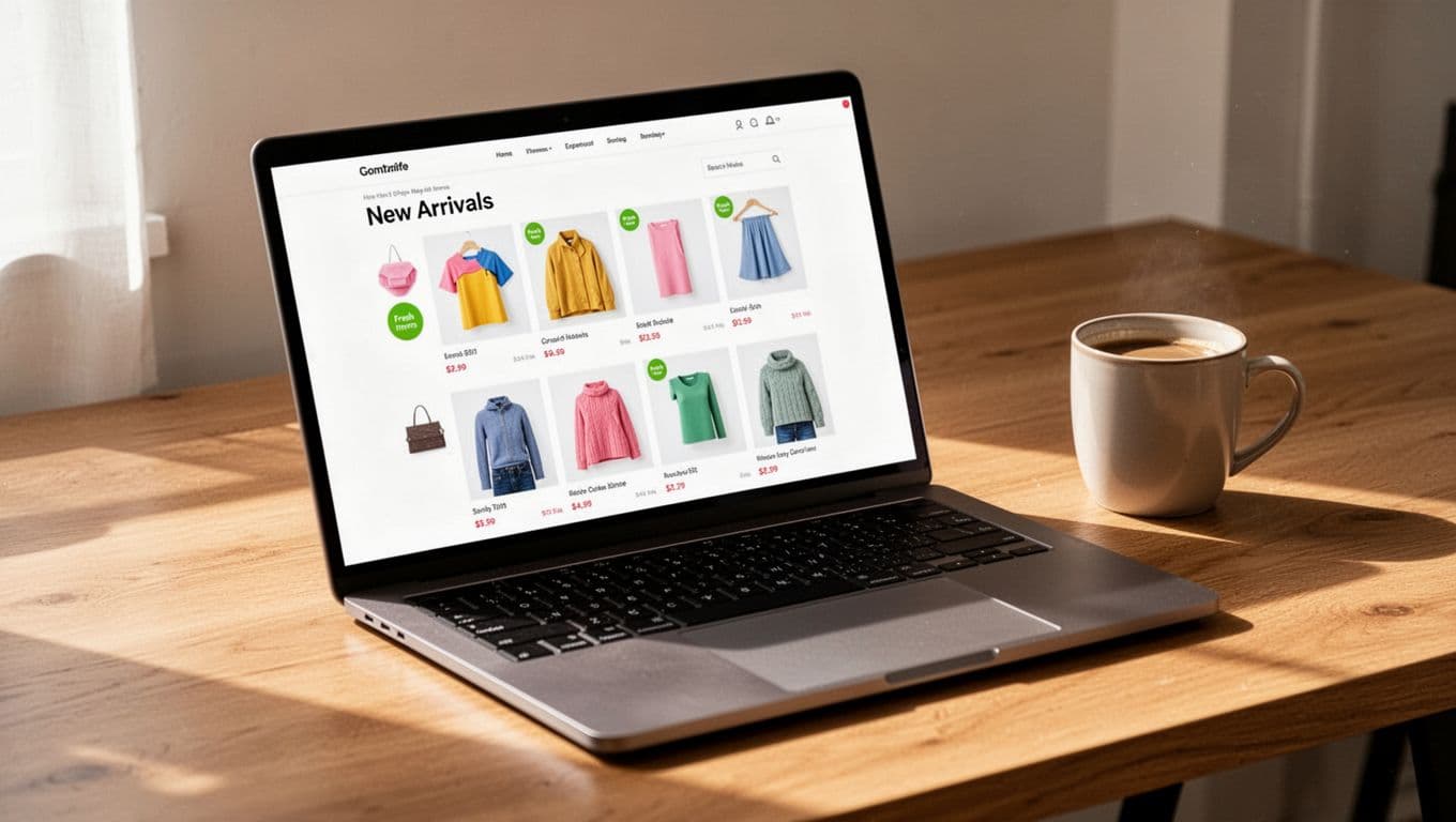
A new arrivals page has one job: show change fast. If a returning shopper lands there and can’t tell what’s new within seconds, the visit feels wasted.
Strong new arrivals page ux makes the page feel current, easy to scan, and worth checking again. That habit grows when freshness is obvious, browsing is low effort, and merchandising keeps the page from looking frozen.
Make “new” obvious on the first screen
“New” needs a clear rule. Some brands use 7 days, others 14 or 30, but the window should stay consistent. A simple “New this week” badge or date-based chip helps shoppers trust what they see. Without that cue, the page can feel like a regular collection with a different title.
The first row matters most. Lead with true recent arrivals, not a large banner or a lifestyle block that pushes products down. Product cards should show clean imagery, price, key variant cues, and stock-aware sizes if that matters in the category. If restocks belong on the page, label them as restocked rather than mixing them with brand-new items.
If a shopper can’t spot fresh products in five seconds, the page won’t build a return habit.
Sorting also needs discipline. Default to newest first, then keep that logic stable. On Shopify, newer items sometimes sink too quickly because of catalog rules or theme behavior. This sorting fix for buried arrivals is a useful reference when fresh items disappear after day one.
Don’t overdo badges. If every card says “new,” “best seller,” “limited,” and “online only,” nothing stands out. One freshness cue is usually enough. Also, keep card heights steady. When image ratios and text blocks jump around, repeat visitors need more effort to re-scan the grid.
Filters should match why people revisit. Size in stock, color, price, category, and “arrived in the last 7 days” are more useful than broad merchandising tags. Better still, keep selected filters visible as chips and remember sort order on return visits. That small detail saves effort and makes the page feel familiar.
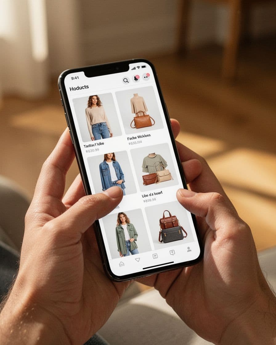
Design for short visits, especially on mobile
Many repeat checks happen on a phone, between tasks, or while someone is commuting. So the page should support quick decisions. Keep filters thumb-friendly, hold the sort control in a sticky bar, and avoid card layouts that jump as images load.
State memory is a big part of retention. When a shopper opens a product and taps back, they should return to the same scroll spot and same filters. Otherwise, the page turns into a maze. The same logic applies to browsing depth. A hybrid approach, where users can tap “Load more” without losing page structure, often works better than a never-ending feed. If you’re weighing that choice, this guide to pagination vs infinite scroll in collections is a practical companion.
Quick product previews can also keep momentum high. For apparel, beauty, or home goods, quick view modals enhancing product discovery let shoppers compare new items without bouncing in and out of product pages. The key is restraint. Show enough detail to support a click or add-to-cart, then keep the grid easy to resume.
Loading states matter as much as layout. Reserve space for images, keep skeletons light, and avoid promo bars that push content down after the page appears. Small interruptions make short visits feel slower than they are.
Search deserves a place here too. Some repeat visitors know roughly what they want, they only want the latest version of it. Adding search autocomplete UX for product discovery near the top of the page can help those shoppers skip manual scanning and get to the right new products faster.
Merchandise the page like a living storefront
A strong page feels active even when product drops are small. That usually means mixing raw recency with curation. For example, you might keep one row for “Just dropped,” another for “Back in stock,” and a third for “New in dresses” or “New under $50.” This keeps the page fresh without forcing every visit through the same flat grid.
Merchandising should also match category behavior. Fashion shoppers often want frequent drops and strong visual variety. Home, beauty, or wellness shoppers may respond better to newness grouped by use case, room, skin concern, or routine. In both cases, clear labels matter, because shoppers read availability and novelty fast.
Editorial support helps as well. A small module with collection links, trend callouts, or staff picks can guide discovery, as long as it doesn’t bury the product feed. Teams planning launch cadence often pair UX work with a broader Shopify new arrivals strategy, so the page reflects how products enter the catalog, not only how they look after upload.
Use a small scorecard to judge whether the page is earning another visit.

| Metric | What it tells you |
|---|---|
| Repeat visits to the page | Whether the page is becoming a habit |
| Product click-through rate | Whether the grid invites deeper browsing |
| Save or wishlist rate | Whether shoppers want to come back later |
| Add-to-cart from new arrivals | Whether discovery turns into buying intent |
| Exit rate after first screen | Whether the opening view feels stale or confusing |
Look at those signals by device, traffic source, and customer type. Also, don’t judge the page only by direct sales. A good new arrivals page often improves discovery before it moves conversion, which is why saves, product views, and return frequency matter.
The page that earns repeat visits is the one that respects time. It shows what’s new fast, keeps browsing smooth, and gives shoppers clear reasons to come back.
When new arrivals feels current every week, the page stops acting like a shelf. It starts behaving like a destination.