

An empty category page looks small, but it can waste high-intent traffic fast. Shoppers have already chosen a path, applied filters, and narrowed the field. When the grid goes blank, many assume the store does not have what they need.
Good no results UX turns that dead end into a guided detour. Instead of showing “0 items” and little else, it helps shoppers widen the path without losing their place. That has a direct effect on bounce rate, product discovery, and revenue.
Why category-page zero results cost more than a missed click
Zero-result states on category pages often come from filter conflicts, local stock limits, price caps, size gaps, or seasonal assortments. That makes them different from search misses. The shopper already trusted your navigation and invested effort in refinement.
That is why category-page failures feel harsher. A blank grid says, “your path was wrong,” even when the issue is a narrow size or an out-of-stock color. Resetting from scratch feels expensive, so many people leave.
The damage shows up in three places. First, bounce rate rises because the page stops offering useful next steps. Second, product discovery drops because shoppers never see adjacent categories, substitute products, or broader inventory. Third, revenue slips because the session had strong intent and no recovery path.
A simple example makes this clear. A shopper lands in “women’s ankle boots,” then filters by size 8, brown, low heel, and under $100. If the page returns nothing, the right move is not a blank apology. The page should point out the limiting filter, suggest one-tap broadeners, and keep related options visible.
This is also a conversion issue, not only a UX issue. Stores lose money when high-intent sessions stall mid-browse, which is why UX impact on conversions deserves attention beyond checkout. Baymard’s no-results page research makes the same point, recovery matters more than the error message itself.
Design fallback paths that preserve shopper momentum
The best no results UX keeps context intact. Shoppers should still see the category name, the filters they chose, and a clear reason the page is empty. Then the page should offer the easiest next move, not force a reset.
The job of a no-results state is to recover intent, not announce failure.
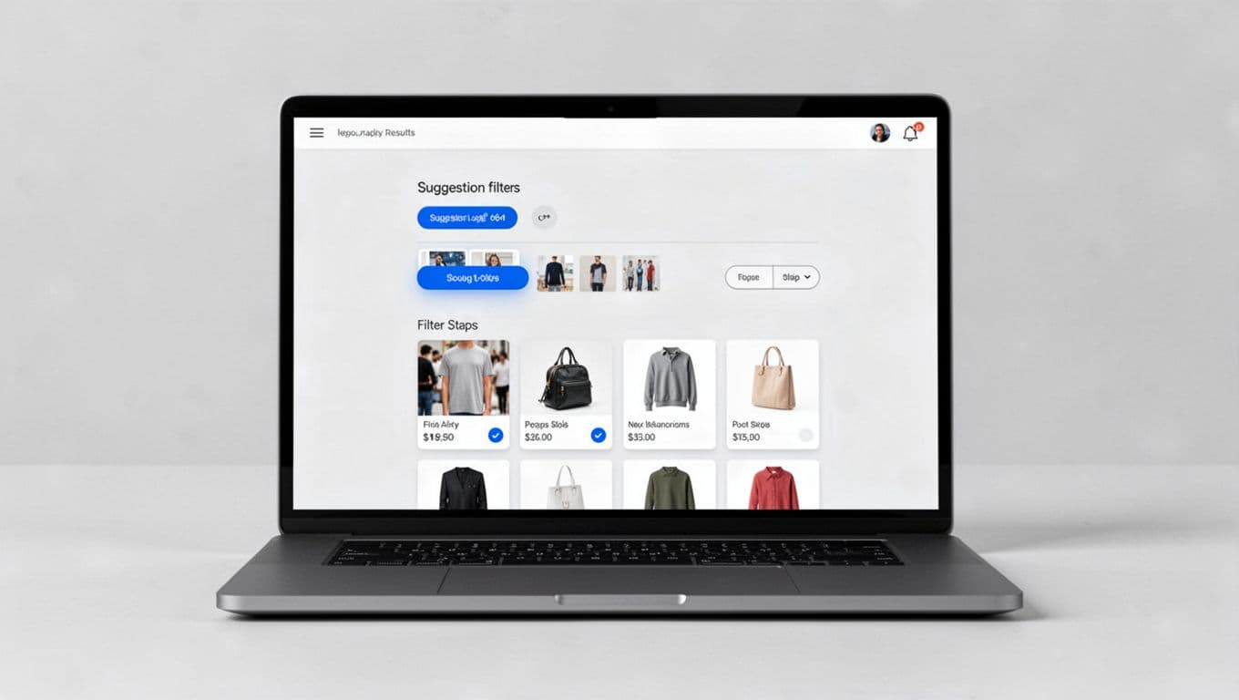
A strong recovery pattern has four parts. First, explain what caused the empty state in plain language. “No products match size 8 and low heel under $100” is far more useful than “No products found.” Next, offer one-click changes that relax the least important constraint. After that, show nearby options such as sibling categories or in-stock substitutes. Finally, keep a live product area on the page, even if those products are broader than the original filter set.
This framework helps teams choose the right fallback.
| Zero-result cause | Best fallback | Why it works |
|---|---|---|
| Over-filtered facet combo | Remove the last filter, widen price, or show nearby sizes | It reduces effort and keeps the shopper’s progress |
| Variant out of stock | Show other colors, sizes, or close substitutes | It protects product intent |
| Thin category branch | Suggest sibling categories with similar use cases | It supports discovery without a full reset |
| Query-based category mismatch | Offer spelling fixes and related searches | It recovers language errors fast |
The key is relevance over volume. Ten random products will not save the session. Three strong alternatives often will. Related category suggestions only work when your ecommerce taxonomy for large catalogs is stable, because the system needs real relationships between categories. If the empty state starts from a typed query or hybrid search-browse flow, pair it with search autocomplete UX patterns that catch typos and synonyms before shoppers hit zero results.
A few common mistakes still show up too often. Do not wipe the shopper’s filters. Do not send them to the homepage. Do not hide the reason for the empty state. Also, do not label unrelated products as “recommended” unless there is a clear logic behind them. Shoppers notice when fallback content feels random.
Mobile no-results UX needs tighter choices and better measurement
Mobile makes no-results states worse because space is tight and patience is short. The filter drawer may hide the problem, the keyboard may cover recovery actions, and the shopper may not see any useful options above the fold.

On mobile, keep the fix simple and visible. Put removable filter chips near the message. Add one prominent “broaden results” action. Limit alternate category links to a few strong options. If you show products, make the first row count.
A short mobile checklist keeps teams honest:
- Show the cause of the empty state without making users reopen filters.
- Keep reset and broaden actions above the fold.
- Preserve the applied filters as editable chips.
- Prioritize one-tap actions over long explanatory copy.
Measurement matters because some empty states are design problems, while others come from catalog or inventory gaps. Track zero-result rate by category, device, and filter set. Then watch recovery click-through rate, exits after zero results, product clicks after recovery, and revenue from recovered sessions. If mobile recovery is weak, the issue may be layout. If one category spikes, the issue may be merchandising or taxonomy.
Clear copy helps, but it is not enough on its own. LogRocket’s guidance on no-results pages also points back to the same principle, tell users what happened, then give them useful next actions.
A blank category grid does not have to be a stop sign. Strong no results UX explains the miss, relaxes the right constraint, and offers relevant alternatives without breaking momentum.
That is how you reduce bounce rate and protect discovery. When the exact item is unavailable, the page should still guide the next best click, because that is often where the sale survives.