
Address Autocomplete UX That Turns Long Forms Into Faster Checkouts
A shopper can forgive one extra tap. They rarely forgive a long, error-prone address form in the e-commerce checkout. For...
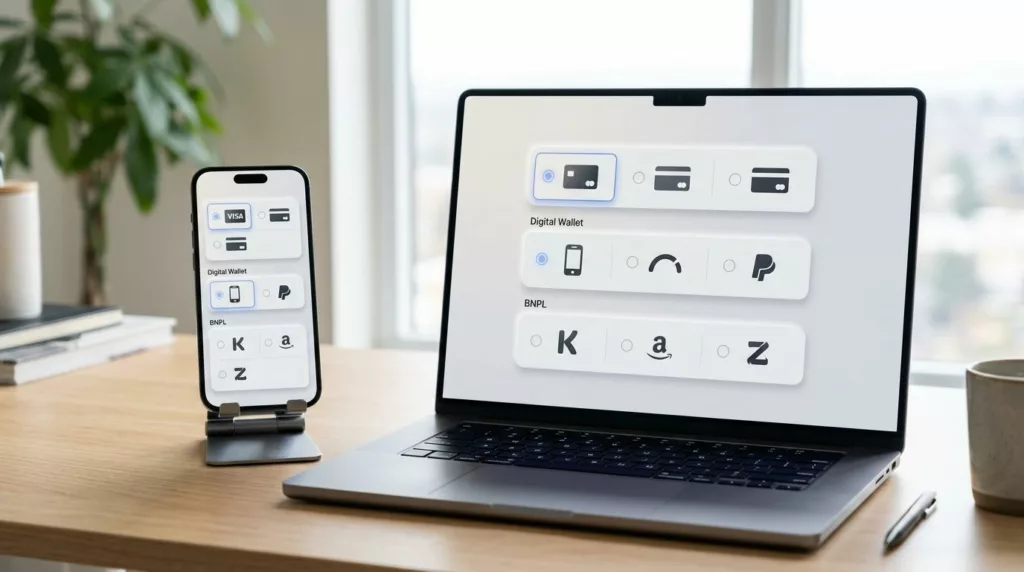
Payment Method Selector UX That Reduces Checkout Hesitation
A shopper can tolerate one more field. They usually won’t tolerate one more decision. That’s why the payment method selector...
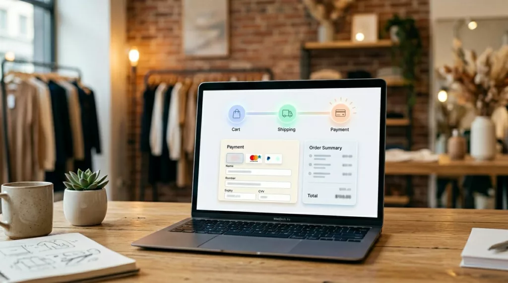
Checkout Progress Indicator UX That Reduces Step Anxiety
Few things drain checkout momentum faster in online retail than not knowing how much is left. When shoppers hit payment...

Subscription Portal UX That Cuts Churn and Support Tickets
Support tickets often start with a small moment of doubt in the post-purchase journey. A user tries to change a...
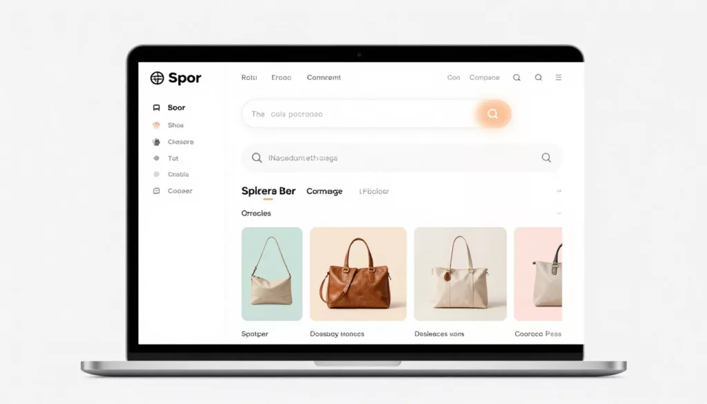
Empty Cart UX Patterns That Bring Shoppers Back
An empty shopping cart page can feel like a dead end. If it only says your cart is empty, you...

Self-Serve Order Editing UX That Cuts Support Tickets
A support queue full of “Can I fix my address?” tickets is usually a product problem, not a customer problem....
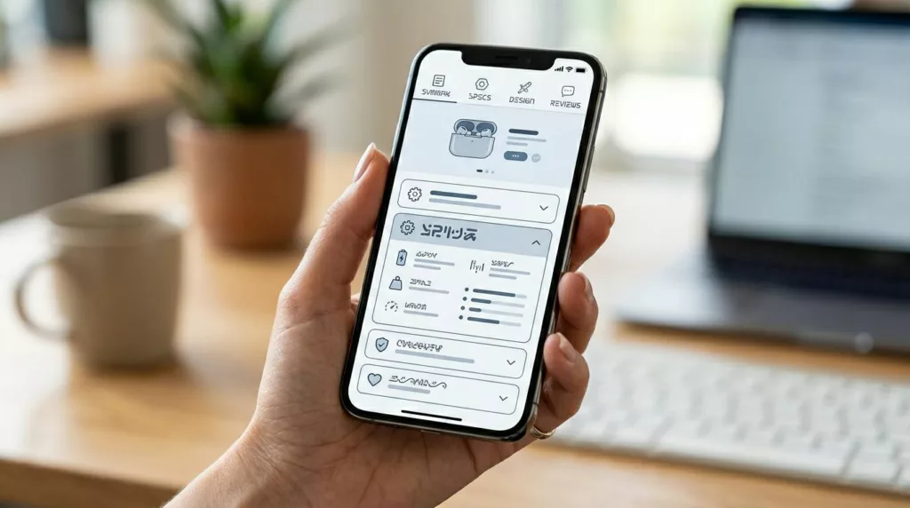
PDP Tabs vs Accordions UX for Mobile Product Pages
On a phone, every product page choice feels bigger. Space is tight, attention is short, and the wrong content pattern...
Bundle Builder UX That Increases AOV Without Shopper Confusion
A bundle should feel like help, not homework. When shoppers see clear steps, honest pricing, and fewer chances to make...

Headless Commerce UX Guide for Small Teams (2026): When It’s Worth It and How Workflows Change
Headless sounds like freedom: design what you want, ship faster, and stop fighting a rigid theme. Then reality hits. A...

Quick View Modal UX Patterns That Increase Product Adds
Shoppers use product listing pages like a shelf scan in a store, fast, selective, and impatient. A quick view can...