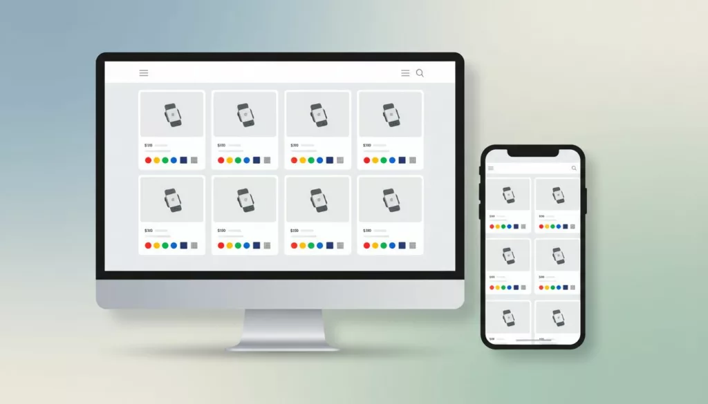

Shoppers compare variants in seconds. If your product cards hide the difference, they slow down or guess. Strong product swatch UX makes the card do more work before the click. It helps people scan faster, compare options on the grid, and move toward the right product with less hesitation.
On category pages, swatches are part of the decision, not decoration. The best patterns surface clear options, show availability, and keep the layout tidy on mobile and desktop. The sections below focus on the parts that matter most on product listing pages.
Build Strong Visual Hierarchy in Your Swatches
A swatch row works best when it feels secondary but easy to find. Place it close to the title or price, and keep the image, price, and variant cue in a clear line of sight. If the card also carries badges, ratings, and quick-add actions, the swatches need their own lane.
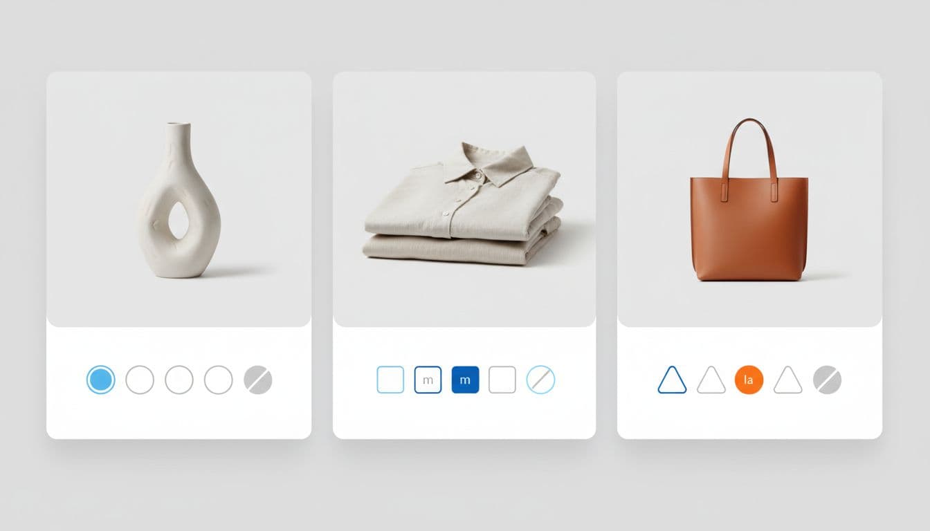
The visual form should match the decision. Color can use solid chips, while prints, leather, and finishes often need image swatches. Keep shapes consistent across the grid, because mixed sizes make comparison slower. For more on card structure, product listing card designs are a useful reference. For choosing the right control type, Craftshift’s swatches vs buttons guide gives a clear split between visual and non-visual options.
If the swatch row competes with the product image, the card has too many visual claims.
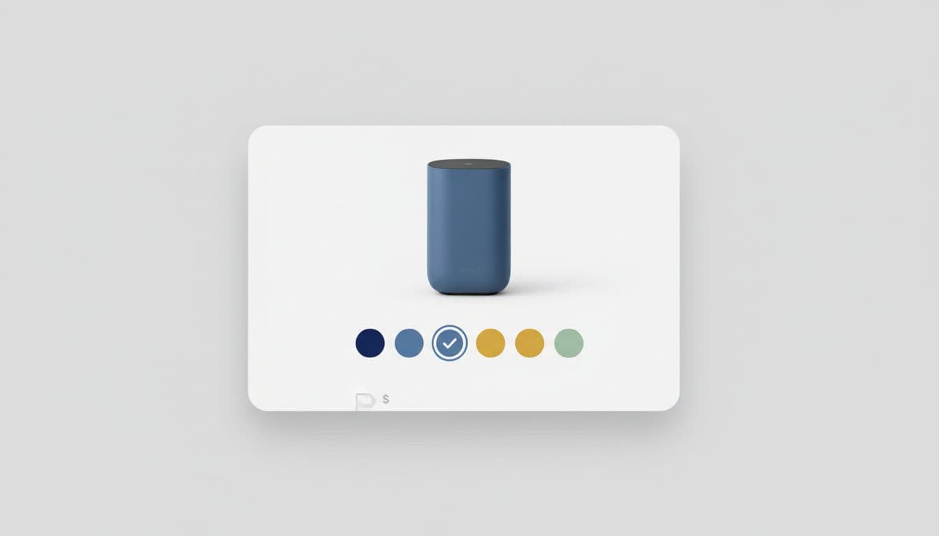
Use State Changes to Make Comparison Feel Safe
State changes are where confidence is won or lost. When shoppers tap a swatch, the selected state should be obvious at a glance. Use a strong outline, a check, or a filled ring, and repeat the same language across the category page. That consistency helps shoppers compare different products without re-learning the pattern on every card.
If the variant changes the product image, swap the image fast enough to feel tied to the tap. That makes color and material comparison easier, especially in fashion, footwear, and home goods. If a variant does not change the image, don’t force a swap just to show activity. The feedback should match the actual change.
Unavailable options need to look unavailable. Dim them, disable them, and avoid dead taps. If stock is limited, show that near the swatch so people do not build a false expectation. For a technical view of this pattern on listing pages, Front-Commerce’s product item swatches docs are useful.
A small hover effect can help on desktop, but it should never be the only signal. The shopper needs to understand the option before the click, not after it.
Label Variants So Comparison Is Real, Not Assumed
The right swatch format depends on what the shopper is comparing. The same dot cannot solve every problem. Color, size, material, and finish ask for different controls, because each one carries a different kind of information.
| Variant type | Best swatch format | What shoppers need | Common mistake |
|---|---|---|---|
| Color | Solid swatch or image swatch | Clear names and a strong selected state | Tiny dots with no labels |
| Size | Chip or button | Text-first labels and a clear active state | Treating size like a color choice |
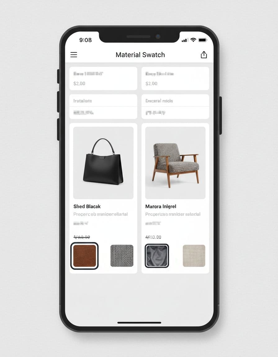
| Material or finish | Image swatch or texture chip | A visible texture cue plus the material name | Using flat color to represent a surface |
This split keeps the card honest. Color swatches work because shoppers can judge them at a glance, while size chips work because the choice is textual. Material and finish sit between the two, so they usually need both a visual cue and a label.
Tooltips can help on desktop when space is tight, but they should not carry the whole experience. On touch devices, labels need to be visible or exposed in a way that does not slow the tap. If you want a deeper look at mobile-friendly controls, mobile variant picker UX covers size and color pickers in more detail.
Design for Mobile and Accessibility
Swatches also need to survive narrow screens and assistive tech. On mobile, small circles fail fast because they are hard to tap and hard to read. Give each option enough touch space, keep contrast strong, and preserve a visible focus state for keyboard users. If the card only works when the user has perfect eyesight and a mouse, it is too fragile.
The layout should stay simple as the screen gets smaller. Keep the visible swatch count manageable, then wrap or reveal the rest in a clear overflow pattern. A long row of tiny options turns comparison into clutter, which slows the shopper down instead of helping them move faster.
Also give every swatch an accessible name, such as the color, size, or finish. That way, the control still makes sense when it is announced out loud. Good product swatch UX should reduce doubt, not add another layer of guessing.
Conclusion
Strong swatch design helps shoppers compare without leaving the grid. It makes the right variant easier to spot, shows availability clearly, and gives each tap a visible result.
When swatches do that well, the card feels useful instead of decorative. The best product cards answer three questions fast, what changed, what is available, and what happens if I tap it.