
A return request doesn’t always mean the sale is lost. In many cases, the shopper still wants the product, only in a different size, color, or condition.
That is why exchange offer UX matters. When a returns portal makes the fix clear and low-effort, more shoppers choose an exchange over a refund. The result is better retained revenue, fewer support tickets, and a post-purchase experience that feels fair instead of frustrating.
Why the returns portal often decides the outcome
Most shoppers do not enter a returns flow hoping for store policy trivia. They want a fast answer to a simple problem: “How do I get the right item without a hassle?”
If the first screen leads with “refund” and buries exchange options, the portal teaches shoppers that cash back is the safest route. That choice architecture matters. People tend to pick the most visible, easiest path, especially when a purchase has already disappointed them.
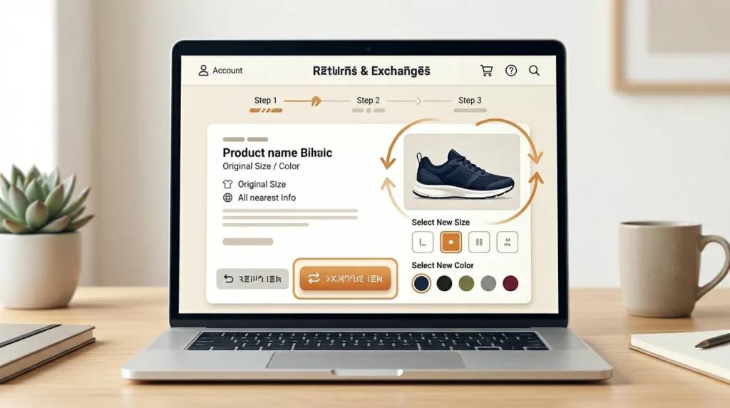
A better exchange-first experience does not hide refunds. It puts the likely fix first. For apparel, that usually means same-item size swaps. For damaged items, it may mean a replacement. For style mismatch, it can mean alternate products or store credit.
Clear information raises trust at the same time. Shoppers are more willing to keep value with your brand when they can see item eligibility, stock status, timing, and any price difference upfront. Good returns portal UX lowers the “What happens next?” anxiety that drives support contacts.
This also starts before the portal opens. If product pages, checkout, and policy pages frame exchanges as easy and refunds as one option among several, shoppers arrive with better expectations. That continuity matters because the portal is not an isolated tool. It is one part of the full post-purchase system.
UX patterns that lift exchange conversion without hurting trust
Good exchange offer design removes work. It does not pressure people or make refunds hard to find.
The strongest portals guide shoppers based on intent. A size-related reason should lead to a same-item swap. A color issue should show available variants first. A damaged-item reason should offer a replacement before anything else. That keeps the next step relevant.
This quick comparison shows how the best patterns map to real shopper needs.
| Shopper situation | Better portal response | Revenue effect |
|---|---|---|
| Wrong size | Show same-item size swap first, with available sizes and delivery timing | Keeps the sale and solves the original problem |
| Preferred variant is out of stock | Offer similar options, back-in-stock alerts, or store credit | Avoids a dead end that turns into a refund |
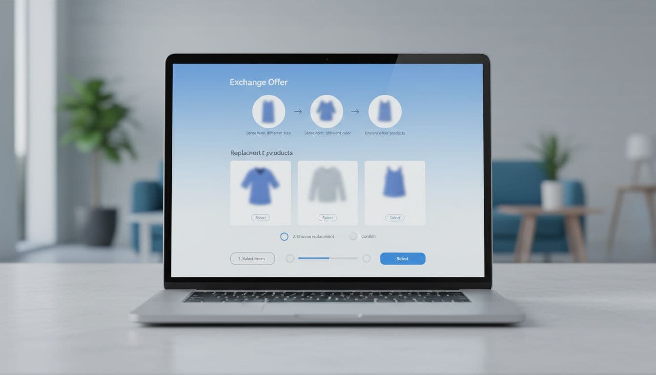
| Shopper wants a different product | Let them browse approved replacements and pay only the difference | Retains value and can lift average order value |
The copy matters too. “Find my size” is stronger than a vague “Continue.” “Exchange now, ships when your return is scanned” is better than a generic promise. Clear labels reduce hesitation.
Inventory visibility is another major lever. If shoppers learn halfway through that the replacement is unavailable, trust drops fast. Show stock status inline. Reserve exchange inventory for a short window when possible. Also show what happens if the replacement costs more or less. Surprises create abandonment.
Some brands add small incentives, and that can work when margin supports it. Practical examples of exchange-first returns show how bonus credit, in-portal shopping, and contextual offers can shift outcomes without turning the flow into a promotion. Advice on store credit versus refunds points to the same idea: present credit and exchanges clearly, but keep refunds visible and honest.
One caution matters here. Do not dump shoppers into a full catalog too early. First, solve the original problem. Then, if needed, introduce alternates and upsell choices.
How to measure retained revenue and keep teams aligned
If your team only watches refund volume, you will miss the value of better return design. A strong returns portal changes behavior, so measurement has to go beyond simple refund counts.
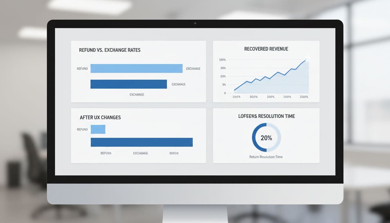
Track a small set of metrics that connect shopper behavior to business outcomes:
- Exchange rate by return reason, so you can see which flows convert and which fail.
- Retained revenue, including exchanges, store credit, and upsell value from replacement orders.
- Portal completion rate, because a confusing flow creates drop-off before any resolution happens.
- Support contacts per return, which often fall when timing and eligibility are clear.
- Time to resolution, because speed affects both satisfaction and repeat purchase intent.
Segment those numbers by category, margin band, and customer type. Apparel fit issues behave differently from damaged electronics. First-time buyers also react differently from loyal repeat shoppers.
The handoff into the portal matters as well. A clear order tracking page UX can route customers to the right action, with enough context that they do not arrive confused or angry. Meanwhile, policy language across the site should match the portal exactly. Mixed messages break trust faster than almost any bad interface pattern.
Teams also need shared rules. Merchandising should define valid substitutes. Operations should set exchange timing and stock reservation logic. Finance needs price-difference and credit rules. CX should review every message for clarity and tone. Brands that improve exchange performance usually treat the portal like a product, not a back-office form. For practical benchmarks, it helps to review guidance on increasing ecommerce exchange rate and compare it against your own return reasons and margin profile.
Conclusion
Refunds feel final because many portals present them as the default answer. A better exchange offer UX changes that moment by making the best fix easier to choose.
When shoppers can see the right replacement, trust the terms, and finish the request with little effort, more revenue stays with the brand. That is why post-purchase design is not only a CX project, it is a revenue decision.