
B2B VAT Number Field UX That Reduces Cross-Border Checkout Friction
A VAT (Value Added Tax) field can look small, but it changes the tax logic behind the order in B2B...
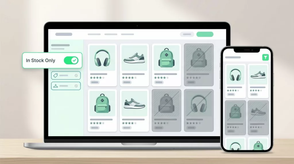
In-Stock Filter UX That Cuts Dead-End Product Browsing
Shoppers do not mind narrowing their options through sorting and filtering in filter UX. They mind wasting time on products...

Post-Purchase Account Creation UX That Protects Conversion
The easiest way to lose a checkout is to ask for a new commitment before the order is done. Buyers...

Pickup Point Selector UX That Cuts Delivery Friction
Pickup point selection looks simple until shoppers have to use it. Then the clock starts, because every extra search, vague...

Product Q&A UX That Reduces Pre-Purchase Doubt
Product Q&A UX That Reduces Pre-Purchase Doubt Shoppers rarely leave a product page because they hate the item. They leave...

Phone Number Field UX for Ecommerce Checkout in 2026
The phone number field can make checkout feel smooth or stubborn in one screen. On mobile, that choice often shows...
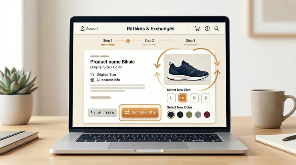
Exchange Offer UX That Recovers Revenue in Returns Portals
A return request doesn’t always mean the sale is lost. In many cases, the shopper still wants the product, only...
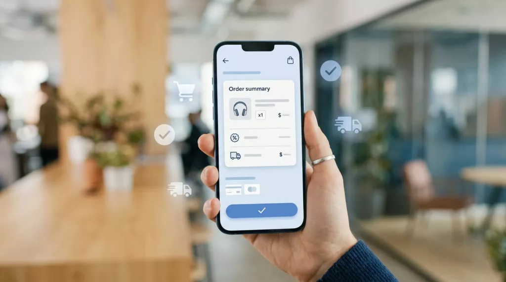
Mobile Checkout UX: Order Summaries That Stop Late Drop-Off
Most late-stage mobile drop-off starts with doubt, not lack of intent. A shopper reaches payment, then pauses because shipping changed,...
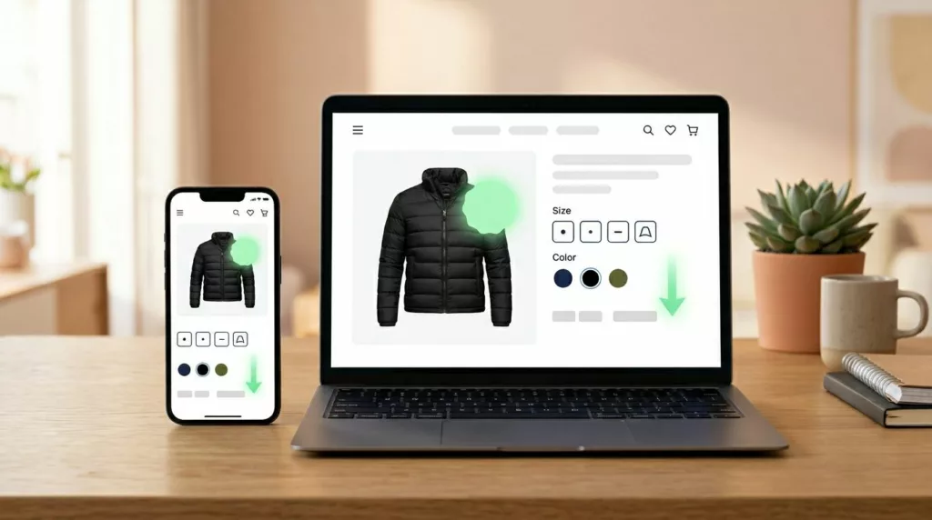
Price Drop Alert UX That Brings Shoppers Back to Buy
A price cut can pull a shopper back faster than most campaigns. Still, the alert only works when it feels...

Contact Page UX That Gets Shoppers to the Right Help Fast
A contact page can save a sale or stall one. When every shopper lands on the same generic form, pre-purchase...