

Product Q&A UX That Reduces Pre-Purchase Doubt
Shoppers rarely leave a product page because they hate the item. They leave because one small uncertainty keeps growing.
A strong product Q&A UX gives that doubt a place to land. It answers the question behind the question, the one that says, “Will this work for me?” or “Will I regret this later?”
That matters on pages where the price, size, fit, material, shipping, or setup details can change the buying decision. The best pages make those answers easy to find, easy to trust, and easy to scan.
Put the most useful questions near the decision point
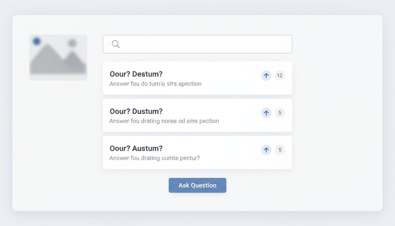
Product Q&A works best when it sits close to the buy box, not buried at the bottom like a spare part. Shoppers should see it while they are still comparing, not after they have already decided.
That means placing short, high-value answers near price, variants, shipping, and returns. For many stores, a compact Q&A block under the primary CTA works well. For high-risk categories like apparel or electronics, one or two answers can sit even closer to the button.
A deeper guide on product page FAQ UX helps when you need to balance FAQ content with the purchase area. The goal is simple, keep the page useful without turning it into a wall of text.
If the answer feels hard to find, the doubt gets louder.
Use the Q&A area to support a decision, not to replace the main product copy. The title, images, price, and variant selector still do the heavy lifting. Q&A adds the final layer of confidence.
Make answers easy to scan and easy to ask
A good Q&A area works like a well-run counter in a store. People can spot what they need fast, ask a question without friction, and move on with confidence.
Search and filters help when a page has more than a few answers. “Shipping”, “fit”, “care”, and “compatibility” tags save time. Helpful vote counts can also pull the best answers to the top.
The answer itself should open with the direct response. Then add one short line of context if needed. A strong answer usually has:
- one plain opening sentence that answers the question first
- a specific detail, such as sizing, timing, or compatibility
- a clear next step when the shopper still needs help
- no filler, no copy-paste language, and no sales fluff
The ask-a-question form should stay short. Name, email, and the question are often enough. Long forms create drop-off before the question even gets sent.
On mobile, tap targets need extra room. Accordions should open cleanly, and the text should stay readable without zooming. If users have to fight the UI, they stop trusting the answers.
Moderate hard so the answers stay credible
Product Q&A can build trust fast, but only if the content stays clean. One wrong or outdated answer can do more damage than no answer at all.
That is why moderation needs a real owner. Someone should review submissions, merge duplicates, and remove stale replies when products change. Size charts get updated. Materials change. Shipping rules change. The Q&A area has to keep pace.

Verified answers matter here. So do labels for customer replies, brand replies, and expert replies. When people know who wrote the answer, they judge it better.
Moderation also means cutting low-value content. Watch for repeated questions, vague answers, and brand-heavy replies that never address the shopper’s concern. If a reply reads like marketing copy, it weakens trust.
Use this rule: if an answer would not help a cautious shopper, don’t publish it. Product pages should reduce friction, not collect noise.
Measure whether Q&A is lowering friction
A product Q&A UX should change behavior, not just fill space. The clearest wins show up in add-to-cart rate, checkout start rate, and fewer support contacts about the same issue.
Track which questions get views, which answers get clicks, and which ones lead to more product page engagement. If shoppers spend time on a shipping or sizing answer, that is useful. If they bounce after opening the section, the content may be too vague or too long.
Structured data can help search engines understand the page, but it should match the visible content. Use Product and FAQ markup only when the page shows real question-and-answer content. Schema does not fix weak copy. It supports strong copy.
If you want to prove the lift, compare the page before and after the change using a clean test plan. The UX design impact on conversion rates article is a useful starting point for that kind of measurement.

Watch for returns too. If people buy less often after reading answers, the Q&A may be correcting a mismatch. That is a good outcome for the business, even if it lowers a vanity metric.
Product Q&A that builds buying confidence
The best product pages answer the hidden questions before shoppers need to ask them twice. They place answers near the decision, keep them easy to scan, and protect them with moderation.
When product Q&A UX is clear and honest, it does more than reduce support tickets. It helps hesitant shoppers trust the page enough to buy.