
A contact page can save a sale or stall one. When every shopper lands on the same generic form, pre-purchase questions, return requests, and order issues all get dumped into one slow queue.
Good contact page UX works like a smart store greeter. It sends each person to the fastest next step, so buying intent stays alive instead of getting buried under support friction.
Start with shopper intent, not a generic inbox
Your contact page is a routing layer, not a mailbox. Start with the jobs people are trying to do, then build routes around those jobs.
Look at support tags, chat logs, site search, and return reasons. Those patterns tell you what should appear first. A shopper asking about fit needs quick reassurance. Someone chasing a package wants instant status. They should never take the same path.
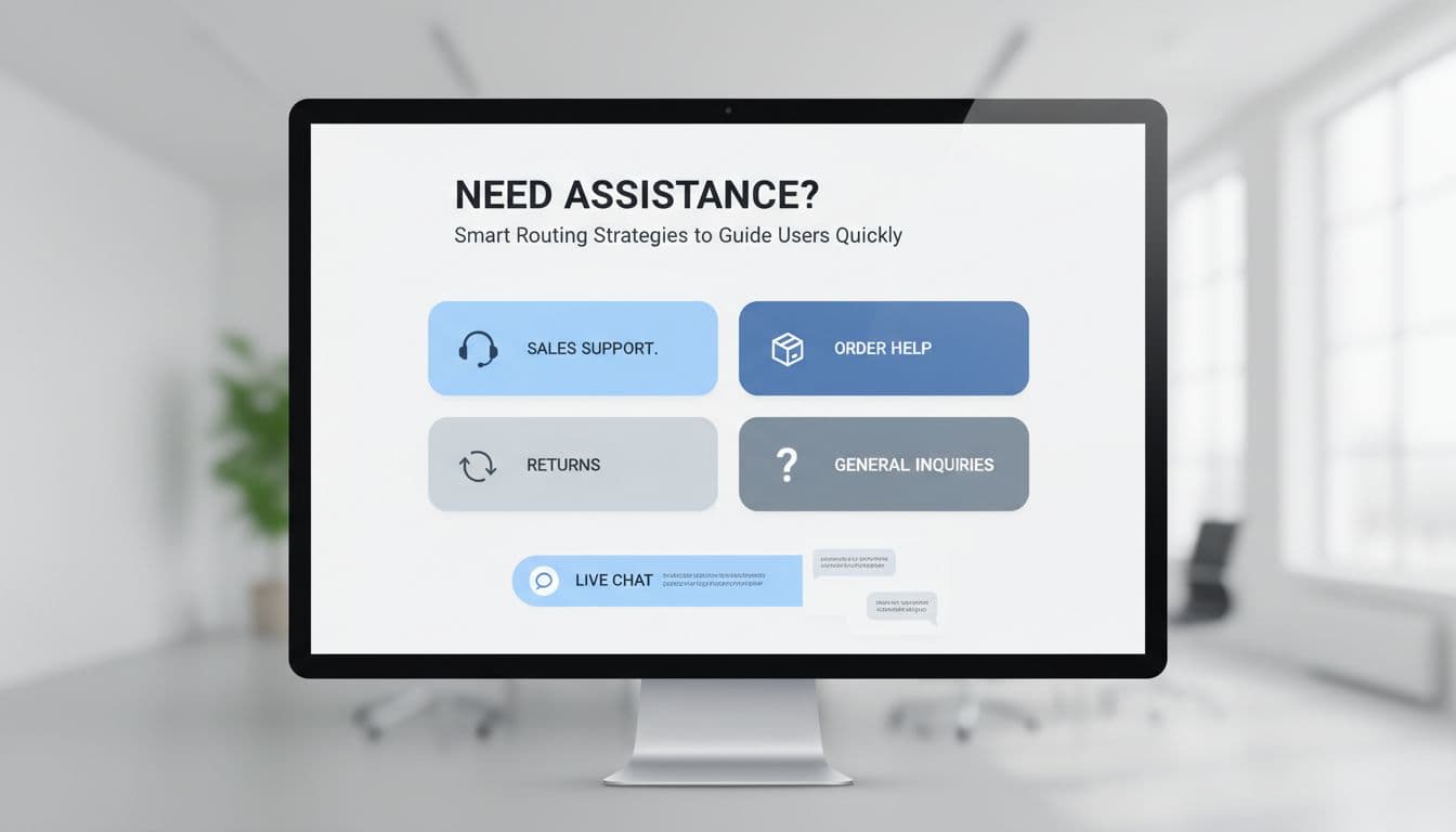
Most stores do well with four to six primary routes shown as cards or large buttons above any form. If you want inspiration, Shopify’s contact us page examples show how strong brands make help options easy to scan.
A simple route map keeps the page useful:
| Shopper need | Best route | Why it works |
|---|---|---|
| Product question before buying | Sales chat or product advice form | Removes doubt while intent is high |
| Order status | Self-service tracking page | Gives an instant answer and cuts tickets |
| Return or exchange | Returns portal | Sets expectations and reduces back-and-forth |
| Damaged or missing item | Support form with order number | Gives the team context right away |
| General inquiry | Basic contact form | Keeps low-priority messages out of faster channels |
The pattern is clear. High-intent or urgent tasks need the shortest path. Low-priority questions can wait in the form queue.
This also helps conversion. If pre-sale shoppers reach sales help faster, fewer of them leave to “check later” and forget. Meanwhile, self-service routes free your team to answer the messages that need a person.
Design each route so the next step feels obvious
Clear routing still fails when labels are vague. “Submit a request” makes people think. “Track my order” or “Ask before buying” does the work for them.
Each route should answer three things right away: what it is for, what happens next, and how long it may take. A small line like “Replies within one business day” builds trust because it sets a real expectation.
If shoppers have to stop and decode your options, the routing is already too slow.
Forms should also change based on intent. If someone selects “order issue,” ask for the order number and let them upload a photo. If they choose “product question,” keep it light. Name, email, product link, message is often enough.
Short, context-based forms usually beat one long catch-all form. Both Mailchimp’s contact form design tips and Orbit’s contact form UX best practices support the same idea: ask only for the details that help solve the request.
Live chat deserves the same discipline. Put it where it can help a shopper decide, not where it fights for attention. A pre-purchase route like “Need help choosing?” can send high-intent users into a faster conversation. On the other hand, a loud chat popup on every visit can hurt the page. These live chat widget UX best practices are a good match for contact pages that need chat without the clutter.
Also, put self-service links next to each route. Under returns, show the policy and portal. Under order help, show tracking. Every answer you surface on the page is one less message in the queue.
Make mobile contact page UX fast, then measure the right outcomes
Mobile is where weak contact page UX breaks first. Tiny links, long forms, and stacked widgets turn a simple task into thumb gymnastics.
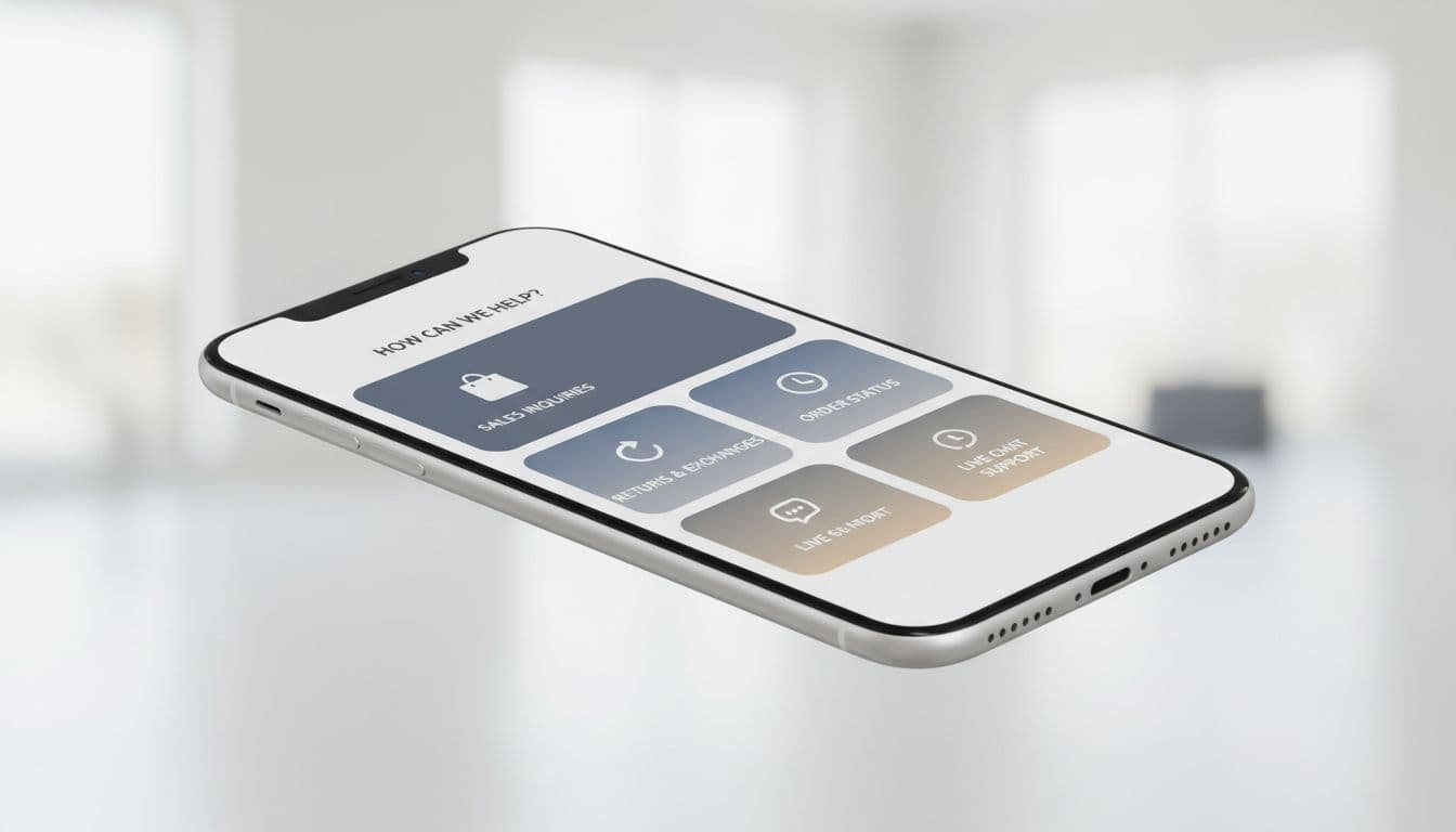
Use a one-column layout with full-width route cards. Keep tap targets large, labels short, and the top tasks near the top of the page. If order tracking is your most-used route, it shouldn’t sit below a bulky general form.
Phone and chat options should stay easy to tap, but they must not cover the screen. Likewise, maps, long FAQ blocks, and heavy widgets often add more weight than value. On mobile, calm pages win.
Reduce typing wherever you can. Pull known details from the account area. Use autofill for name and email. If a shopper must fill a longer form, the same rules from checkout address form UX patterns apply here too: use the right keyboard, clear labels, and friendly validation.
Track routing speed, not only form submissions
Submission count tells only part of the story. A better contact page routes people faster, lowers wrong turns, and protects revenue.
Watch metrics like route selection rate, self-service usage, transfer rate between queues, time to first response, and conversion after contact for pre-sale questions. If many shoppers still choose “general inquiry,” your labels are too broad. If return contacts stay high after adding a portal, that portal is hard to find or hard to trust.
Those gains reach beyond support. Better routing reduces friction, and less friction often means more completed orders. That’s the larger UX impact on conversion rates.
The best contact page doesn’t ask everyone to write a message. It guides each shopper to the shortest useful path.
Treat it like a router, not a mailbox, and contact page UX starts doing real commercial work. Shoppers get answers faster, support teams waste less time, and more sales survive the moment of doubt.