
A price cut can pull a shopper back faster than most campaigns. Still, the alert only works when it feels relevant, honest, and easy to act on.
Many teams stop at the send. Then the shopper clicks, lands on the wrong page, loses their saved variant, or faces new friction at checkout. Strong price drop alert UX closes that gap and turns return visits into orders.
Why price drop alerts work best with high-intent shoppers
A shopper who asks for a price alert has already done part of the buying work. They found the item, checked the price, and decided it was close enough to watch. That makes this flow less about awareness and more about timing.
Because of that, relevance matters more than reach. The alert should match the exact item, selected variant, and chosen channel. If someone saved a black size M jacket, a generic alert about the product line feels sloppy.
Price thresholds matter, too. A $2 drop may help on beauty refills, but it won’t move most furniture buyers. Give teams a simple rule based on category and margin. For some products, “notify me for any drop” is fine. For others, a 10% threshold earns more trust and fewer low-value clicks.
Wishlists often improve this context because they store intent over time. Teams that connect alerts to saved items usually get a cleaner return visit, especially when paired with wishlist-triggered price drop and restock alerts.
The alert should feel like a service tied to shopper intent, not a promo blast with better timing.
Place the signup where purchase intent is already strong
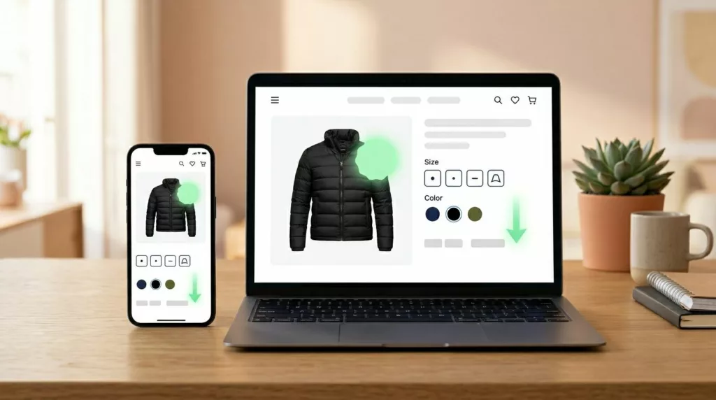
The best signup point is usually on the product page, near the price and buy area. That is where shoppers decide whether to act now or wait. A footer form or site-wide pop-up misses that moment.
A strong opt-in keeps the first step light. Ask for one field, usually email, unless SMS fits the audience and product value. Logged-in shoppers should not retype anything. Pre-fill when possible, and save the selected size, color, or bundle before the user submits.
A few patterns usually work well:
- Keep the CTA in the same visual area as price and add to cart.
- Show the saved variant in the alert state, so the shopper knows what is tracked.
- Explain whether the shopper will get one alert or a short series.
- Separate price alert consent from broader marketing consent.
Copy should stay plain. “Get an alert if this price drops” works better than vague language. On mobile, a compact bottom sheet often beats a modal because it keeps product context visible.
This is also where teams can borrow from effective back-in-stock flows that recover sales. The same lesson applies here, variant accuracy is not a nice extra. It is the difference between a useful reminder and a broken promise.
Write alert messages that help the shopper decide fast
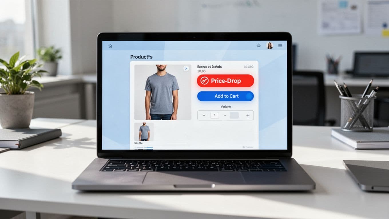
Good alert messages answer the next buying question right away. What changed, which item changed, and what should the shopper do now?
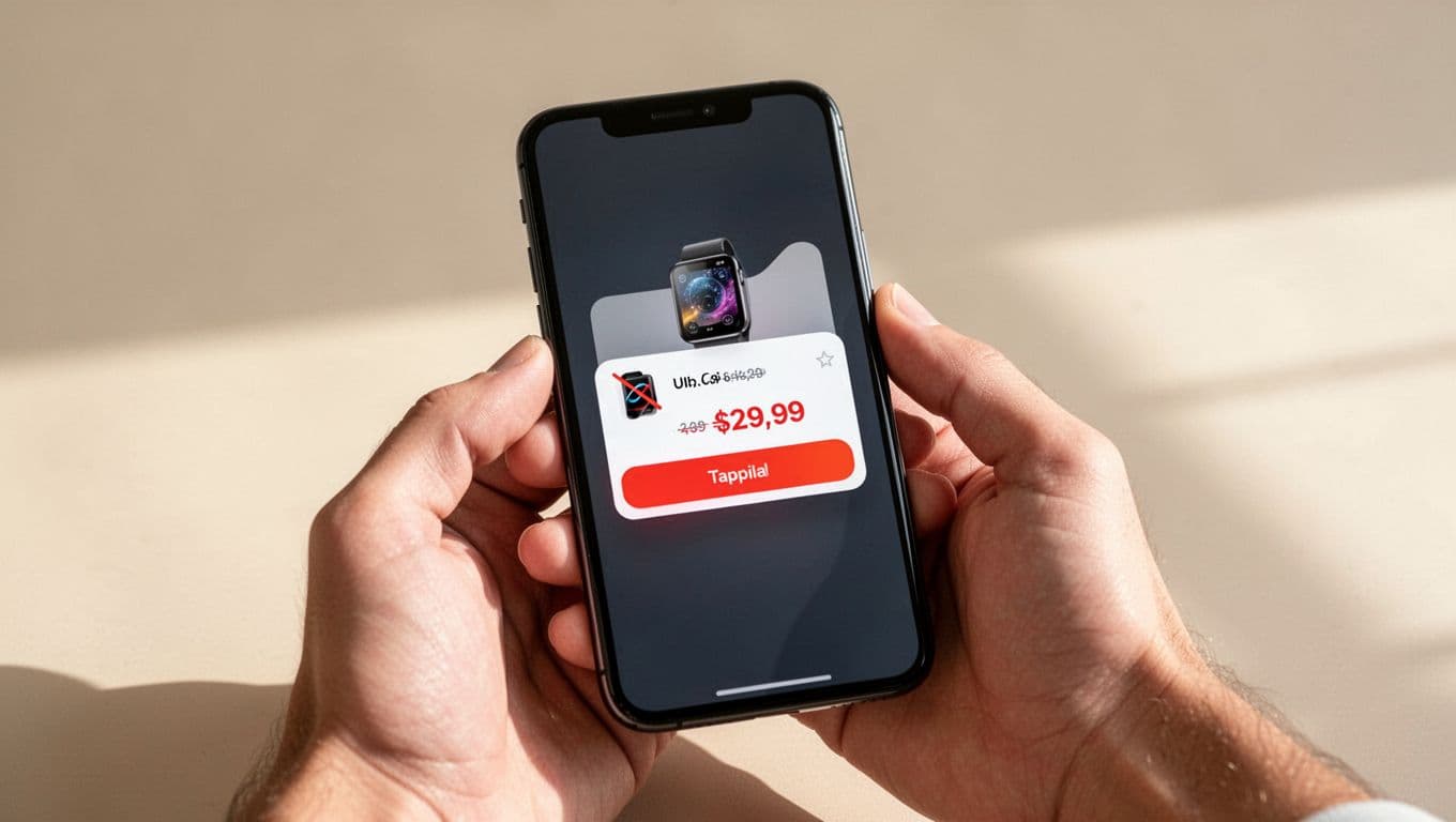
A useful message includes the product name, saved variant, new price, old price, and one direct CTA. If stock is low, say so only when it is true. False urgency may lift one click, but it hurts trust later.
Here is a simple channel view for teams planning message logic:
| Channel | Best use | Main risk |
|---|---|---|
| Rich detail, images, secondary info like shipping or returns | Slow response if the offer is short-lived | |
| SMS | Fast action for higher-intent subscribers | Feels intrusive if drops happen often |
| Push | Immediate re-entry for app users | Easy to ignore if copy is generic |
The pattern is simple. Email can carry more context. SMS and push need tighter copy and stronger timing. Across all three, the landing page has to match the promise in the alert.
Message examples help teams stay grounded. “Price dropped on your saved size. Was $120, now $99.” is clear. “Big savings waiting for you” is weak because it hides the actual value.
Also, cap frequency across channels. A shopper should not get email, SMS, and push within the same hour for the same drop. That feels like pressure, not help.
Reduce friction from the click to checkout
The alert wins attention. The destination wins the order.
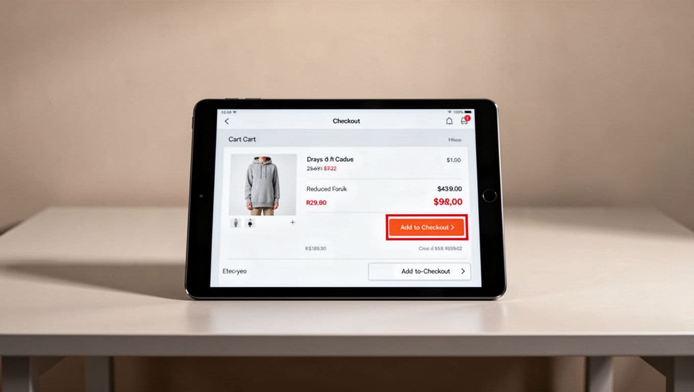
Send shoppers to the exact product or cart state tied to the alert. Preselect the saved variant. Show the updated price immediately. If the item qualifies for free shipping or a delivery estimate, surface that near the CTA so the shopper does not need to hunt for it.
This is where trust can break. If the alert says $99 and the page shows hidden fees later, the return visit feels wasted. Teams should pair alert flows with transparent cart price breakdowns and honest delivery messaging.
Keep checkout momentum high, especially on mobile. Wallets, autofill, and a clear guest path reduce the work after the click. If account creation blocks the purchase, the alert has done its job only to hand the shopper a new obstacle. A cleaner path often starts with guest checkout UX to lower abandonment.
A simple post-click flow works well: alert click, exact item page, one-tap add to cart, preserved price, fast checkout. If the item sold out or the price changed again, say that at once and offer the next best action. Silence creates doubt.
Price drops bring people back because they feel like progress. The UX has to keep that feeling alive all the way to payment.
A good price drop alert UX does three things well. It captures intent with little friction, sends a message that respects context, and removes work after the click.
When the saved item, the updated price, and the next step all line up, shoppers do not feel marketed to. They feel helped, and that is why they buy.