

Most late-stage mobile drop-off starts with doubt, not lack of intent. A shopper reaches payment, then pauses because shipping changed, tax appeared late, or the cart can’t be edited without losing progress.
Most teams focus on forms first. Yet the review layer often decides whether the order feels safe enough to place. One recent set of 2026 cart abandonment data still puts mobile well behind desktop. Strong mobile checkout UX closes that gap by making the order summary clear, stable, and easy to act on.
Why the order summary decides the final tap
On desktop, people can scan fields and totals side by side. On mobile, they see one slice at a time. That makes the order summary the last place they verify price, quantity, discount, delivery timing, and overall confidence.
Practitioners sometimes treat the order summary as a passive recap. On mobile, it also orients the user. It answers three fast questions: what am I buying, what will I pay today, and can I still change it? If any answer is hard to find, friction rises fast.
Late abandonment often starts when the summary hides behind a small link, opens as a full-screen detour, or updates without explanation. A wrong variant or missing coupon then feels expensive to fix. This is why fixed totals and visible item counts often outperform hidden summaries that depend on memory.
Good mobile checkout UX keeps the summary close without letting it crowd the form. A collapsed bar with item count and total works well at the top. A sticky CTA paired with the current total works well near the bottom. Recent checkout flow UX guidance points to the same pattern on small screens: single-column flows, visible totals, and a tappable summary instead of a separate page.
If express payment is available, the summary still needs to stay visible. Speed only helps when the price feels believable.
What strong mobile summaries get right
The best summaries are easy to scan in two seconds. Shoppers should spot the essentials without expanding three panels or scrolling past policy text.
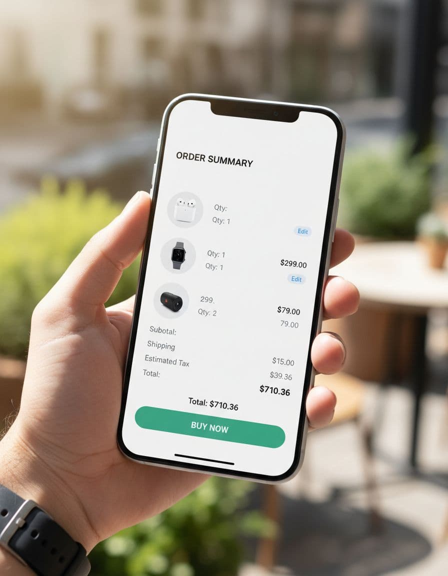
A strong summary keeps the right details in plain view:
- item thumbnail, name, variant, and quantity
- unit or line price
- subtotal, shipping, tax, discount, and final total
- inline edit and remove controls
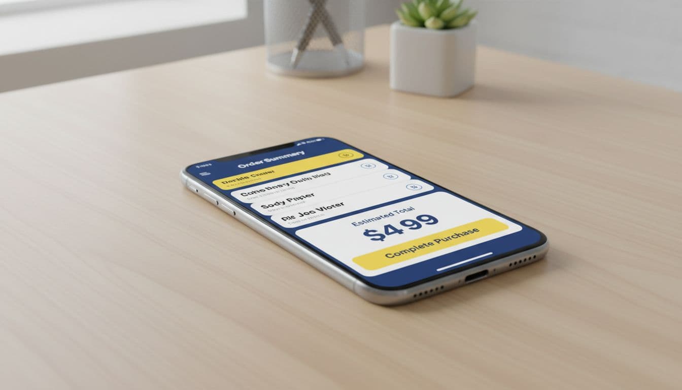
- a sticky primary CTA that stays in the thumb zone
Keep detail on demand. Long product names can collapse, but variant, quantity, and line price should stay visible. If the summary expands, let it close without jumping the page. If the CTA sticks, pair it with the live total so the action and cost stay together. If you use wallets or express pay, place them below the visible total, not above a hidden summary.
Editable line items matter more than teams expect. If a shopper has to leave checkout to change size or quantity, the path back feels risky. Let them edit inside the summary or in a small inline sheet, then recalculate in place. Good examples look modest. A shopper sees two items, taps edit next to quantity, watches the subtotal change, and keeps going.
Promo codes need the same restraint. Keep the field collapsed by default, place it near the summary, and show the savings next to the total the moment it applies. Good promo field placement near summaries avoids turning checkout into a coupon hunt.
Price disclosure also needs plain language. If shipping is estimated, say that. If tax appears later because the address is incomplete, say that too. Recent mobile checkout best practices keep pushing the same idea: show the full order summary before the final payment step, not after.
Keep the total visible, editable, and explained at every step.
Bad order summary patterns that trigger last-minute exits
Poor mobile summaries usually fail in small, fixable ways. Text gets cramped. Totals jump after the user enters an address. The promo field dominates the screen. The only edit link sends people back to cart, then drops form data on return.
A bad experience also hides trade-offs. For example, “Shipping calculated later” with no context often reads as “more fees are coming.” So does a blank tax row. Consider a common flow: the shopper picks economy shipping, sees one total, enters an address, and then watches sales tax and shipping jump with no note about location or method. If the summary doesn’t explain the change, the new amount feels like a mistake, even when it is correct.
Another failure pattern is keyboard collision. The shopper taps the promo field, the keyboard covers the total, and the apply button pushes the CTA off-screen. On a small device, that turns one optional task into a hard-to-recover detour.
Teams also cause exits with silent validation. A required field fails, but the only sign is a red outline above the fold. Meanwhile, the order summary still shows the old total. People assume payment failed or inventory changed, then they leave.
Accessibility, trust, and error prevention on small screens
Mobile checkout doesn’t happen in ideal conditions. People are one-handed, distracted, on glare-heavy screens, or using assistive tech. So the summary must support readable text, strong contrast, clear labels, and tap targets that don’t invite mistakes.
Accessibility also improves conversion. When quantity buttons are large enough, line items are labeled, and total updates are announced properly, fewer shoppers make accidental changes. For screen-reader users, badge icons and collapsed panels need usable labels. “Summary expanded” helps. An unlabeled chevron does not.
When the total changes, announce it clearly. Sighted users need the changed row close to the CTA. Error messages should appear next to the field or line item that caused the problem, not only at the top of the page. If a promo code fails, keep the value in place and explain why. If stock changes, flag that row and offer a direct fix.
Trust cues help here, but only if they are brief. A delivery estimate, returns link, secure payment note, or payment method reassurance near the summary lowers anxiety. A wall of badges does the opposite. Well-placed trust signals in order summaries work because they support the decision instead of distracting from it. The same applies to shipping and tax disclosure. If rates update live, preventing surprise cost abandonment depends on clear loading states and honest totals.
Conclusion
Late abandonment on mobile often starts at the order summary, because that is where price clarity and purchase confidence meet. The patterns that help are simple: keep the total visible, let shoppers edit in place, disclose shipping and tax early, and explain every change.
Teams don’t need a dramatic rebuild to improve mobile checkout UX. They need an order summary that is easy to scan, easy to trust, and easy to correct before the final tap.