
Shoppers do not mind narrowing their options through sorting and filtering in filter UX. They mind wasting time on products they cannot buy.
That frustration shows up fast on category pages, search results, and facet-heavy collections. A strong in-stock filter UX enhances ecommerce filters by prioritizing stock visibility, a core component of effective filter UX, so people can keep browsing with confidence instead of hitting a wall.
Key Takeaways
- Prioritize in-stock filters to cut dead-end browsing: shoppers trust results more when availability is clear upfront, avoiding frustration from sold-out items hidden in grids.
- Design for trust with clear labels, counts, and states: use ‘In stock’ near key facets like price and size, with live updates, active chips, and easy resets to keep the page feeling reliable.
- Handle mobile with visible drawer states: show applied stock filters above results via chips, place near the top, and ensure reversible taps to maintain quick scanning without cognitive load.
- Prevent empty results proactively: disable risky options, suggest fixes like ‘Remove Size M for 24 results,’ and offer recovery paths to sustain discoverability.
- Measure impact on behavior: track stock filter usage, empty-result rates, and post-filter adds-to-cart to confirm reduced hesitation and higher engagement.
Why dead-end browsing happens so often
Dead-end browsing usually starts with a simple problem; the catalog hides availability until too late. A shopper lands on a category page, selects from filter categories like size or color, and the grid suddenly feels empty. The page may still show products, but many of them are unavailable.
That creates a filter UX trust problem. If the interface keeps exposing sold-out items without a clear stock signal, shoppers start to doubt the whole result set. They may assume the store is poorly maintained, even when inventory is accurate.
This issue gets worse in faceted search. A query can return dozens of products, yet the useful ones sit below unavailable variants. For a broader look at search and discovery on result pages, the search results page UX for conversions article is a useful companion.

If a shopper cannot tell what’s available, the filter feels broken, even when the catalog is fine.
Baymard’s filtering options examples show how often stores miss essential controls, especially when filters do not map cleanly to user intent. Stock is one of those controls. It sounds small, but it changes how safe the page feels.
The real issue is not only inventory. It is the absence of a clear path forward when inventory gets tight.
Design the stock filter so it earns trust
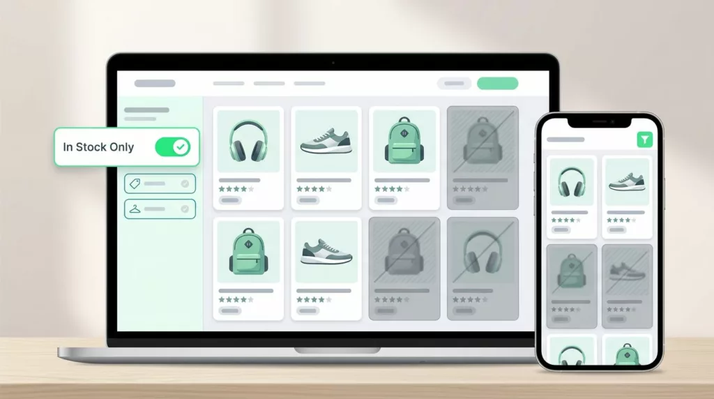
A good stock filter should feel like a relief, not another decision. The label needs to be plain, the state needs to be obvious, and the result count needs to update fast enough that shoppers trust what they see.
For most stores, “In stock” is the clearest label. If you also sell backorders or preorder items, the wording has to be even more precise. A vague label like “Availability” can hide too much. Shoppers should know whether they are filtering to products they can buy now or products that can ship later.
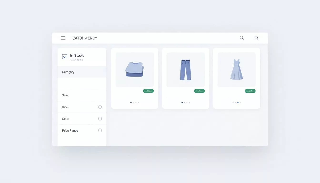
Placement matters too. Stock belongs near the filters shoppers already use most, such as price, size, color, and brand. On many category pages, that means it should sit inside sidebar filters or a horizontal filter bar with common elements like checkbox filters and price range sliders, instead of being buried in a secondary panel. The more it feels like a normal part of the grid, the less friction it creates.
The best stock filters also tell the truth about the size of the set. Result counts help. So do active chips. So does a visible state after the filter is applied, showing clear filter values. When shoppers can see that “In stock” is on, they do not have to guess why the page changed.
A practical setup usually includes:
- A clear stock label that matches the inventory rules on the site.
- A visible count that updates when the filter is selected.
- A reset path that is easy to spot and easy to tap.
- Consistent placement near other high-use facets.
- Honest empty states when no items remain in the set.
For a deeper look at how stock fits into broader ecommerce filters, the faceted navigation for better discovery guide covers how to organize categories so people can narrow with less effort.
The main idea is simple. Stock should reduce doubt, not add it. If the filter creates more questions than answers, the design needs work.
Mobile filter drawers need visible state
Mobile browsing puts even more pressure on stock filters. Screen space is tight, attention is split, and a shopper can lose context in one scroll.
That is why mobile filter drawers need strong state clarity to reduce cognitive load. The drawer should show applied filters like selected stock status before the user closes it. When the page reloads, the active filter should appear as applied filters above the results grid. If the user has to reopen the drawer to check what changed, the interface has already added friction.
The mobile filter drawer UX best practices article goes deeper on state, chips, and reversible selections. Those details matter because mobile shoppers move quickly. They often make one selection, scan results, and decide whether to refine again. A hidden stock state slows that loop down, hurting overall filter UX.
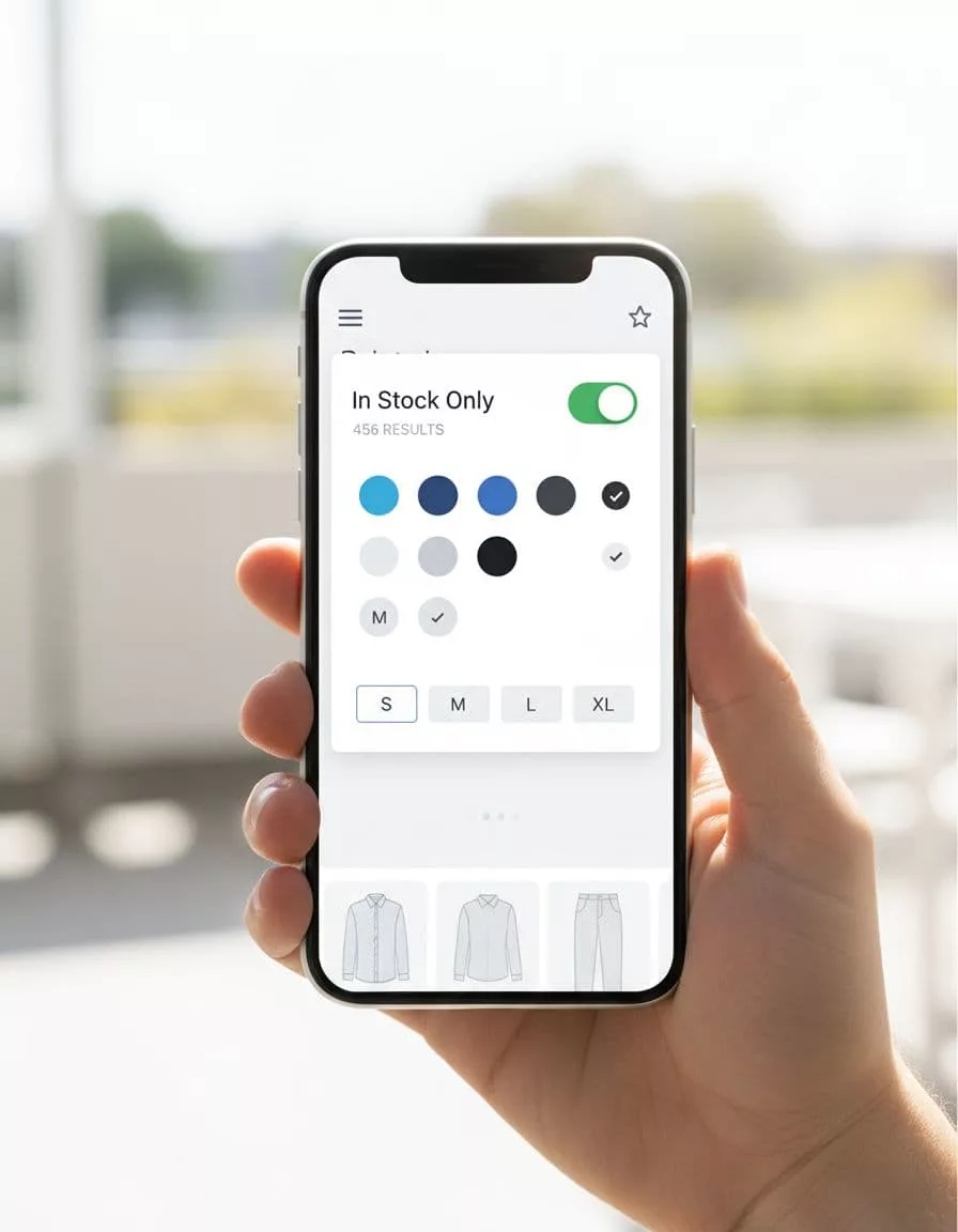
Keep the control simple on small screens, unlike dropdown menus that can overwhelm users. A checkbox or toggle works well when the user is choosing between all items and available items. If the drawer includes a long list of facets, place stock near the top so it does not disappear below the fold.
Result counts matter even more on mobile. A shopper should see the effect of the filter without hunting for it. If the count drops from 456 to 83, the change feels real. If the count stays hidden, the page feels less trustworthy.
One more detail helps a lot. Make filter choices reversible with one tap. Active filter chips above the grid save time and reduce mistakes. They also make the page feel less trapped, which is exactly what good mobile filtering should do.
Stop empty-result states before they appear
Empty results are where good intentions go to die. A shopper can start with a valid interest, apply multi-select filters, and end up with nothing. Once that happens, the page is no longer helping them browse; it harms product discoverability.
The fix starts with smarter filter logic. When a size, color, or brand choice would wipe out the result set, the interface should show that risk before the shopper commits to prevent zero results. Disabled options with counts work well. So does a message that tells users what to remove to recover results.
For example, “Remove Size M to see 24 results” is clearer than a blank screen. It gives the shopper a next step instead of a dead end.
This logic matters in search too. The fixing zero-result search issues guide explains why zero-result paths need recovery options, not just apologies. The same idea applies to filters. Whether the dead end starts with a query or a facet, the response should keep the session alive and maintain discoverability.
If you use WooCommerce, the Product Filter – Stock docs show how stock status can be exposed as a live filter. That matters because live updates make availability feel current, which is exactly what shoppers want when they are ready to buy.
A strong empty-state recovery plan usually does three things:
- It explains why the result set disappeared.
- It suggests the smallest useful fix.
- It keeps the user close to the products they wanted.
That last point is the one teams miss most often. When a stock filter removes the entire grid, the page should not just stop. It should offer the nearest useful path, such as loosening one facet, showing related available items, or returning to the parent category with the applied filters still visible.
Measure whether shoppers are moving, not circling
Good stock filtering should change behavior in a measurable way. If it works, shoppers browse with less hesitation and fewer exits after filtering.
Start by checking how often the stock filter gets used. Then compare that number with the rate of empty-result states. If stock usage is high but empty results stay common, the filter may be too late in the flow, or the surrounding facets may be too strict, particularly in enterprise filtering for large catalogs.
Next, look at the path after the filter is applied. Do shoppers add to cart more often? Do they keep browsing? Do they remove the stock filter and try sorting and filtering again? Those patterns tell you whether the control is helping or just acting as a gate.
It also helps to compare desktop and mobile behavior. A desktop grid can hide weaker state cues for a while. Mobile cannot. If mobile exits spike after filter use, the drawer may be too dense, the active state may be unclear, or the reset may be too hard to find.
Through user research, a few metrics are worth watching together:
- Filter open rate
- Stock filter select rate
- Empty-result rate after filtering
- Remove-filter rate
- Add-to-cart rate from filtered sessions
Taken alone, each metric tells a partial story. Together, they show whether your interactive filtering and ecommerce filters reduce friction or create it.
Frequently Asked Questions
What is the best label for an in-stock filter?
‘In stock’ works best for most stores as it plainly signals items available to buy now. Avoid vague terms like ‘Availability’ that could confuse backorders or preorders. Pair it with precise inventory rules so shoppers know exactly what they get.
Where should the stock filter be placed on category pages?
Place it near high-use facets like price, size, color, and brand in sidebars or horizontal bars. This makes it feel like a normal part of the grid, not a buried option. Consistent positioning builds familiarity and reduces friction.
How do you make mobile stock filters trustworthy?
Show applied states via chips above the results grid after drawer use, with live counts that update instantly. Keep controls simple like checkboxes at the top of drawers to avoid scrolling. Reversible taps prevent users from feeling trapped.
What causes empty results and how to fix them?
Tight inventory combined with multi-select filters often wipes out sets, killing momentum. Use smart logic to disable zero-result options and suggest minimal fixes like ‘Remove Size M to see 24 results.’ Always offer a clear recovery path to related items or categories.
How can you measure if in-stock filters are working?
Track stock filter select rates against empty-result rates and post-filter add-to-cart actions. High usage with low empties and more carts signals success; spikes in mobile exits may mean poor state visibility. Combine with filter open rates for the full picture.
Conclusion
Shoppers stay longer when the filter UX keeps them oriented and maintains momentum. That means stock has to be visible with collapsible filters, reversible via a clear all button, and honest at every step.
The best in-stock filter UX does one job well. It stops people from wandering into dead ends and gives them a clear way back when results run dry. If the page helps them feel in control, it boosts product discoverability; they are far more likely to keep browsing, and far less likely to leave in frustration.