A shopper can find the right product and still abandon the order minutes later. Another may reach checkout quickly but never discover the product that fits their needs.
Ecommerce usability testing helps teams see those failures as they happen. Instead of guessing from analytics, you watch people search, compare, add items, enter details, recover from errors, and explain their decisions. A useful plan separates product-discovery problems from checkout friction, then gives each issue a clear task, success measure, and owner.
Key Takeaways
- Test product discovery and checkout as separate journeys because shoppers face different problems in each.
- Write realistic tasks with clear success criteria before recruiting participants.
- Test desktop and mobile experiences, including keyboard use, screen readers, zoom, contrast, and error recovery.
- Combine task completion, time on task, error rate, path analysis, and participant confidence.
- Protect participants by avoiding real payment details, collecting informed consent, and controlling recordings and personal data.
Start With Two Separate Usability Testing Journeys
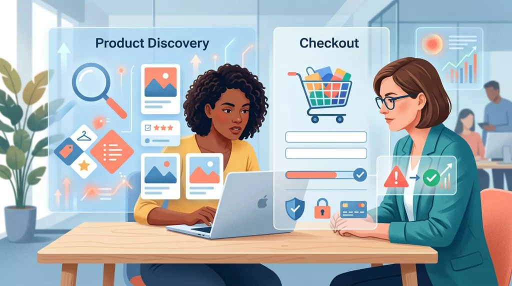
Product discovery answers one question: Can shoppers find and understand the right product? Checkout answers another: Can they complete the purchase with confidence and without avoidable effort?
A single session can include both journeys, but your research plan should keep their goals separate. Search relevance, filters, category labels, product information, and comparison tools affect discovery. Address validation, shipping costs, payment errors, account requirements, and trust cues affect checkout.
Separating the journeys prevents a common reporting problem. A team may see that a participant failed to order and label the result “checkout friction.” Yet the participant might have chosen the wrong variant because the product page hid important information. The failure started during discovery, not payment.
Set a research question for each journey:
- Discovery: Can new shoppers locate a suitable product using search, navigation, filters, or category pages?
- Product evaluation: Can shoppers confirm specifications, availability, delivery information, and compatibility?
- Checkout: Can shoppers complete an order as a guest or signed-in customer?
- Error recovery: Can shoppers understand and fix problems with address, shipping, promotion, or payment fields?
- B2B purchasing: Can business buyers handle approval rules, tax exemption, purchase orders, quotes, or invoice preferences?

A practical audit can support recruitment and test design. Use this ecommerce UX audit checklist to identify weak points before writing participant tasks.
Your plan should also state what the test won’t measure. Moderated usability sessions can reveal confusion and intent, but they don’t predict a precise conversion-rate increase. Analytics can show where many users exit, while usability testing helps explain why.
Define Research Goals, Tasks, and Success Criteria
Good usability tasks sound like shopping requests, not instructions about interface controls. Tell participants what they need to accomplish, but don’t tell them where to click.
A weak task says:
Use the search bar to find the blue waterproof jacket, open the second result, and add size medium to your cart.
This task tests whether someone can follow directions. A stronger version says:
You need a waterproof jacket for a rainy weekend trip. Find one that fits your needs, check whether your preferred size is available, and add it to your cart.
The second task leaves room for natural behavior. The participant may use search, navigation, filters, or an internal recommendation. That choice gives your team useful evidence about the whole discovery experience.
Write a success criterion for every task. For example:
- The participant finds a product that meets the stated requirements.
- The participant identifies the correct size, color, or configuration.
- The participant can explain why the item fits the need.
- The participant adds the intended item and variant to the cart.
- The participant reaches the order confirmation without moderator assistance.
For checkout, use a realistic purchase context:
Buy the selected jacket using guest checkout. Choose the least expensive delivery option that arrives before Friday, apply the provided discount code, and stop before placing the order.
Stopping before payment protects participants and still tests most of the flow. If the test needs a live transaction, use a controlled environment with test cards, fake addresses, and no real customer accounts.
Keep tasks independent when the research question matters. If a participant first searches for an item and then checks out, discovery problems can influence later performance. A shorter task set may produce cleaner findings than an ambitious session that causes fatigue.
Research teams can also adapt established templates for common ecommerce scenarios. These ecommerce usability testing templates cover tasks for discovery, checkout, and post-purchase experiences.
Recruit Participants Who Match the Buying Context
Recruitment should reflect how customers shop, not only their age or location. A business selling office equipment needs participants who understand workplace purchasing if the flow includes quotes, approvals, or purchase orders. A fashion retailer needs people who buy apparel online and make decisions around fit, size, and returns.
Screen for behaviors that affect the journey:
- New visitors versus returning customers
- Mobile-first versus desktop shoppers
- Guest buyers versus account holders
- Consumers versus business purchasers
- Frequent users of filters, product comparisons, or saved lists
- Shoppers who use assistive technology or keyboard navigation
You don’t need every segment in every study. Choose the segment connected to the research question, then record who took part. If mobile checkout is the concern, recruit mobile shoppers rather than treating device ownership as a minor demographic detail.
A small formative study can reveal serious usability problems, but avoid presenting its findings as a statistical estimate. Report how many participants encountered an issue and describe the pattern you observed. Follow-up research can test whether the pattern appears across a larger customer group.
Moderated sessions work well when you need to ask follow-up questions, observe hesitation, or test complex B2B workflows. Unmoderated studies can collect more sessions with less scheduling effort, but participants may abandon unclear tasks without giving your team enough context.
Privacy needs a written process. Before the session:
- Explain what you will record, why you need it, and how long you will retain it.
- Ask for explicit consent for screen, audio, camera, or eye-tracking data.
- Tell participants not to enter real passwords, payment details, or sensitive customer information.
- Use test accounts, masked fields, and dummy addresses whenever possible.
- Restrict access to recordings and set a deletion date.
Accessibility testing needs the same care. Ask participants whether they need keyboard-only navigation, screen magnification, captions, a screen reader, voice input, or another method. Don’t treat assistive technology as a separate compliance exercise. It changes how shoppers find products, review errors, select controls, and complete payment.
Test Product Discovery With Real Shopping Problems
Discovery testing should cover the path before the cart, including search, navigation, filters, product listings, product pages, and comparison behavior. The goal is to learn whether shoppers can form a useful mental model of the catalog.
Start with open-ended tasks. Ask participants to find a product for a need, occasion, specification, or business use case. Avoid naming the exact product unless you’re testing search for a known item.
Useful discovery tasks include:
- Find a printer suitable for a small office with wireless printing and a low running cost.
- Find a replacement filter that fits the appliance you own.
- Choose running shoes for outdoor use, then verify the return policy and available size.
- Compare two monitors and decide which one suits a remote work setup.
- Find a product under a stated budget that can arrive by a given date.
Observe the participant’s first move. Do they understand the category labels? Do they scan promotional banners before finding the catalog? Can they tell whether the search box accepts model numbers, plain-language needs, or both?
Internal search needs close attention. Record whether shoppers notice autocomplete, understand suggestions, recover from a misspelling, and recognize a zero-results message. If search is a major entry point, review these search autocomplete UX practices alongside your session findings.
Filters create a different set of problems. Participants may miss a filter because it sits below the fold, misunderstand technical terms, or select values that remove the product they need. Ask them to explain what each selected filter means. Then watch whether the product count and active-filter summary match their expectations.
Product pages should answer the questions that influence a decision. Test whether participants can locate:
- Price, stock status, and delivery timing
- Size, dimensions, materials, compatibility, or technical specifications
- Variant selectors and their effect on price or availability
- Returns, warranty, subscription, or installation information
- Reviews, ratings, images, and downloadable documentation
- Quantity controls and minimum order requirements
Use a discovery scorecard for each participant. Capture task completion, time on task, wrong turns, requests for help, and confidence after the task. Ask, “How confident are you that this is the right product?” on a five-point scale, then ask what information would raise that score.
A participant who completes the task in 45 seconds but reports low confidence has exposed a product-information problem. Someone who takes four minutes but feels certain may need a faster path, not more content. Both findings matter.
Test Checkout Friction Across Desktop and Mobile
Checkout testing should begin with a product in the cart and continue through order review. Keep the discovery task separate when you need to isolate checkout performance.
Ask participants to complete a purchase using a realistic constraint:
You are ordering supplies for your team. Use the fastest delivery option that stays within the approved budget, apply the company tax-exemption details, and select the payment method your organization normally uses.
For consumer checkout, the task might involve guest checkout, a promotion code, delivery instructions, and a preferred payment method. Give participants the information they need, but don’t tell them which field contains it.
Watch the transition from cart to checkout. Does the shopper understand what happens next? Can they edit quantity, remove an item, or change a variant without losing progress? Are shipping charges and taxes shown early enough to support a reasonable decision?
The first checkout screen often reveals account friction. Test guest checkout, sign-in, password recovery, and account creation separately. A shopper who wants to finish an order may not want to create an account first. If registration is required for a valid business reason, explain the reason at the point of choice.
Form usability deserves detailed observation. Record whether participants know which fields are required, understand the expected format, and notice errors after submission. Test addresses that include apartment or suite numbers, international postal formats if relevant, and business addresses with separate billing and shipping details.
Payment testing should include recovery. Use a safe test environment to simulate a declined card, an expired card, a failed wallet handoff, or a payment page that times out. Ask participants what they think happened and what they would do next. The error message should identify the problem without exposing sensitive payment information.
Mobile sessions need their own task runs. A responsive layout can look correct in a browser and still fail when a shopper uses a thumb, a virtual keyboard, or a small viewport. Test with common screen widths and actual devices when possible. Pay attention to:
- Sticky bars that cover totals or buttons
- Address fields hidden by the keyboard
- Small tap targets and closely spaced controls
- Coupon fields that push the payment button below the fold
- Payment redirects that return to an empty cart
- Back-button behavior and accidental data loss
- Autofill, password managers, and wallet prompts
On desktop, test tab order, focus visibility, zoom to at least 200 percent, and error announcements. On mobile, test screen-reader labels, orientation changes, touch target spacing, and zoom behavior. WCAG 2.2 provides the accessibility reference point, but participant behavior shows whether your implementation works in practice.
Use this checkout usability improvement guide when your sessions expose repeated issues with forms, trust, payment, or cart editing. For a broader testing sequence, this checkout flow optimization guide offers additional research methods and checkpoints.
Measure Behavior, Errors, and Confidence Together
No single metric describes usability. Task completion tells you whether participants reached the intended outcome. Time on task shows effort, but a long time isn’t always a failure. A shopper may spend time comparing products because the decision requires care.
Track a consistent set of measures:
| Measure | What it shows | Example use |
|---|---|---|
| Task completion rate | Whether participants achieved the stated goal | Compare discovery tasks across search and navigation |
| Time on task | Effort and efficiency | Identify slow address entry or product comparison |
| Error rate | How often users make wrong selections or submit invalid data | Find confusing filters and form fields |
| Assistance count | How often the moderator rescues the participant | Identify unclear labels or missing information |
| Path taken | The route users choose | Compare search, category, and recommendation paths |
| Confidence score | How certain users feel about their choice | Detect product-page trust gaps |
| Abandonment reason | Why a participant stops | Separate cost, account, payment, and comprehension issues |
Define your measures before sessions begin. For example, discovery task completion may require finding a qualifying product, selecting an available variant, and explaining the choice. Checkout completion may require reaching the review screen without moderator help, while payment submission remains disabled.
Qualitative confidence adds context to behavioral data. Ask participants to rate confidence from one to five, then capture the reason in their own words. “I found a product, but I don’t know if it fits my machine” points to a compatibility gap. “I don’t trust the delivery date” points to shipping clarity.
During analysis, classify each observation by journey stage, user impact, frequency, and evidence strength. Frequency means how many participants experienced it. Impact means whether the issue blocks a purchase, causes a wrong choice, or adds effort. Evidence strength reflects whether you observed the behavior directly or heard a suggestion.
Avoid turning every comment into a redesign request. A participant may dislike a color or layout without experiencing a task failure. Prioritize issues that block completion, cause incorrect decisions, create repeated errors, or reduce confidence at a high-value moment.
Turn Findings Into a Testable Improvement Plan
A research readout should help a team decide what to change next. Write each finding in a consistent format:
Participants using mobile search missed the active filter summary, then assumed their results were incomplete. Four of six participants repeated the search. Test a persistent filter summary near the result count, and measure repeated-query rate and discovery task completion.
This format connects evidence to an action and a metric. It also avoids vague recommendations such as “make filters more intuitive.”
Separate quick fixes from research questions. A missing error message may need a direct content and design change. Confusion about product compatibility may require interviews with customers, product-data review, and another usability round.
Create a short priority list based on user impact and implementation effort. High-impact, low-effort changes often include clearer field labels, visible delivery dates, better error text, and persistent cart details. High-impact, high-effort issues may include search ranking, catalog taxonomy, checkout architecture, or B2B approval logic.
Run a second test after changes ship. Reuse the same task goals, but don’t rely only on identical participants. Compare completion, time, error rate, assistance, and confidence with the first round. A faster task isn’t automatically better if participants now choose the wrong product or miss important terms.
Share recordings carefully. Use short clips with consent, remove personal data, and pair every clip with the task and observed behavior. Stakeholders can then see the problem without turning a single participant into proof of a universal pattern.
Usability testing works best as a repeatable product practice. Schedule discovery checks after major catalog, search, or navigation changes. Test checkout after payment, shipping, account, tax, or promotion updates. Keep a research repository so teams can compare recurring problems instead of restarting from zero.
Conclusion
A strong ecommerce usability testing plan treats discovery and checkout as connected but different journeys. Discovery testing examines whether shoppers can find, compare, and trust the right product. Checkout testing examines whether they can complete the order, handle errors, and understand the final cost.
Use realistic tasks, clear success criteria, desktop and mobile sessions, accessible test conditions, and privacy-safe participant handling. Combine completion and time with errors, paths, assistance, and confidence. When each finding leads to a measurable change, your team can improve the shopping experience without relying on unsupported conversion promises.