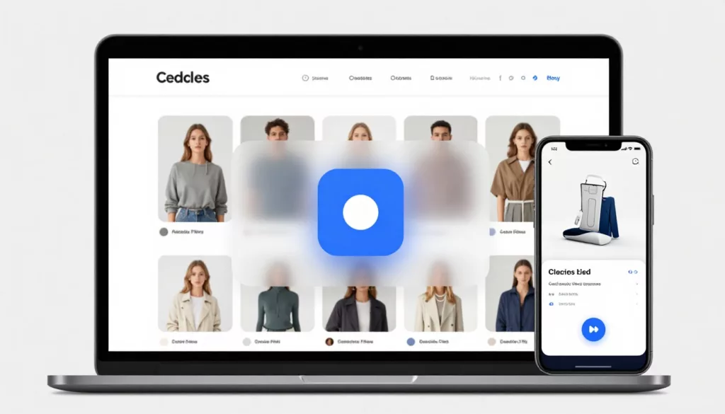
Quick View Modal UX Patterns That Increase Product Adds
Shoppers use product listing pages like a shelf scan in a store, fast, selective, and impatient. A quick view can...
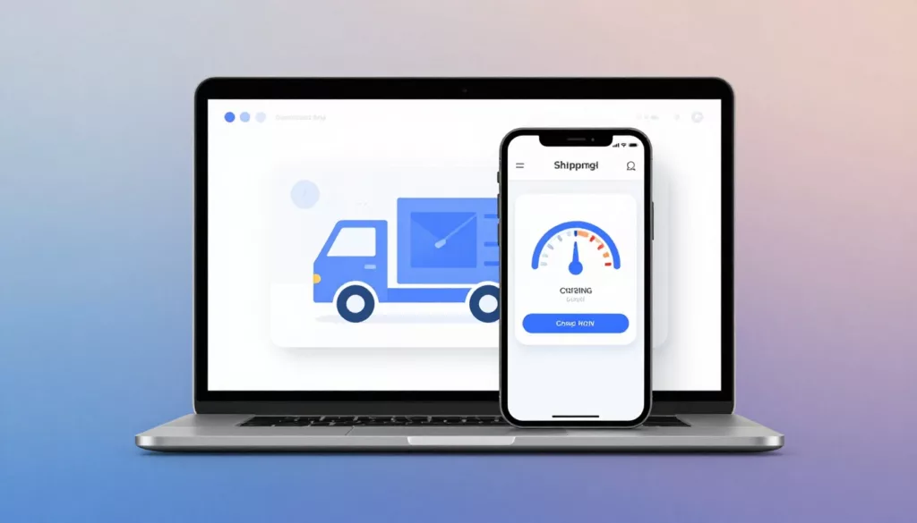
Shipping Calculator UX Patterns That Reduce Surprise Costs
Nobody likes getting to the register and hearing, “Oh, plus fees.” In eCommerce, that moment often happens in shipping, when...

Product Page FAQ Section UX That Lifts Conversion
A shopper gets to your product page, likes the photos, and pauses. Not because they’re unsure about the product, but...

Free Shipping Threshold UX That Increases AOV Without Feeling Pushy
Free shipping can lift average order value, but it can also backfire. Shoppers don’t mind a nudge, they mind feeling...

Better On-Site Personalization Without Creepy Vibes: Rules, AI Recs, and User Controls
Most teams want on-site personalization that lifts conversion without making people feel watched. That’s the tightrope. If your message sounds...

Email Capture Without Annoying Popups: First Visit, Exit Intent, and Mobile Patterns
Nobody visits your site hoping to be greeted by a modal. They came for a product, an answer, or a...
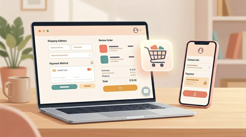
Microcopy for E-commerce UX: 100 Button, Error, and Shipping Lines You Can Copy and Tweak
Ever watched a shopper hesitate at checkout like they’re standing at a locked door, key in hand? That door is...
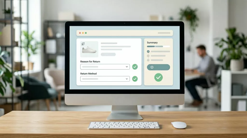
Returns and Exchanges Page UX That Cuts Refund Requests
Refund requests in ecommerce returns don’t start at the warehouse. They start when a customer feels stuck, unsure, or suspicious....

Passwordless Login UX for Ecommerce: Magic Links and OTP
Passwords are like a spare key hidden under the doormat, easy to use, but also easy to misuse. For online...

Size Guide UX Patterns That Reduce Returns for Apparel Stores
Most returns for apparel items start as a simple guess. The shopper likes the product, but sizing feels like a...