The easiest way to lose a checkout is to ask for a new commitment before the order is done. Buyers came to buy, not to build a profile.
A strong post-purchase account creation flow respects that intent. It protects the sale first, then turns the completed order into a reason to sign up. The real job is to make that second step feel useful, quick, and optional.
Protect the sale before asking for an account
If checkout still asks people to log in or create a password, the first fix is obvious, remove that barrier. Guest checkout should be the default path, with account setup moved to after payment.
That tradeoff matters. You can recover account adoption after the sale, but you cannot recover a lost order as easily. A checkout that pauses for registration creates a bad choice at the worst moment. A post-purchase invite creates a better one when the buyer already trusts you.
If you need a baseline for that cleanup, start with checkout UX fixes that reduce abandonment. The point is not to remove account value. The point is to stop asking for it too early.
Keep the checkout form focused on shipping, delivery, and payment. If a field does not help the purchase finish, move it out. The account prompt can wait until the order confirmation page, the follow-up email, or both.
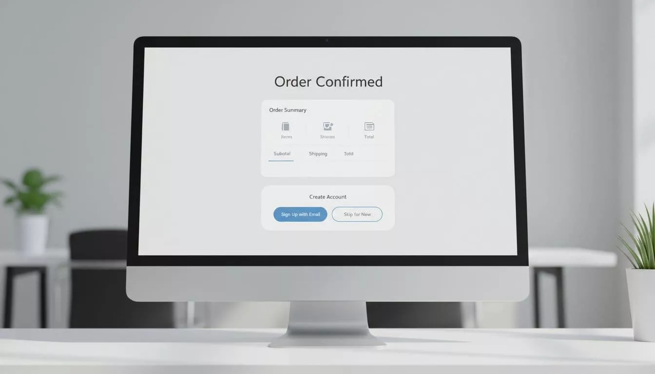
Make the confirmation page do the first ask
The confirmation page is the first place where an account prompt can feel like service instead of friction. The order is complete, the shopper feels relief, and the reason to create an account is easy to understand.
Baymard’s post-checkout UX research points in the same direction. Save the ask for after the purchase, then keep it short.
A good confirmation-page prompt does three things. First, it explains the benefit in plain words, such as faster reorders, live tracking, saved addresses, or easier returns. Second, it keeps the form tiny, often just an email confirmation or a passwordless start. Third, it gives a clear skip path without guilt or visual pressure.
The message should sound like a shortcut, not a contract. “Save your order details for next time” works better than “Create an account now.” Buyers already know the purchase succeeded. They need a reason to care about the account.
Put the prompt below the order summary, not above it. That way, the receipt gets priority and the upsell stays in the background. If you must use a modal, keep it small and easy to dismiss. Better still, use a card or inline block with one primary action.
Use email and passwordless setup to finish the job
Email-based activation is where the handoff either stays light or turns into a chore. The best version arrives fast, works on mobile, and asks for one simple action.
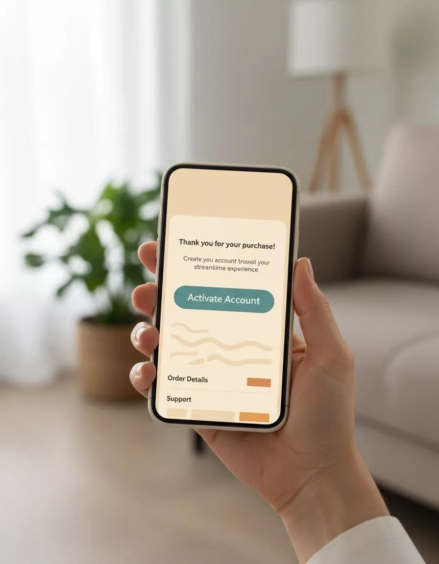
Send the message within minutes of purchase. The subject line should confirm the order first, then mention account setup as an option. People care about the receipt before they care about the profile.
Passwordless setup is usually the best fit here. A magic link or one-time code removes the password problem at the exact moment when motivation is low. If the account must support a password later, ask for it after the user has already signed in and seen the benefit.
That sequence matters. The user should land in an account area that already has value, such as order status, tracking, saved details, or reorder options. Raleon’s Shopify account creation best practices make this case well, because the message is not “sign up for us,” it is “get a better post-purchase experience.”
If you need a fallback, add a resend link and a clear note about expired links. Do not hide recovery behind support. A delayed account should still feel easy to finish.
Build for mobile, accessibility, and repeat use
A prompt that looks fine on desktop can fall apart on a phone. Tap targets shrink, keyboard changes become awkward, and small copy turns into a wall of text.
Keep the mobile version simple. Use large buttons, short labels, and a layout that stacks cleanly. If the user can finish activation with one thumb and one tap, you are close to the right shape.
Accessibility needs the same care. Every action should have a clear label. Focus order should move naturally from the confirmation content to the account prompt. Error messages should say what went wrong and how to fix it. Color contrast should support the button state, not just the brand palette.
The skip path matters here too. It should be visible, but not louder than the primary action. If users cannot find a way to decline, the prompt starts to feel like a trap.
Once the account exists, the next screen should have a job. A Shopify customer account page UX that shows orders, tracking, and reorders gives people a reason to come back. Without that, account creation feels like a dead end.
Measure the tradeoff, not just the sign-up count
If you cannot see the handoff, you cannot improve it. Track the full path, from checkout completion to account activation, so you know where people stop.
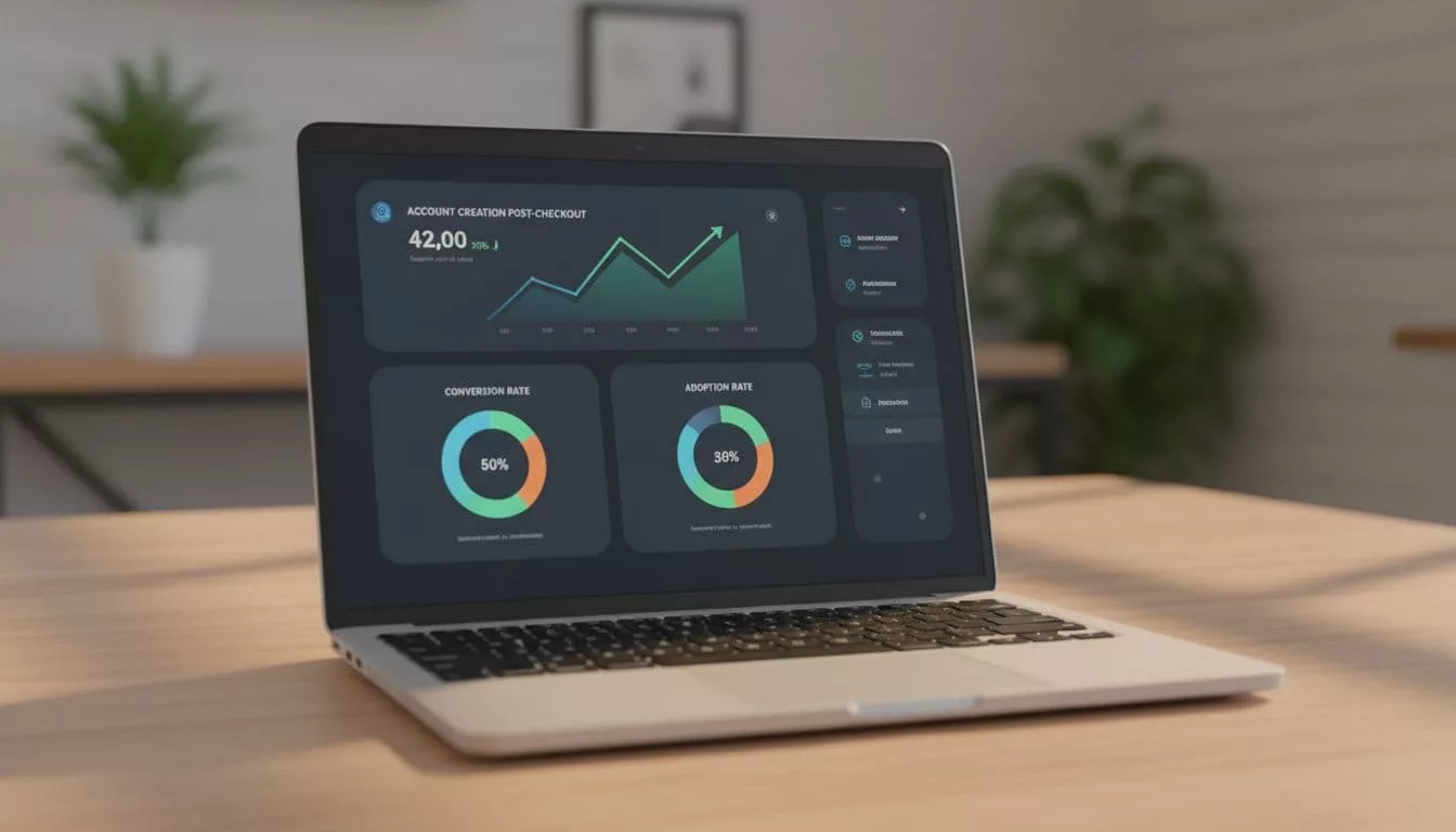
These are the core events worth watching:
| Event | What it shows | Why it matters |
|---|---|---|
| Checkout completion rate | Whether the purchase stays healthy | Protects the main revenue goal |
| Confirmation prompt view rate | How many buyers see the offer | Tells you if placement is working |
| Prompt acceptance rate | How many people start account setup | Shows the prompt’s appeal |
| Activation email click rate | Whether the follow-up message earns attention | Reveals the strength of your timing and copy |
| Account activation rate | How many invited buyers finish setup | Measures the true adoption outcome |
| First repeat purchase rate | Whether the account creates future value | Connects signup to business impact |
Do not judge the flow by account sign-ups alone. A high signup rate means little if checkout completion drops. Watch both numbers together, then test one change at a time. Copy, placement, button labels, and activation timing all deserve separate tests.
Device split is worth watching too. Mobile buyers often need a lighter prompt and a better email handoff. Returning customers may accept account setup faster than first-time buyers. The data will show where the friction lives.
Conclusion
The strongest post-purchase flow respects the order first and the account second. That is how you keep checkout clean without giving up on adoption.
When the prompt appears after payment, when activation takes one tap, and when the account has a clear purpose, the experience feels fair. That balance is what protects conversion while still growing account creation over time.