Proof of Delivery UX for B2B Account Portals
Customers do not open account portals for decoration. They open them when a shipment needs proof, a finance team needs...
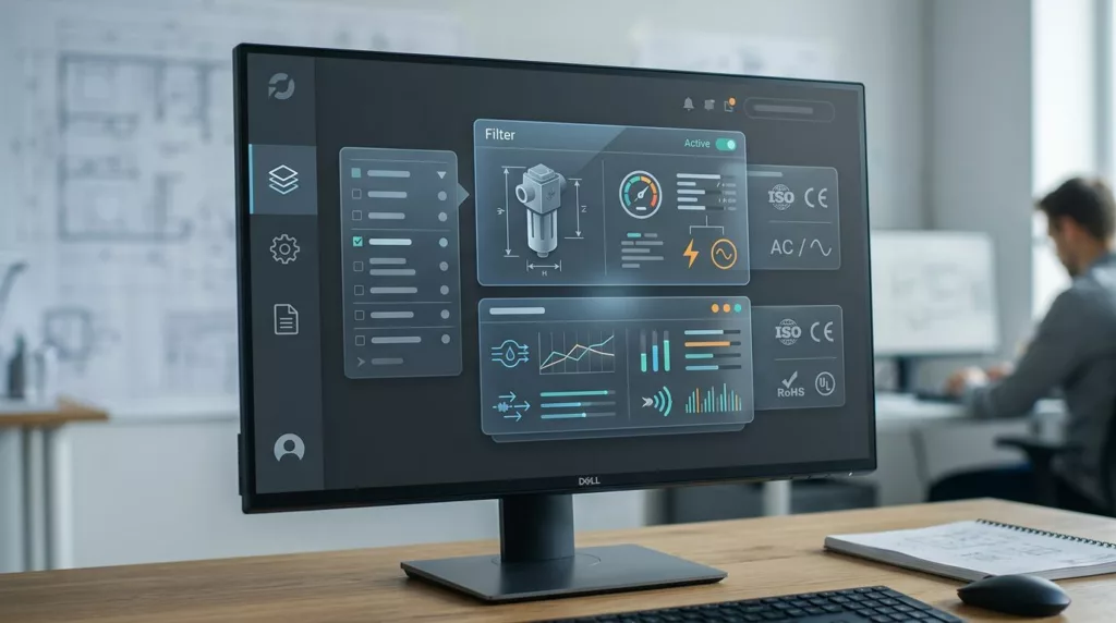
Dimensional Filter UX for Industrial Catalogs
Industrial buyers do not browse product catalogs like casual shoppers. They scan for exact sizes, load ratings, materials, and standards,...
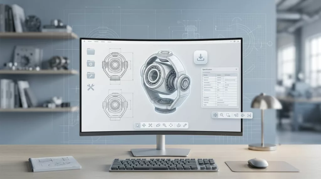
CAD Download UX for Industrial Product Pages
Engineers rarely land on a product page to admire the layout. They want to know if the part fits, which...
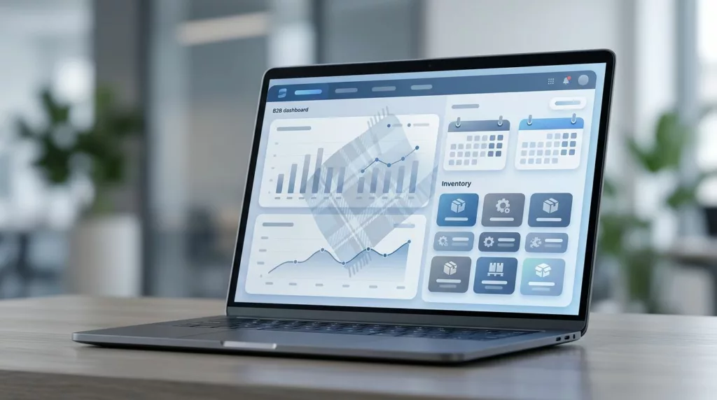
Blanket Order Release UX for B2B Account Portals
Blanket orders look simple on paper. In a portal, they can turn into a mess of dates, quantities, approvals, and...

Self-Serve Invoice Download UX for B2B Account Portals
B2B buyers rarely log in to admire a dashboard. They log in because they need an invoice, a PO match,...
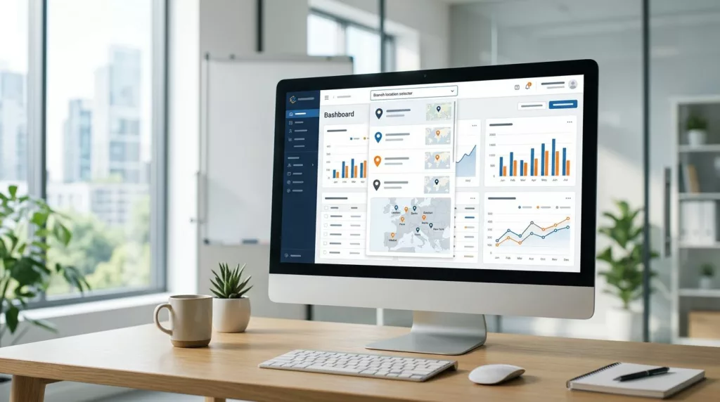
Branch Location Selector UX That Reduces B2B Order Errors
Branch choice sounds simple until the wrong branch gets the order. Then inventory misses, pickup delays, tax mistakes, and manual...

Invoice Payment Portal UX for B2B Ecommerce Accounts
B2B buyers do not open an invoice portal to browse. They open it to find a balance, get approval, or...

Quick Order Form UX for B2B Reorders in 2026
When a buyer already knows what they need, every extra click feels like waste. A B2B quick order form should...
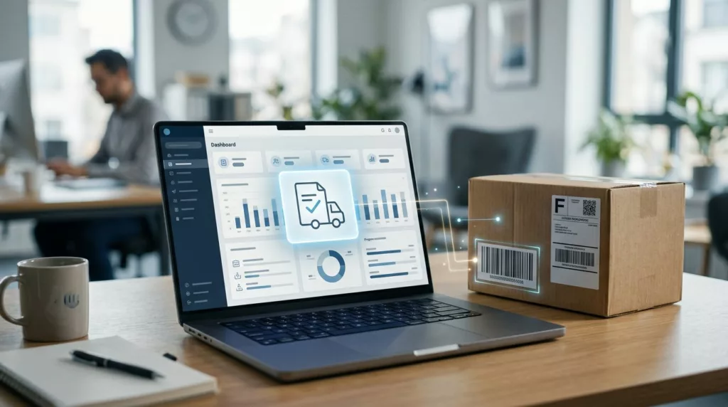
Partial Shipment Tracking UX That Reduces Support Tickets
Partial shipments are where order tracking pages lose people. A shopper sees one box on the way, one item delayed,...

Contact Page UX That Gets Shoppers to the Right Help Fast
A contact page can save a sale or stall one. When every shopper lands on the same generic form, pre-purchase...