


A single stray tap can turn one item into four, and most shoppers won’t notice until the cart total jumps. On mobile, that small mistake feels like a pricing error, even when the math is right.
Good quantity selector ux makes the next action obvious, hard to trigger by accident, and easy to reverse. That matters on product pages, in mini-carts, in full carts, and inside sticky add-to-cart modules where space is tight and thumbs are blunt tools.
On PDPs, use a guarded quantity pattern, not a tiny field
On a product page, quantity is often a secondary choice. For many catalogs, the safest default is simple: start at 1, keep the value visible, and use a large stepper only when shoppers commonly buy multiples. That reduces noise near the main CTA and prevents accidental pre-add changes.

A free-text input is usually the weakest option on phones. It opens the keyboard, hides nearby UI, and invites typos like “11” instead of “1”. Dropdowns are not much better. They compress choice into a tiny target and slow down a simple action.
Use a stepper with three clear parts: minus, current value, plus. Each tap target should be at least 44 x 44 px. Keep 8 to 12 px between the stepper and nearby actions so the shopper doesn’t hit “Add to cart” while trying to increment.
This context guide helps pick the right pattern:
| Context | Best default | Main tradeoff |
|---|---|---|
| Fashion PDP | Fixed at 1 until add | Slower for bulk buyers |
| Grocery or refill | Stepper visible early | More risk of stray taps |
| B2B or wholesale | Stepper plus direct entry | More UI complexity |
Research supports this split. Baymard’s research on converting add to cart into a quantity selector shows the pattern works well when repeat units are common, such as grocery or replenishment. For lower-frequency purchases, showing quantity too early often creates extra decisions with little benefit.
If quantity can change order value with a stray thumb, treat it like a high-risk control.
State handling matters too. Disable the minus button at 1, but keep it visible so the rule stays clear. If stock caps or pack sizes apply, show the next valid step before the tap, not as an error after it. When quantity sits beside options, your mobile product variant selectors should share the same source of truth, so size, color, stock, and quantity never drift out of sync.
In mini-carts and carts, auto-update fast and make reversal easy
Once an item is in the cart, quantity becomes an edit task. That changes the UX. Shoppers expect quick changes, immediate totals, and no mystery “Update” button hiding below the fold.
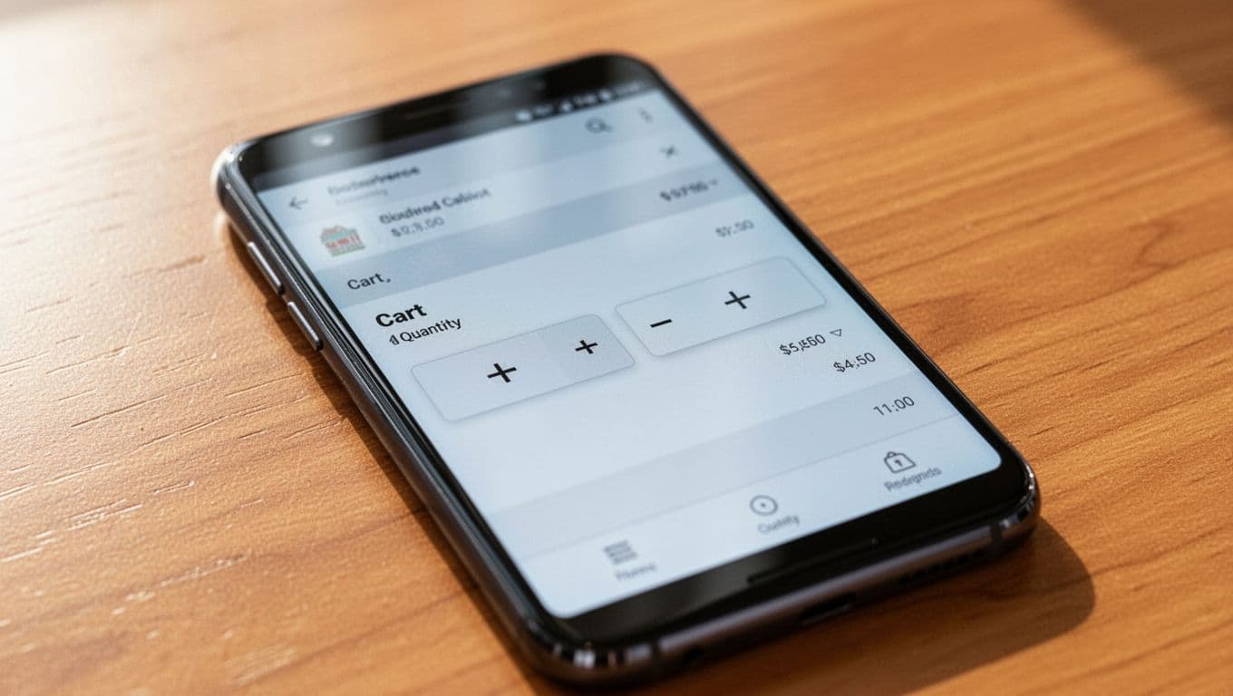
A strong cart pattern uses visible plus and minus buttons, updates line totals after each tap, and keeps the row stable while prices refresh. Baymard’s guidance on auto-updating cart quantities aligns with what most teams see in testing: shoppers don’t want to edit a number, then hunt for a second control to apply it.
Still, auto-update has a tradeoff. If pricing, promos, or shipping recalculation is slow, every tap can feel broken. In that case, update the row optimistically, show a loading state in the totals area, and block repeat taps until the request settles. Don’t freeze the whole screen.
A few anti-patterns still cause most mobile quantity mistakes:
- Tiny steppers embedded inside dense cart rows
- A text field with no buttons
- Silent removal when tapping minus from 1 to 0
- Quantity changes that require a separate “Update” CTA
Removal needs special care. A minus tap from 1 should not quietly delete the item. Either swap the minus button to a trash icon at 1, or confirm removal with a short undo. That small detail prevents the “where did my item go?” moment.
If cart math changes shipping tiers, bundle rules, or fees, connect quantity changes to shipping calculator UX patterns so the price shift feels explained rather than random. Also announce quantity and subtotal updates for assistive tech, because mobile cart edits need to work beyond touch alone.
Sticky add-to-cart modules need tight state sync
Sticky modules are useful because they keep the buying path in thumb reach. They also create a second place where quantity can go wrong. If the main PDP says 1 and the sticky bar says 2, trust drops fast.
The fix is simple in principle and easy to get wrong in builds: use one quantity state across the page, sticky bar, mini-cart, and cart. A selector in one place should update every other surface immediately.
For many stores, the best sticky pattern is conservative. Show the current quantity, but let shoppers edit it inline only when multi-unit purchase is common. Otherwise, keep the sticky bar focused on the main CTA and open a compact sheet or mini-cart for quantity edits. That reduces fat-finger errors near the primary button.
This is where spacing and hierarchy do most of the work. Keep at least 12 px between the quantity control and the CTA. Give the value its own container. Add a pressed state within 50 ms. Lock repeat taps while inventory or pricing updates.
If you’re already refining purchase controls, these add-to-cart button patterns for mobile pair well with quantity work because the button, quantity state, and feedback states should behave as one system. Broader Baymard product page UX benchmark findings also support reducing clutter around core purchase actions.
Before release, test these failure cases on real phones:
- One-handed use on small screens
- Slow network after rapid taps
- Max quantity and pack-size limits
- Screen reader announcements after updates
- Sticky bar plus mini-cart state sync
The best quantity selector doesn’t ask shoppers to be careful. It absorbs careless taps and keeps the order accurate anyway.
Most mobile add-to-cart mistakes come from controls that are too small, too close, too quiet, or out of sync. Fix those four problems, and quantity becomes a low-friction edit instead of a hidden source of cart errors.
When the right quantity is easier than the wrong one, mobile checkout gets calmer, cleaner, and more believable.