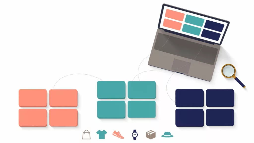
Ecommerce Card Sorting for Clearer Category Navigation
A shopper who cannot predict where a product lives often leaves before they compare it. Ecommerce card sorting helps teams...
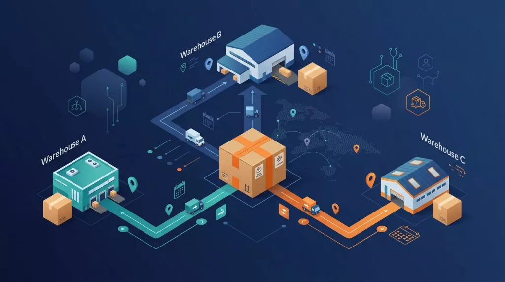
Order Splitting UX for B2B Multi-Warehouse Fulfillment
When one purchase order turns into three delivery dates, buyers shouldn’t have to reconstruct the plan from warehouse codes and...
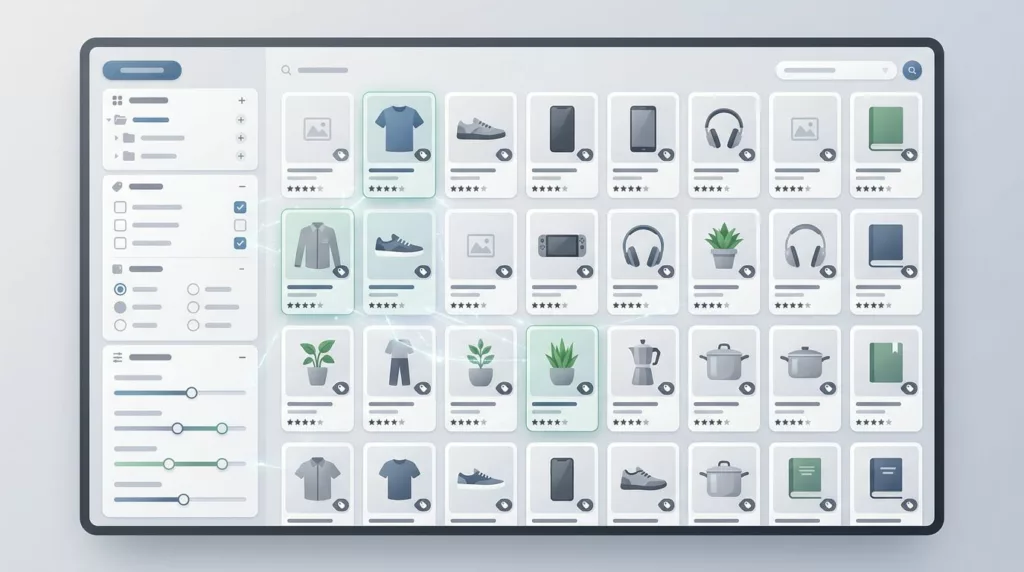
Faceted Search UX for Large Ecommerce Catalogs
Large ecommerce catalogs punish weak filtering fast. When shoppers face hundreds or thousands of products, the filter panel becomes the...

Branch Location Selector UX That Reduces B2B Order Errors
Branch choice sounds simple until the wrong branch gets the order. Then inventory misses, pickup delays, tax mistakes, and manual...
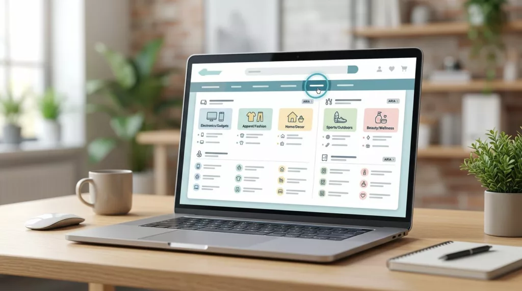
Accessible Mega Menu UX for Large Ecommerce Catalogs
Large catalogs can make navigation feel like a crowded stockroom. Products multiply, categories split, promotions compete, and the menu that...

HTML Sitemap SEO for Large Ecommerce Catalogs
Large ecommerce stores bury good pages fast. A product can sit three clicks deep, hide behind filters, and still deserve...

Contact Page UX That Gets Shoppers to the Right Help Fast
A contact page can save a sale or stall one. When every shopper lands on the same generic form, pre-purchase...
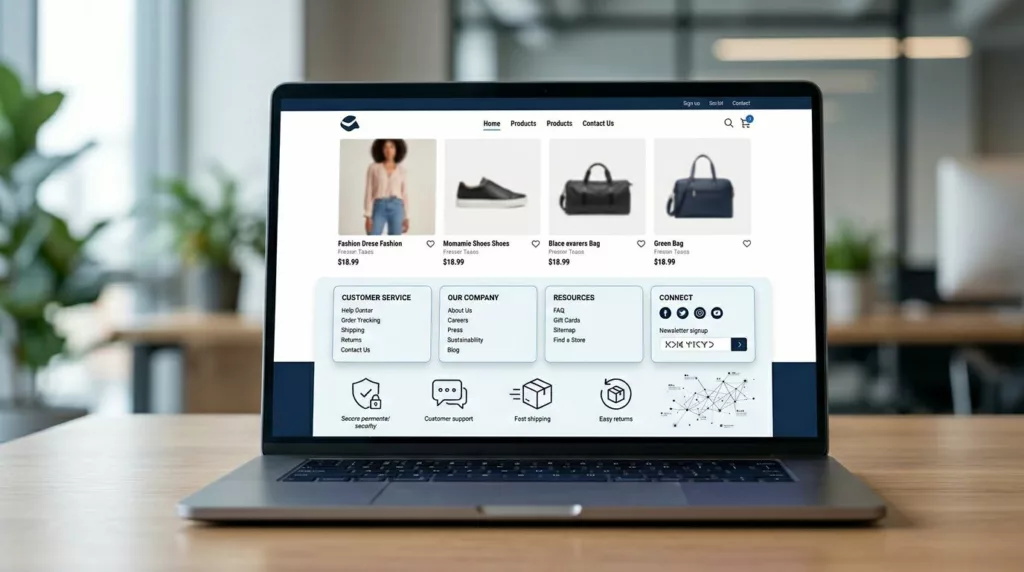
Ecommerce Footer UX for Trust, SEO, and Faster Support
Most footers get designed last. Yet a smart ecommerce footer ux setup can calm doubt, guide support, and strengthen internal...
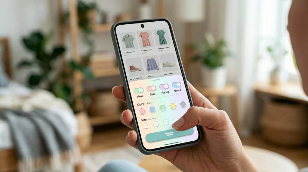
Mobile Filter Drawer UX That Helps Shoppers Narrow Faster
A crowded product grid on a phone feels like hunting through a messy shelf. Shoppers open filters because they want...
Category Page No-Results UX That Keeps Shoppers Moving
An empty category page looks small, but it can waste high-intent traffic fast. Shoppers have already chosen a path, applied...