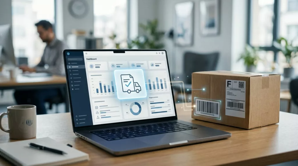
Proof of Delivery UX for B2B Account Portals
Customers do not open account portals for decoration. They open them when a shipment needs proof, a finance team needs...
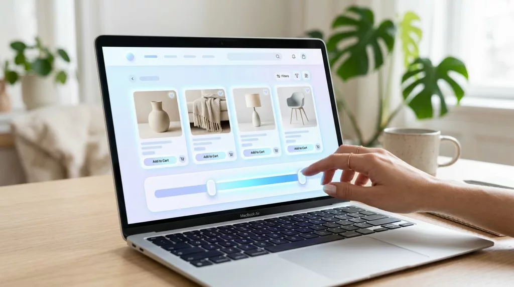
Price Range Filter UX That Helps Shoppers Narrow Faster
A price filter should save time. When it doesn’t, shoppers start second-guessing the whole category. A strong price range filter...
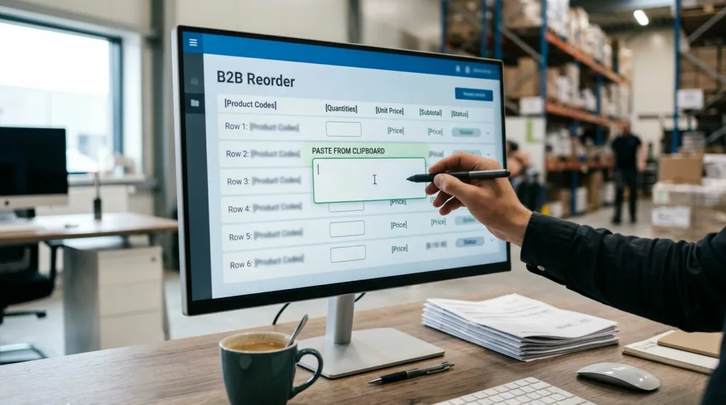
Quick Order Pad UX for B2B Reorders That Buyers Use Fast
A quick order pad UX can save minutes on every repeat purchase, and those minutes add up fast for wholesale...
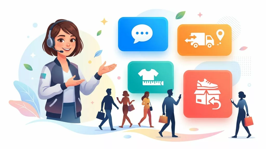
Contact Page UX That Gets Shoppers to the Right Help Fast
A contact page can save a sale or stall one. When every shopper lands on the same generic form, pre-purchase...
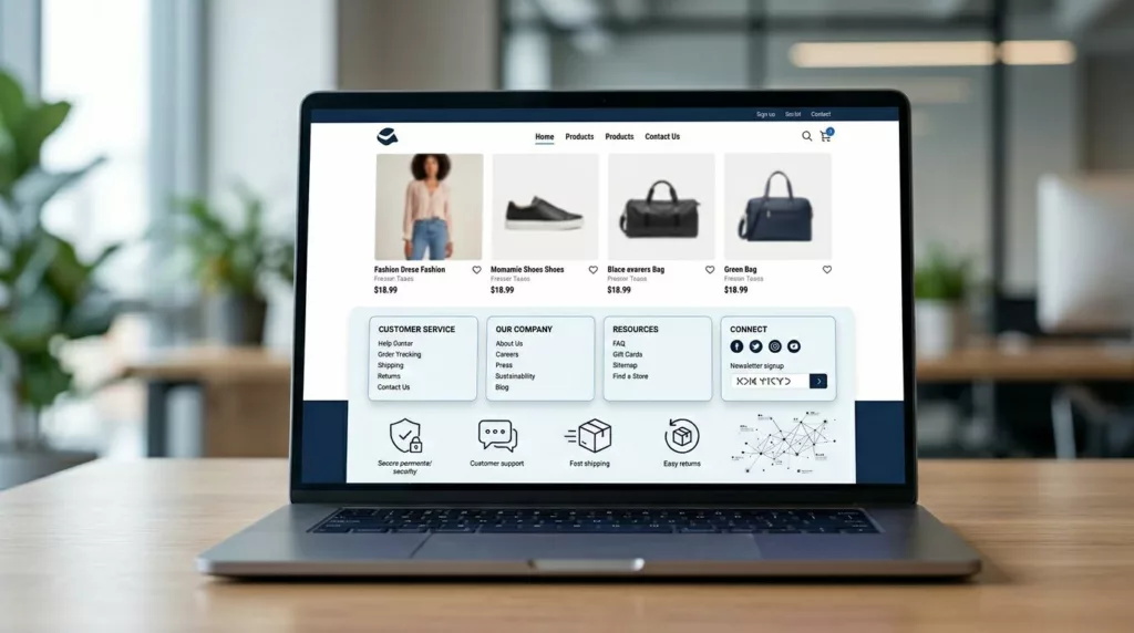
Ecommerce Footer UX for Trust, SEO, and Faster Support
Most footers get designed last. Yet a smart ecommerce footer ux setup can calm doubt, guide support, and strengthen internal...
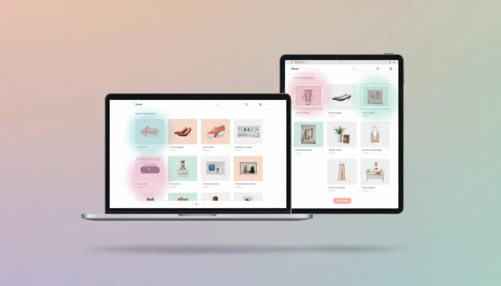
New Arrivals Page UX That Earns More Repeat Visits
A new arrivals page has one job: show change fast. If a returning shopper lands there and can’t tell what’s...
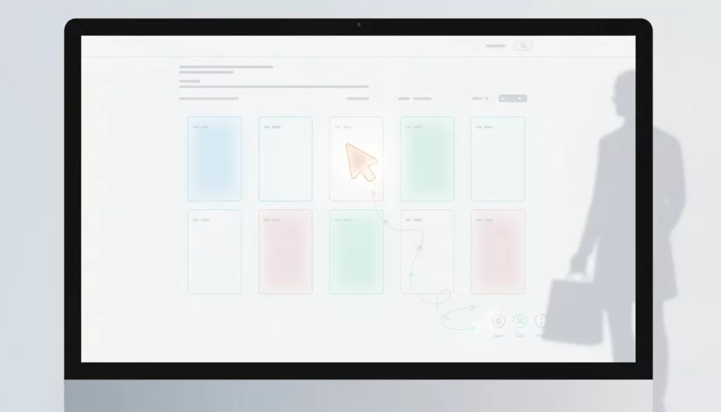
Category Page No-Results UX That Keeps Shoppers Moving
An empty category page looks small, but it can waste high-intent traffic fast. Shoppers have already chosen a path, applied...
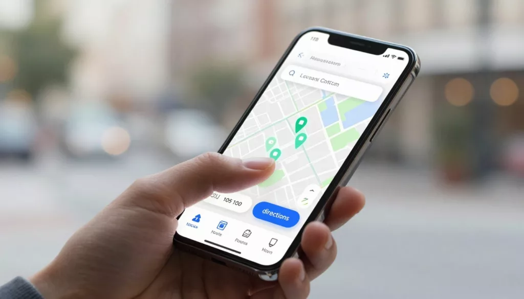
Store Locator UX That Drives More Visits and Local Orders
A shopper who wants your nearest store isn’t browsing, they’re deciding. If your store locator UX is slow, vague, or...

Ecommerce Taxonomy for Large Catalogs That Won’t Break in 2026
When a catalog hits six figures, the first thing to break is rarely the platform. It’s the ecommerce taxonomy underneath...
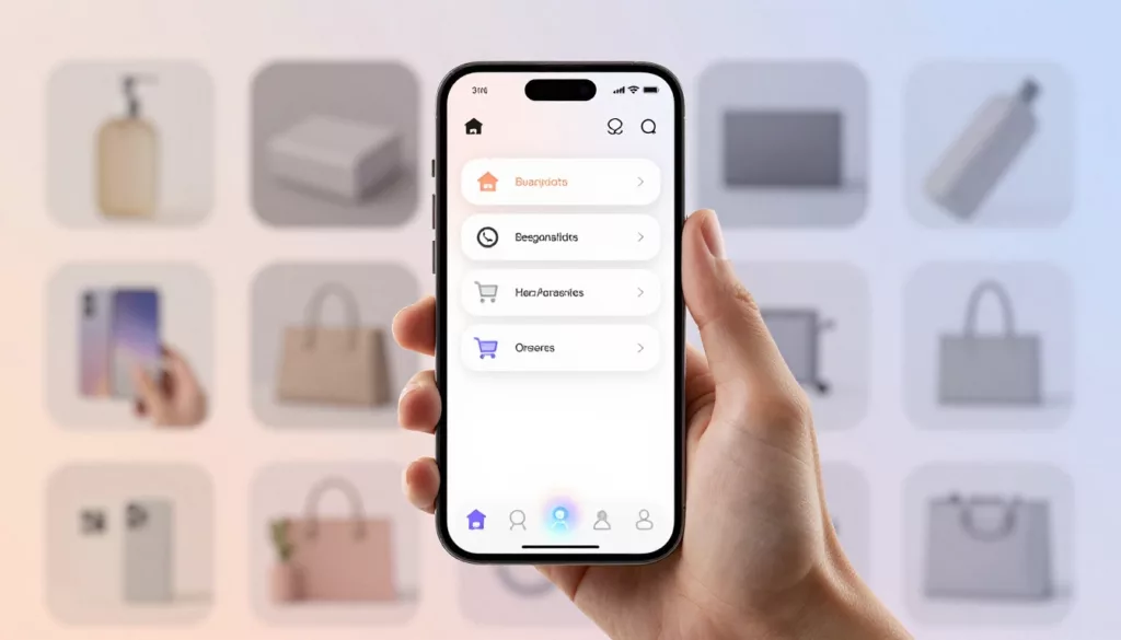
Mobile Bottom Navigation UX for Ecommerce Stores in 2026
On a phone, every extra reach, tap, and pause costs money. That’s why mobile bottom navigation has become one of...