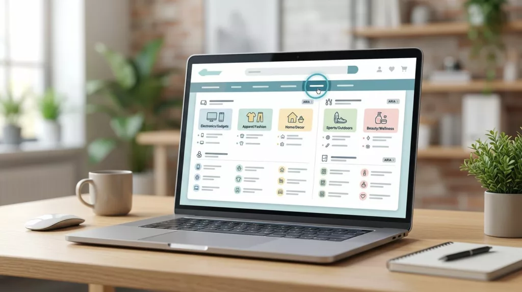
Large catalogs can make navigation feel like a crowded stockroom. Products multiply, categories split, promotions compete, and the menu that once felt tidy starts working against shoppers.
An accessible mega menu has to do more than show links. It has to help people scan fast, move with a keyboard, understand where they are, and reach the next step without guessing.
That gets harder as the catalog grows. The fix starts with structure, then interaction, then testing against real shopping tasks.
Why large catalogs break the classic mega menu
A small store can hide a lot behind one neat dropdown. A large store cannot. Once you add brands, subcategories, attributes, seasonal collections, and content links, the menu starts carrying too much weight.
The first problem is usually hierarchy. Teams group items by internal departments, while shoppers think in use cases, product types, price bands, or styles. That mismatch makes the menu harder to scan, even before accessibility enters the picture. For a broader view of layout options, the ecommerce navigation patterns page shows how mega menus, sticky headers, and mobile category UX fit different catalog shapes.
The second problem is hidden behavior. Hover-only triggers, tiny hit areas, and fast-closing panels punish anyone with shaky pointer control. Keyboard users run into a different wall when the tab order jumps around or focus disappears inside the overlay.
Then there is the content problem. Big menus often repeat the same idea in several columns, or they stuff in promo blocks that look nice and crowd out the useful links. When that happens, the menu stops acting like a map and starts acting like clutter.
A good large-catalog menu answers three questions quickly: where am I, what else is nearby, and how do I get there without backtracking? If it cannot do that, the design needs another pass.
Start with taxonomy before layout
Menu design gets easier when the taxonomy is clean. That means the category tree, labels, and relationships between product groups are settled before the visual panel appears.
Use shopper language, not internal org charts. “Running shoes” is clearer than “Athletic performance footwear.” “Desk chairs” lands faster than “Seating solutions.” The right label is the one people would use when they talk about the product out loud.
A strong taxonomy also keeps sibling groups at a similar depth. If one branch goes three levels deep while another stops at one, the menu feels uneven. Shoppers notice that even if they cannot name it. For a deeper look at structure choices, ecommerce taxonomy best practices covers how large stores can organize categories without creating dead ends.
If the category tree is confusing, the menu will only hide the confusion for a moment.
Before visual design, decide which items deserve top-level space, which belong in subgroups, and which should live in filters or search. That separation matters. A mega menu is not the place for every attribute, policy link, or campaign idea.
If you want a planning reference that focuses on the setup work before implementation, Matthias Ott’s background notes on building an accessible mega menu are a useful read. The main takeaway is simple: the better the content model, the less the interface has to fight.
Give keyboard users a path they can predict
Keyboard support should feel calm and repeatable. A shopper should be able to Tab to the trigger, open it with Enter or Space, move through the links in order, and close it without losing their place.
That means every interactive control needs a visible focus state. It also means the panel should open in a way that matches the control. If a button opens the menu, the same button should close it. If the user tabs away, the menu should not trap focus or vanish before they can reach the last item.
Use semantic HTML first. Real buttons for toggles, real links for destinations, and a logical document order for the contents inside the panel. ARIA can help with state, but it cannot fix poor structure. For most ecommerce menus, a disclosure pattern works better than forcing the full ARIA menu pattern on a link-heavy panel.
The W3C menus tutorial is a solid reference for keyboard behavior and menu state. It helps teams check the basics, such as predictable focus movement, clear open and close actions, and support for non-mouse users.
A simple rule helps here: if the user cannot operate the menu with Tab alone, the experience is incomplete. Arrow keys can be a bonus, but they should never be the only path.
Use state changes clearly too. A toggle should expose whether the panel is open. A screen reader user should not have to guess. The label, the focus order, and the expanded state should all point to the same answer.
Make visual hierarchy do the heavy lifting
Large menus fail when every link looks equal. Shoppers need a way to separate major groups from supporting links at a glance. Good visual hierarchy does that without adding noise.
Start with clear group headings. Then keep the items under each heading tight and consistent. A column with eight links is easier to scan than one with twelve mixed items, a promo badge, and a stray help link. Spacing matters as much as typography. It gives the eye a place to rest.

A useful mega menu feels like a shelf with clear labels. It does not feel like a warehouse aisle. That means strong alignment, simple type choices, and enough contrast for people to read the content without strain.
Icons can help, but only when they add meaning. A tiny shoe icon beside “Men’s Shoes” may work. A row of decorative icons next to every category usually slows the scan. Images can also help in apparel, home, or beauty, yet they should stay secondary to text. If the picture replaces the label, accessibility starts to slip.
Keep the visual treatment stable across the whole panel. One section should not shout while the others whisper. When headings, link styles, and promo blocks all follow the same rhythm, the menu becomes easier to read in one pass.
Make hover, touch, and mobile work together
Desktop hover menus still matter, but hover cannot be the only way in. The trigger should also open on focus and click, because many shoppers use keyboards, touch screens, or trackpads that behave differently from a mouse.
Hover should feel deliberate. A menu that flashes open when the pointer grazes it creates more stress than value. Use a short delay if needed, and make sure closing behavior is forgiving. Fast pointer movement should not collapse the whole panel before the user can reach the items inside.
Touch needs a different approach. On small screens, large top-level panels often turn into stacked disclosures or a simpler category hub. That is where patterns like mobile bottom navigation UX can help, especially for Search, Cart, and Account. Deep category layers can live in a separate menu or category page.
The choice depends on the task. Here is a quick comparison that helps teams pick the right behavior for each device.
| Pattern | Best use | Main risk | Accessibility cue |
|---|---|---|---|
| Hover mega menu | Desktop browsing with many categories | Opens or closes too fast | Pair hover with focus and click |
| Click-to-open panel | Dense catalogs and mixed input methods | Adds friction if labels are vague | Use clear buttons with state changes |
| Search-first header | Very large catalogs with strong intent | Hides category structure | Keep browse paths close by |
| Mobile bottom nav | High-frequency actions on phones | Limited slots | Reserve it for top tasks only |
For many ecommerce teams, the right answer is a mix. Use the mega menu where it helps discovery, then let mobile navigation do the quick-jump work. The unconventional ecommerce navigation ideas page is useful when a store needs something beyond a standard dropdown, especially on mobile-heavy sites.
The main point is consistency. A shopper should not learn one set of controls on desktop and a different set on mobile unless the product really needs it.
Keep the menu useful, not crowded
A mega menu can become a dumping ground if no one draws the line. The easiest way to keep it useful is to decide what belongs there and what belongs elsewhere.
Top categories, major subcategories, popular brand groups, and a few time-sensitive promotions usually fit well. Long legal links, deep filter choices, repeated offers, and low-value content pages usually do not. Those items slow the scan and push better links farther down.
Search should carry high-intent lookups. Filters should handle refinement. Breadcrumbs should help people recover once they move deeper into the catalog. For that last part, ecommerce breadcrumb UX design is a strong companion pattern, because it keeps orientation clear after a shopper leaves the menu.
Menus also need room to adapt by category type. Apparel can use broad groups with strong visual cues. Electronics may need tighter technical subcategories. Home goods might need a mix of product type and room-based browsing. The label system should support the products, not flatten them.
The strongest menus are honest about what they are good at. They help shoppers enter the catalog. They do not try to finish every task inside the header.
Test real tasks, not just the code
A menu can pass a component review and still fail in the store. The only meaningful test is whether real shoppers can use it under real conditions.
Start with keyboard checks. Open the menu, move through it, close it, and return to the trigger. Then repeat the same flow with a screen reader on. Pay attention to focus order, state announcements, and whether the current location stays clear.
Next, test on touch and at high zoom. A menu that looks fine at 100% may break at 200% or 400%. Labels wrap, columns collide, and controls become too small. Mobile browsers can reveal different gaps, especially when safe areas, sticky headers, and long category names all meet.
Use this checklist during review:
- Open the menu with Tab, Enter, and Space.
- Move through every reachable link in a clear order.
- Close the panel with Escape and by tabbing away.
- Confirm the focus ring stays visible at every step.
- Test the panel at 200% and 400% zoom.
- Check long labels, translated labels, and wrapped text.
- Verify the menu works without hover.
- Confirm the current state is clear to a screen reader.
For a practical breakdown of common failures, the accessible navigation menus guide gives a good list of pitfalls to watch for, including keyboard gaps and unclear controls.
One more thing matters here: test with real catalog data. Dummy labels often hide layout problems. Real product names reveal them fast.
Conclusion
An effective mega menu for a large catalog is built in layers. The taxonomy comes first, then the interaction model, then the visual treatment, then the testing. When those pieces line up, the menu feels lighter even if the catalog keeps growing.
The best accessible mega menu does not try to impress people with complexity. It gives them clear paths, steady focus, and a layout that respects how they browse. That is what turns a crowded header into a usable part of the store.