


A checkout can lose a sale because of one mistyped digit. That is why credit card form UX still matters, even when wallets and saved cards are common.
When card entry feels clear, shoppers type faster, spot errors sooner, and trust the page more. The best patterns reduce thinking, not only typing, so they cut both abandonment and payment retries.
Start by removing work the user never needed.
Remove choices before the user starts typing
Many payment errors begin before the first keystroke. A card form gets harder when it asks users to make system-level choices, like picking a card type from a dropdown. As web.dev’s payment form guidance points out, the payment processor can infer the network from the number, so that extra field only adds doubt.
Visible labels also beat placeholder-only forms. Once placeholder text disappears, users must remember what the field wanted. That hurts speed on desktop and accuracy on mobile. Keep labels outside the field, keep helper text short, and ask only for billing details your processor or fraud rules need.
Good implementations also support paste, autofill, and browser-assisted entry. Accept spaces in card numbers, normalize them in the background, and let saved-card tools fill the form without friction. For frontend teams, proper autocomplete tokens help a lot. If the whole checkout still asks for too much, these broader checkout UX mistakes to avoid often magnify card-entry problems.
Match the field layout to the card in the shopper’s hand
People don’t read a bank card like a database row. They scan the long number first, then glance at expiry, then the security code. Your layout should follow that order.

A short comparison makes the difference clear:
| Field | Lower-error pattern | Higher-risk pattern |
|---|---|---|
| Card number | One field, auto-spaced, accepts paste | Four boxes that block paste |
| Expiry | One MM/YY field, or two short numeric inputs | Long month and year dropdowns |
| CVV | Short field with nearby hint | Vague label or hidden help |
This pattern works because it matches how people check the physical card. It also keeps the eye moving in one direction. In contrast, four separate number boxes, auto-tabbing, or long dropdowns create tiny breaks that invite mistakes. They also make correction harder after a typo.
Keep the card block visually tight, but don’t cram extra items into it. “Name on card” is often unnecessary for ecommerce and can be moved or removed if your stack doesn’t need it. If billing usually matches shipping, make that the default and let people change it only when needed.
Validate early enough to help, not so early that you distract
Inline validation should guide users, not scold them. Wait until there is enough input to judge the field. A card number can show brand detection early, but it shouldn’t flash red after the third digit. Expiry should reject impossible dates, not half-finished ones. CVV feedback usually works best on blur or after the expected length.
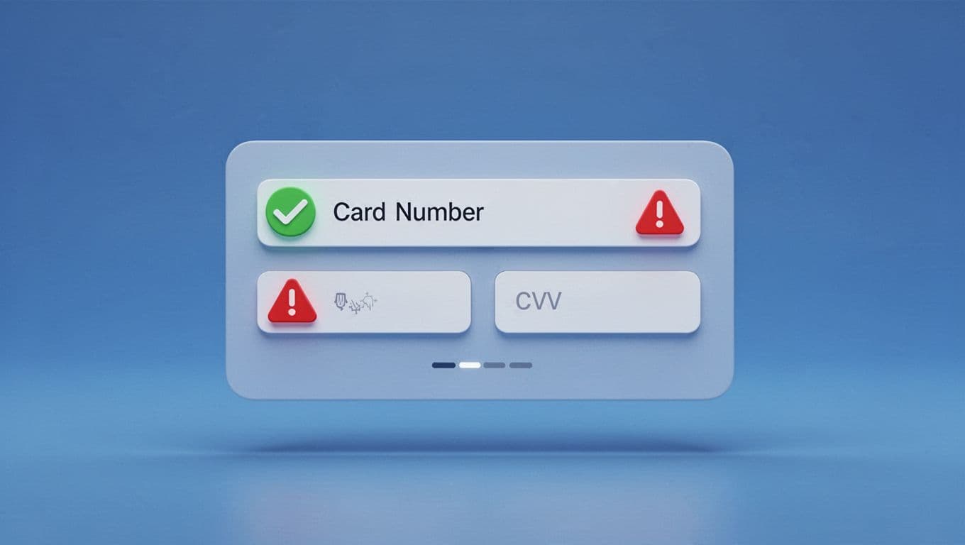
Stripe’s guide to credit card checkout UI and Zuko’s advice on card-entry forms both point to the same rule: put errors next to the field, say what went wrong, and show how to fix it.
Bad implementations wait until submit, then throw a generic banner at the top of the page. Good ones keep focus near the problem. They also preserve field values after a decline, keep the user in place, and move keyboard focus to the field that needs attention. On mobile, that small recovery detail saves a lot of rework.
Never clear a full card field after one small error. That turns a fix into a restart.
Accessibility matters here, too. Pair color with text, link error text to the field programmatically, and announce changes for screen readers. After a server-side decline, preserve whatever input is safe to keep. “Check the 3-digit code” helps. “Payment invalid” doesn’t.
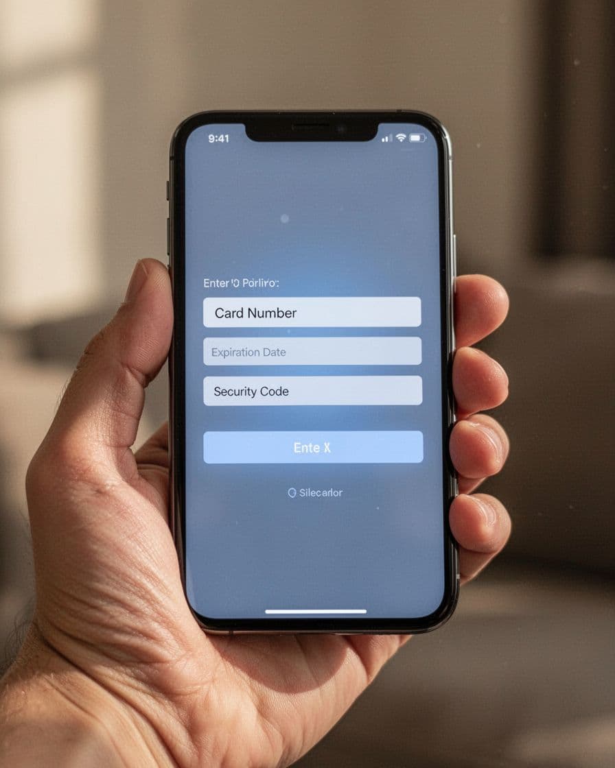
Design for mobile thumbs, while keeping wallets as a side door
Mobile card entry fails when tiny fields, zoom jumps, and weak keyboard choices pile up. Use a single-column layout, large tap targets, and input text large enough to avoid browser zoom. Keep labels visible, place the numeric keypad where it makes sense, and leave enough spacing so thumbs don’t hit the wrong field.
Modern shoppers also expect typing help. GR4VY’s credit card form best practices explains why autofill, card scanning, and stored details reduce manual errors. Those tools work best when your form accepts them cleanly and still lets users edit the result without fighting masks or auto-jumps.
Card scanning should stay optional. It helps in good lighting, yet worn cards and glare still cause misses. When scan data lands in the form, users should be able to fix any field by hand. Keep the order total and security cues nearby, too, because speed without trust still feels risky.
Tokenized wallets such as Apple Pay and Google Pay should sit near the card form, not replace it. They cut entry errors because there is less entry. Still, they are a faster path, not the only path. Good mobile checkout keeps standard card entry ready as a clear fallback, which is the same idea behind express checkout UX for mobile success. If wallet auth fails, return users to the form with their progress intact.
A strong payment form doesn’t need clever tricks. It needs fewer decisions, calmer feedback, and inputs that match real behavior.
When the layout mirrors the card, validation helps instead of punishes, and mobile typing stops fighting the user, payment errors fall before the final tap. That is what good credit card form UX looks like, fewer retries and more completed orders.