Customer Part Number Mapping for B2B Catalog UX
Buyers rarely search B2B catalogs by product name first. They paste a customer part number, a legacy code, a customer...
Parametric Landing Pages That Rank Without Losing Buyers
Parametric landing pages can pull in search traffic and still help people narrow a purchase, but only when they are...

Proof of Delivery UX for B2B Account Portals
Customers do not open account portals for decoration. They open them when a shipment needs proof, a finance team needs...
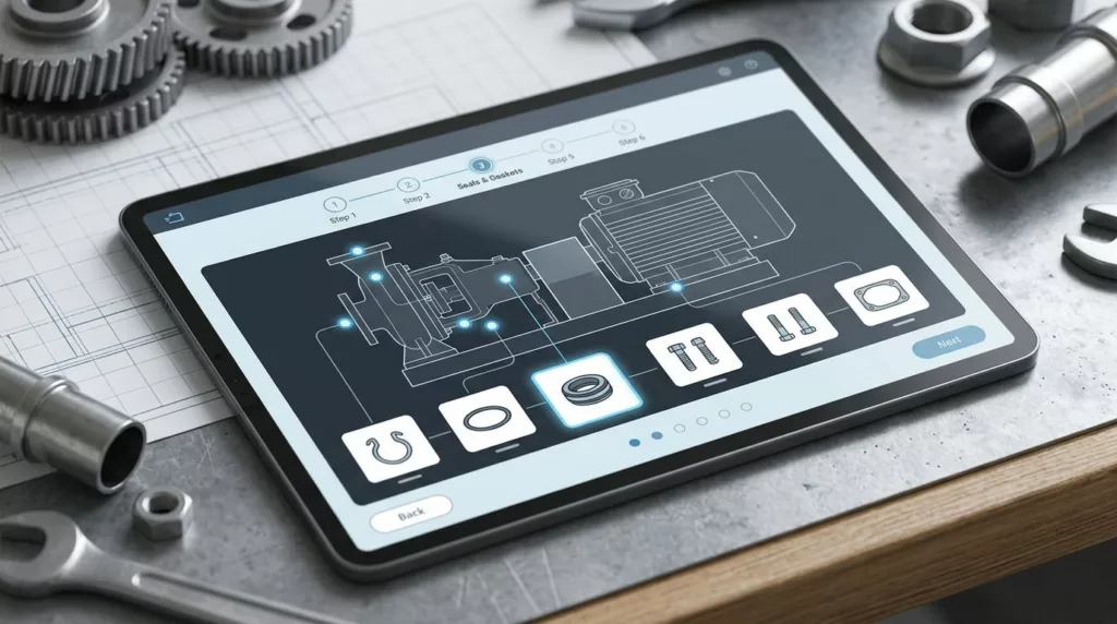
Repair Kit Builder UX That Prevents Missing Parts
What good is a repair kit builder if the customer still has to guess which clip, seal, or fastener belongs...

Open Orders Dashboard UX for B2B Account Portals
B2B buyers don’t open an account portal to browse. They open it because they need an answer fast. When the...
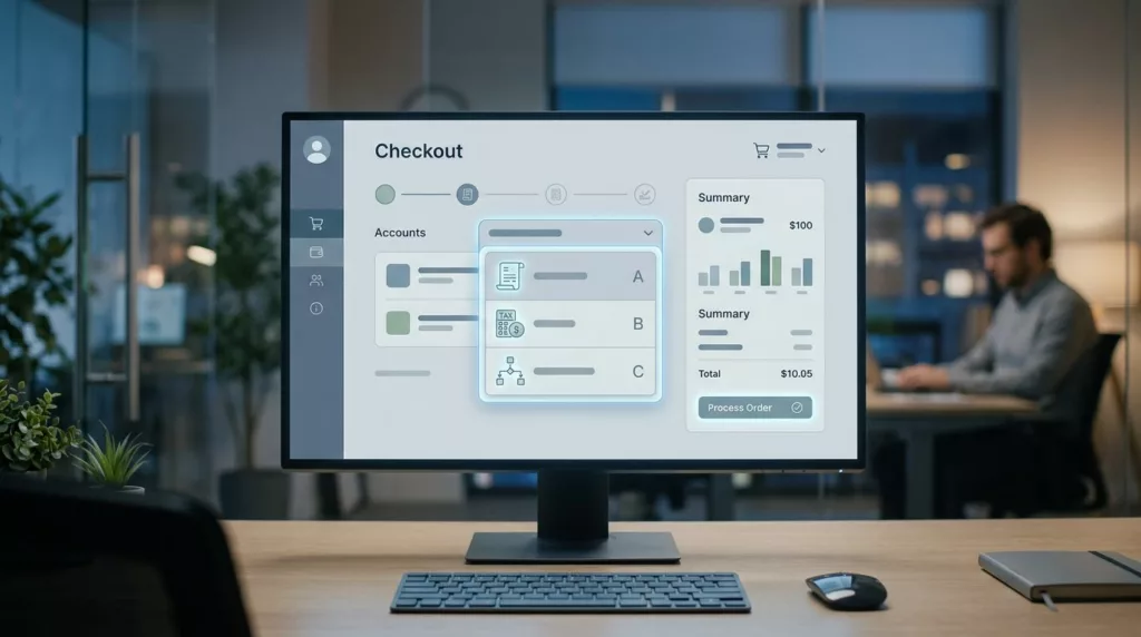
Bill-To Account Selector UX for B2B Checkout
A wrong bill-to account can send an order to the wrong tax profile, the wrong invoice queue, and the wrong...

Product Configurator UX for Custom B2B Product Pages
Custom B2B pages fail when buyers have to guess. One unclear field, one hidden rule, or one surprise cost can...

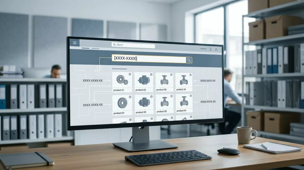
Cross-Reference Table UX That Helps Buyers Find Replacement Parts
Buyers who need replacement parts usually do not start with a perfect product name. They start with a worn label,...
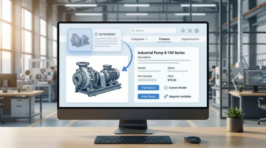
Superseded Part Messaging UX and Part Identification for Industrial Product Pages
Industrial buyers do not have patience for guesswork. When a part number has changed, the page needs to communicate that...
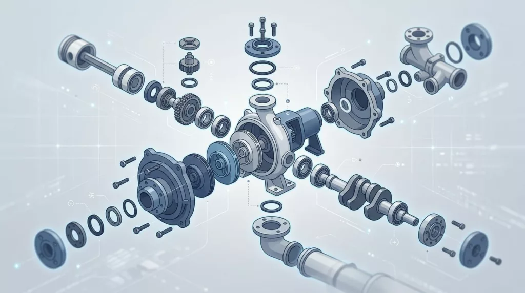
Exploded Parts Diagram UX for Spare Parts Ecommerce Stores
When a shopper knows the machine but not the part name, the wrong interface can slow everything down. A long...