
Ecommerce Log File Analysis for Large Stores in 2026
Large stores do not struggle because they lack data. They struggle because the data is noisy, spread across teams, and...

Ecommerce Image SEO Checklist for Product Pages in 2026
Product images now do more than show color and shape. They help shoppers decide, support search visibility, and shape how...
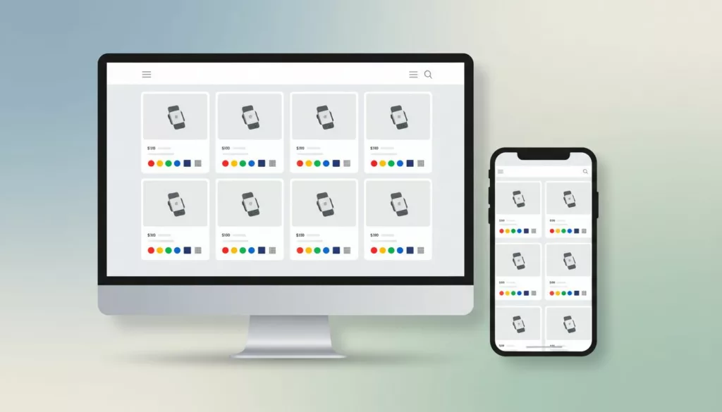
Product Card Swatch UX That Helps Shoppers Compare Variants
Shoppers compare variants in seconds. If your product cards hide the difference, they slow down or guess. Strong product swatch...

Video Schema for Ecommerce Product Pages in 2026
A product video can do more than persuade shoppers, it can also help search engines understand the page. That only...

Phone Number Field UX for Ecommerce Checkout in 2026
The phone number field can make checkout feel smooth or stubborn in one screen. On mobile, that choice often shows...

Headless Ecommerce SEO Checklist for 2026
Headless commerce gives you flexibility, but search engines still need plain signals they can read fast. If the storefront waits...

HTML Sitemap SEO for Large Ecommerce Catalogs
Large ecommerce stores bury good pages fast. A product can sit three clicks deep, hide behind filters, and still deserve...

Product Personalization UX That Stops Custom Order Errors
Custom products fail long before the warehouse touches them. Most failures start on the product page. The usual cause isn’t...

Shopify Markets SEO Checklist for 2026: Fix the Signals That Matter
Going global can hurt rankings faster than it grows revenue. When every market page looks the same except for currency,...
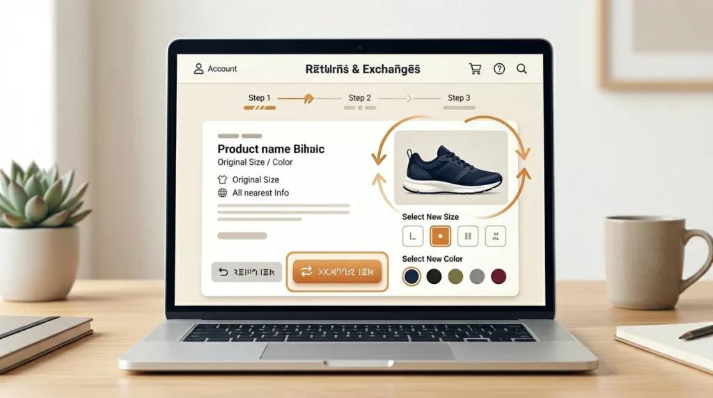
Exchange Offer UX That Recovers Revenue in Returns Portals
A return request doesn’t always mean the sale is lost. In many cases, the shopper still wants the product, only...