
One badly placed cost center field can slow an otherwise smooth B2B checkout. That matters more in 2026, because buyers expect self-serve speed while finance still needs clean coding for reporting, approvals, and spend control.
If you ask for the field too early, you add friction. If you hide it too late, you create rework for operations. The best checkout pages treat cost center entry as part of the buying flow, not as an accounting afterthought.
Why the cost center field matters more now
A cost center is small on the screen, but it carries real weight behind the scenes. It connects the order to budgets, teams, and internal reporting. In many companies, it also helps route approvals and match invoices to the right cost owner.
That is why B2B checkout in 2026 has to do two jobs at once. It needs to feel fast for the buyer, and it needs to keep finance happy. Enterprise buying still runs through rules, tax details, and approval paths, and ORO’s enterprise B2B ecommerce guide is useful background on how checkout fits into that larger system.
The pressure is even higher when the buyer is self-serving. They want the same low-friction experience they get from consumer checkout, but they still need business controls like PO numbers, invoices, and account-level pricing. A B2B checkout feature list helps show how many of those requirements now live inside one flow.
Put the field where buyers expect it
Placement decides whether the field feels helpful or annoying. The right position depends on how often the value changes and how often the same account orders again.
A simple comparison makes the tradeoffs easier to see.
| Pattern | Best when | Main tradeoff |
|---|---|---|
| Inline on the details step | Most orders need a cost center | Adds visible friction to every buyer |
| Inside a “Business details” section | You serve mixed consumer and B2B traffic | Buyers may miss it if the section is collapsed |
| On the review step | Finance checks must happen before submission | Late errors can force a full rework |
| Prefilled for saved accounts | Repeat buyers use stable billing rules | Defaults can go stale if account data changes |
For most enterprise checkouts, inline works best when the field is short and common. Collapsed sections work better when the field is optional or account-specific. Review-step capture makes sense when the value only matters for a final approval check.
If your layout keeps fighting the business rules, checkout flow best practices for 2026 can help you decide whether the field belongs in the main form, a side panel, or a later step.
A cost center field should feel like a memory aid, not a tax form.
Make the input easy to finish on the first try
Field design matters as much as placement. If a buyer has to stop and guess, the flow already lost momentum.
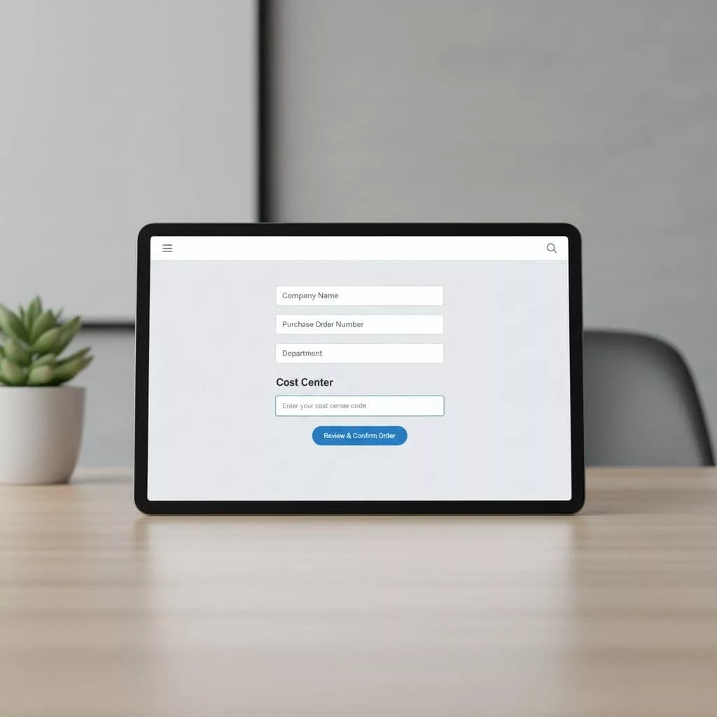
Use a clear label first, then add a short helper line if the format is not obvious. If the field accepts a department name, project code, or internal cost center, say so. If it needs a fixed code, show an example right next to the label.
Autocomplete helps when values come from a known list. Paste support matters too, because buyers often copy codes from an internal system. A long dropdown sounds tidy, but it turns a quick task into a search problem. Free text with validation is often better than a huge menu.
The error state needs the same care. Place the message near the field. Explain what failed in plain language. Then keep the buyer on the same screen. If the correction requires a format, show the format, not a lecture.
A few field rules hold up well in B2B checkout:
- Use a real label, not placeholder text that disappears after typing.
- Prefill the value when the account profile already knows it.
- Accept keyboard input and paste without extra steps.
- Avoid a required field when the buyer has not seen the final total yet.
- Keep the error message specific, so the user knows what to change.
If you also support fast payment paths, pair this with improving mobile completion with express checkout. Mobile buyers hate extra typing, and saved payment methods only help when the business fields stay light.
Balance buyer speed with finance control
The hardest part of cost center field UX is not the label. It is the logic behind it.
Finance teams want reliable data. Operations teams want clean routing. Buyers want to finish an order without hunting for an internal code they barely use. Good checkout design respects all three.
Start with conditional rules. Show the field only when the account needs it. If the buyer belongs to a team with a fixed cost center, prefill it. If the order changes by department, project, or legal entity, keep the field visible and editable. That is where account-based checkout personalization earns its place.
Keep the experience tied to actual policy, not form habits. A field that is always required often means the form is too blunt. A field that appears only when the account or order needs it feels more natural.
For buyers with known profiles, save the last valid value and update it when account data changes. That small detail lowers repeat friction. It also reduces back-and-forth between procurement and finance after the order is placed.
If you are mapping the rest of the business flow at the same time, practical ways to improve checkout usability can help you tighten the validation, copy, and error handling around the field.
Common mistakes that create hidden cost
A cost center field can fail in subtle ways. The checkout still works, but the back office pays for it later.
The biggest mistake is asking for the field too early. Buyers should see the cart total, shipping, and payment context before they face extra business data. Another common problem is using internal jargon that the buyer does not know. Finance may say “cost center,” while the buyer thinks in terms of department, budget code, or project name.
Dropdowns are another trap. They look organized, but they frustrate users when the list is long or the names are similar. Searchable inputs or smart autocomplete are usually better for enterprise forms.
Old defaults cause trouble too. A saved cost center that no longer matches the account creates bad records and trust issues. That is why the field should refresh with account data, not stay frozen forever.
The last mistake is treating the field as if every order follows the same procurement path. In 2026, that is rarely true. Some buyers need approvals. Some use guest checkout with saved business details. Some buy by mobile and expect the form to adapt.
A quick checklist for launch
Use this as a final pass before the field goes live.
- Prefill approved values when the account profile already knows them.
- Show the field only when policy or order type requires it.
- Keep the label simple and match the buyer’s language where possible.
- Add a short helper line if the format is not obvious.
- Accept paste, keyboard entry, and search where the code list is long.
- Validate inline before the final submit step.
- Save clean values for repeat orders when the account allows it.
- Test the flow on mobile, because short fields can still feel heavy on a small screen.
That checklist keeps the focus on the buyer’s next step, while still giving finance the data it needs.
Conclusion
The best cost center field does not feel like an extra task. It feels like part of a smart checkout that already knows who the buyer is and what the company needs.
When the field appears at the right moment, uses the right default, and gives clear feedback, buyers keep moving and operations get cleaner data. That balance is the real goal of cost center field UX in 2026.