
Engineers rarely land on a product page to admire the layout. They want to know if the part fits, which file to grab, and whether the file is current. If that answer takes too long, the CAD section loses trust before the download starts.
A strong CAD download UX does more than place a button on the page. It helps buyers move from product ID to file access with no doubt, no guesswork, and no detours through messy menus. That kind of clarity improves usability, keeps engineers moving, and gives B2B teams a cleaner path to conversion.
Put CAD access where engineers expect it
Placement shapes behavior fast. If the CAD area sits too low on the page, buried in a tab or hidden below long marketing copy, many visitors never reach it. Engineers scan for model numbers, specifications, availability, and file access together, so the download area needs to sit close to those details.
On larger product pages, a right-hand panel or sticky action block often works well. On smaller screens, a clear download card within the first scroll is safer. The file action should feel like part of the product story, not a separate destination.
When the broader page layout is weak, the CAD area gets buried fast, so the page structure has to support it, as in user-centered product page design. That usually means a page hierarchy with one clear primary action, a visible spec summary, and a direct path to technical files.
If the first view does not answer “Is this the right file?”, the rest of the page has to carry the doubt.
Keep the same naming logic across the page, search results, and file labels. If the product is sold as a specific series or variant, use that language in the download area too. Consistency saves time, and time matters when an engineer is deciding whether to stay or leave.
Build the CAD section around the first three questions
Most CAD sections fail for a simple reason. They expect the user to click before the page proves anything. A better section answers three questions right away: what file is this, is it current, and will it work in my setup?
A strong CAD block usually includes these elements:
| Element | What to show | Why it matters |
|---|---|---|
| File format | STEP, IGES, native CAD, or 2D drawing | Helps engineers choose the right file fast |
| Revision data | Revision code, release date, version note | Confirms the file matches the current product |
| Part identity | SKU, model, series, and variant | Reduces wrong-file downloads |
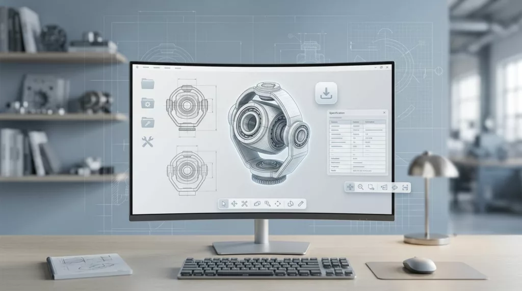
| Preview | Thumbnail, viewer, or simple diagram | Gives quick visual confirmation |
| File details | Size, units, and access notes | Sets expectations before the click |
That structure removes a lot of friction. It also reduces support work, because buyers spend less time asking which file is current.
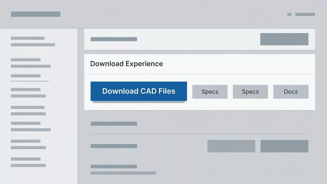
If several formats are available, show them as separate choices instead of burying them in one generic link. A design engineer may want a native file, while a specifier only needs a PDF drawing. Both should find the right path without thinking too hard.
The best sections also show the product context around the file. A short note like “For 24V variant, rev C” can prevent the wrong download. Small details like that protect trust.
Reduce friction without making the page feel gated
Many industrial sites ask for a form before they give the file. That can work, but only when the gate feels fair. If the form is long or vague, the user assumes the company values the lead more than the engineer.
Keep the form short. Email address, company name, and one optional field are often enough. If your team needs more data, explain why it matters. A direct line of copy beats a heavy-handed form every time.
The simplest way to lower drop-off is to show the file value before the gate. Let users see the format, revision, and file size first. Then make the submit action feel like the final step, not the first hurdle.
A few practical rules help here:
- Ask for the minimum data needed to route the lead.
- Offer an immediate download after submit.
- Send the file link by email only as a backup.
- Show a clear error if the file is unavailable.
Legacy and replacement parts need even more care. If a part is superseded, the CAD area should point to the current file and make the replacement path obvious, similar to best practices for displaying replacement parts. Engineers should never land on a dead end when they are trying to keep a project moving.
This is where business impact becomes visible. Better gating cuts avoidable exits, lowers support tickets, and improves lead quality. The people who do convert are usually more serious because they had enough context to proceed.
Design for real engineering workflows, not just ideal desktop sessions
A lot of CAD traffic still starts on desktop, but not all of it ends there. Buyers check parts on a laptop at work, then verify details on a phone in a plant, field office, or shop floor. The page has to work in both places.
On mobile, the download action needs to stay obvious. Buttons need enough space for touch use, and file options should not hide behind hover states. If a user has to zoom in before they can tell which format is which, the page has already lost some of its value.
The same logic applies to supporting visuals. If your catalog uses diagrams or exploded views, keep the visual language consistent with the CAD area so users do not have to relearn the page. A related pattern like exploded parts diagram UX patterns can help teams think about how technical visuals and file access support each other.
File names matter too. Engineers often save files locally and share them across teams. A clear filename, revision label, and part number make that process easier. Cryptic names only create more cleanup later.
A good mobile experience also respects speed. Large files, slow form loads, and hidden download states all create doubt. If the file is big, say so. If the process takes a moment, show the user that something is happening. Clarity reduces frustration.
Measure whether the CAD experience is working
A CAD section should earn its place with data, not assumption. Track clicks on each file type, form starts, form completions, and the path users take after they reach the download area. Those signals tell a clearer story than page views alone.
It also helps to compare high-traffic pages with low file activity. When a popular product page gets visits but little CAD engagement, the issue may be placement, copy, or a mismatch between the page and the engineer’s task. When a file gets clicked but conversions stay weak, the surrounding product content may still need work.
Support teams can help here too. Repeated questions about revision, format, or fitment are a strong sign that the page is hiding key details. Fewer questions after launch usually means the download UX is doing its job.
The strongest tests are simple. Try a different file placement, adjust the download label, shorten the form, or change the default format shown first. Then watch what happens to the click rate and the completion rate. Small edits often reveal where the real friction sits.
Conclusion
Industrial product pages win trust when they remove doubt quickly. That is the heart of CAD download UX. Engineers want the right file, current revision, and a clear path to access it without a scavenger hunt.
When the page puts the download area in the right place, shows the right details, and keeps the gate light, the experience feels professional instead of forced. The result is better usability, happier engineers, and a cleaner path to conversion.
The strongest CAD sections do one thing well. They help the buyer move forward without stopping to ask for help.