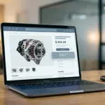
A product page can look polished and still lose the sale when the core charge appears too late. Shoppers spot price surprises fast, especially on alternators, batteries, calipers, and other parts with deposits.
Strong core charge messaging tells them what they pay now, what comes back later, and what happens if they keep the old unit. That clarity reduces cart exits and support tickets.
The fix starts on the PDP, where the decision begins. Small wording choices and layout choices matter more than long explanations.
Why core charge copy breaks trust on PDPs
Shoppers do not read every line. They scan the main price, compare tabs, and move on when the math feels hidden.
When a core charge appears only in the cart, the product page feels incomplete. When the label changes from “core charge” to “core fee” to “refundable deposit” across screens, the page feels inconsistent. That drift creates doubt, even when the numbers are correct.
NNG’s ecommerce product page guidance and Baymard’s data-driven ecommerce best practices both put price clarity ahead of decoration. If you’re reviewing the full page layout, the product page optimization checklist helps you audit price, specs, and trust cues together.
The page should answer one question fast: “What do I pay today?” If the answer takes hunting, the shopper starts to doubt the whole offer. That doubt grows when the charge sits in a footnote, a tab, or a collapsed block below reviews.
A clean price line is not enough. The price story needs a visible deposit line, a refund note, and the same label everywhere the part appears. Otherwise, the shopper feels like the number changes as they move through the funnel.
Put the charge in the price block, not the footer
The price block should read like a receipt. Base price, core charge, and refund amount belong in the same visual cluster.
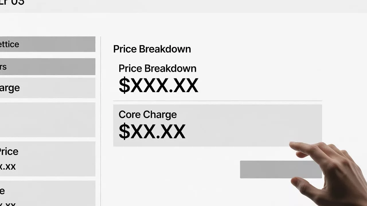
Use a simple stack so the eye can follow it in one pass:
- Part price. Put the product price first, so the shopper sees the base cost before anything else.
- Core charge. Label the deposit beside the price, not in a distant note or accordion.
- Total today. Show the amount charged now, especially when the deposit is refundable.
- Refund amount. State what comes back after the old core is returned.
Keep those lines together on desktop and mobile. On a small screen, stack them inside the same card or price group. Do not split the charge from the main price with reviews, shipping badges, or promotional copy.
If the shopper has to hunt for the deposit, the page already feels wrong.
The visual order should match the way shoppers think. They want the current cost first, then the return value, then the rules. A faint footnote can help, but it should never carry the whole message.
Use the same wording in cart and checkout. If the PDP says “core charge” and the cart says “core deposit,” the change looks like a second fee. Even when the math is identical, the wording feels less honest.
Explain the refund in plain language
Refund copy gets messy when teams bury the rule in return policy text. Keep the shortest accurate version close to the price, then link to the full policy only if needed.
A clear line like “Refunded when your old part is returned” works better than vague language. If the refund posts after inspection, say that. If the core must arrive within a set return window, show the window near the charge. If the condition rules matter, mention the main ones in plain words.
Use the same phrase on the PDP, in checkout, and in the order email. A shopper should not have to translate three different versions of the same policy. That is where support calls start.
“Refundable” means little when the next step is unclear.
If your policy rejects damaged or incomplete cores, state that where the charge appears. If the refund needs the original hardware, mention that too. Short, direct language lowers friction because it removes guesswork at the exact moment the shopper is deciding.
For products with no core charge, say that clearly as well. A simple “No core charge” label prevents the shopper from assuming the fee is hidden somewhere else.
Handle edge cases without clutter
Edge cases are where pages get noisy, but they are also where clarity matters most. A little structure keeps the page readable.
- Multiple quantities. Multiply the deposit by quantity and show both the per-unit and extended core charge.
- Remanufactured parts. Keep the charge visible even when the item already sounds rebuilt or exchange-based.
- Incompatible returns. State what disqualifies the core, such as cracked housings, missing hardware, or mismatched components, if that is your rule.
- Bundled kits. Break out any charge that applies to only one item in the bundle.
If your catalog mixes new, remanufactured, and exchange parts, the page should show which SKUs carry a charge and which do not. Do not make shoppers infer that from the product title. Titles are easy to skim past. Labels near the price are harder to miss.
Consistency matters across suppliers too. If one vendor uses “core charge” and another uses “deposit,” standardize the shopper-facing term. Backend labels can vary. The PDP text should stay stable.
Tooltips, FAQ blocks, and mobile layouts
Tooltips help when they answer one question fast. They fail when they turn into a policy dump.
Use a tap or hover trigger next to the core charge label. The tooltip should say what the charge is, when it returns, and where the return steps live. Keep the copy short. On mobile, the trigger needs a large tap target and an obvious close action. Keyboard access and screen-reader labels matter too.
For fuller answers, a nearby FAQ block works better than a long footnote. The approach in product page FAQ UX fits high-anxiety categories because it keeps the explanation close to the add-to-cart button. If you’re shaping the broader page structure too, UX-centric product pages is a useful reference for keeping the purchase block tight.
The FAQ should cover the questions that slow the sale. Typical ones include how long the refund takes, what condition the old part must meet, and whether the charge applies to every unit in the cart. Put those answers where shoppers can reach them without a long scroll.
On mobile, the best layout is often a short helper line under the price, then a compact FAQ below the purchase block. Do not hide the explanation below a wall of reviews. That puts the answer where it is hardest to find.
Test the page against real shopping behavior
Good copy still needs proof. Watch where shoppers pause, tap, or back out on products with a core charge.
Start with the basics. Test the label text, the placement, the refund phrasing, and the mobile order of the price lines. Then check whether the same language appears in cart, checkout, and post-purchase email. If one screen says “deposit” and another says “charge,” the flow feels broken.
The best tests are simple. Compare a version with the charge embedded in the price block against one with the charge hidden behind a tooltip. Compare a short refund line against a longer policy summary. Compare a mobile stack with a split layout. The cleaner version should win on clarity, and the support team should hear fewer confused questions.
If you want a broader redesign frame, the product page itself should be treated as a system, not a set of isolated widgets. Price, specs, trust cues, FAQ, and returns all need to tell the same story.
Conclusion
A shopper should never discover a core charge as a surprise at checkout. The page works better when the charge is visible, labeled, and explained in one place.
That means clear price hierarchy, plain refund language, careful handling of quantity and reman cases, and a FAQ that supports the decision instead of hiding it. When those pieces match, the page feels honest.
Clear core charge messaging does more than explain a fee. It gives the shopper a clean path from price to purchase, and that is what keeps the page from losing trust at the last step.