
Case Pack Selector UX for Wholesale Product Pages
A wholesale buyer can abandon a page in seconds if the pack math feels unclear. The problem is rarely price...

Accessible Product Gallery UX for Ecommerce Stores
A high-quality image gallery can sell a product or leave shoppers unsure. When images are hard to scan, hard to...
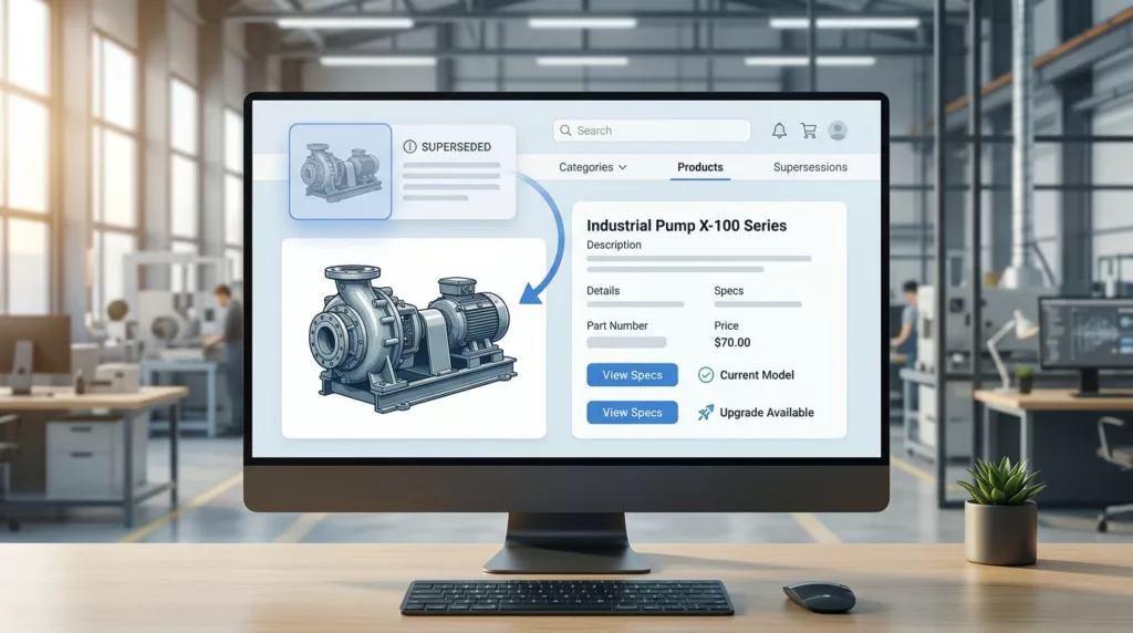
Superseded Part Messaging UX and Part Identification for Industrial Product Pages
Industrial buyers do not have patience for guesswork. When a part number has changed, the page needs to communicate that...

Branch Inventory Messaging UX for Distributor Product Pages
Buyers do not mind seeing limited stock. They mind uncertainty. When branch inventory messaging is vague, they hesitate, call the...
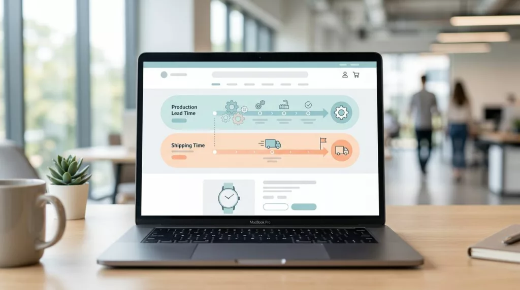
Lead Time Messaging UX for Made-to-Order Product Pages
A shopper buying a made-to-order product is not only judging the item, they’re judging the wait. If the timeline feels...

Product Document UX for Specs, Manuals, and SDS Downloads
Product documents can either remove doubt or create it. When a buyer needs a spec sheet, manual, or SDS file,...

Backorder Messaging UX That Keeps Shoppers Confident
Backorder pages lose trust when they hide the one thing shoppers want most, timing. If people can’t tell whether a...
Unit of Measure Selector UX for B2B Product Pages
A buyer who lands on the wrong unit of measure can place a costly order in seconds. On B2B product...
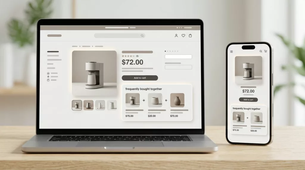
Frequently Bought Together UX That Increases Bundle Attach Rate
A bundle widget can sit on a product page and still do nothing. The difference is often not the offer...
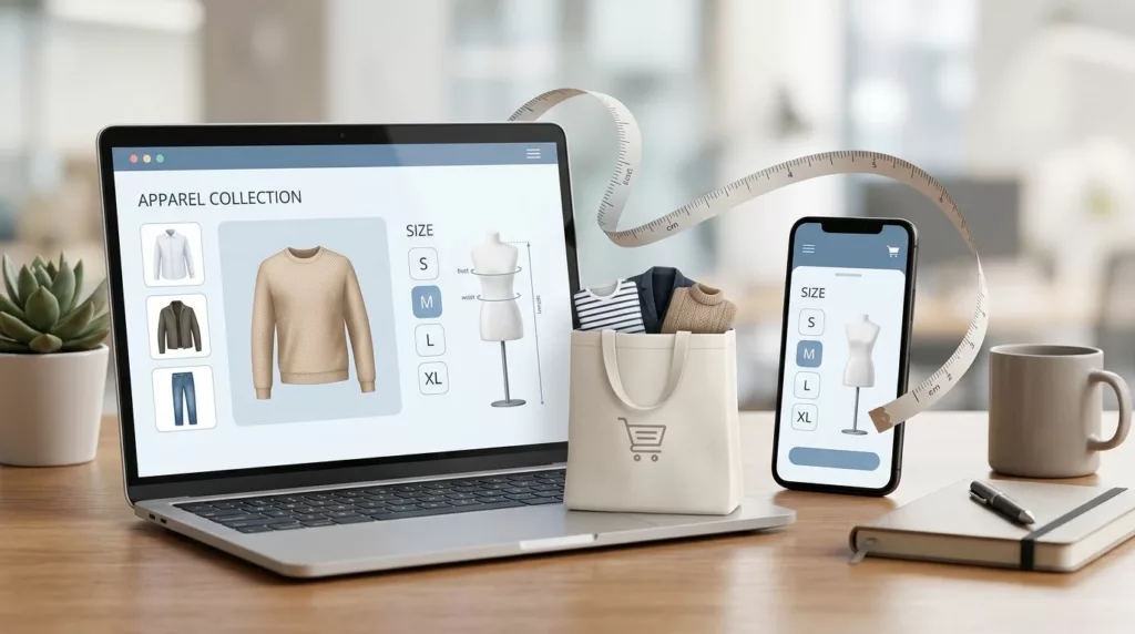
Fit Finder UX to Reduce Returns
In apparel e-commerce, returns usually start before checkout, not after delivery. When shoppers can’t tell how a garment will fit,...