
B2B buyers notice origin faster than many teams expect. A small line that says where a product is made can reduce doubt, or create it if the wording is vague.
On product pages, country of origin UX affects procurement reviews, tariff questions, and trust in the supplier. The best pages make that information easy to scan, easy to verify, and hard to miss when it matters.
Why origin details matter on B2B pages
In B2B, origin is not decoration. It shapes compliance checks, lead times, resale rules, and internal approval chains. The person on the page may not be the final decision-maker, so the page has to answer questions they will hear later.
That matters even more when the buyer is comparing vendors with similar specs. If one supplier states the manufacturing country clearly and another hides it in a PDF, the first one feels easier to work with. Transparency also fits broader B2B ecommerce behavior, where buyers want enough information to act without waiting on a rep.
A review on transparency in B2B supply chains links transparent information flow with both marketing and supply chain decisions. That does not mean overloading the page. It means showing the facts that help a buyer move.
The same logic appears in broader B2B ecommerce best practices, where self-service access and account visibility reduce back-and-forth. Origin messaging belongs in that same layer of trust.
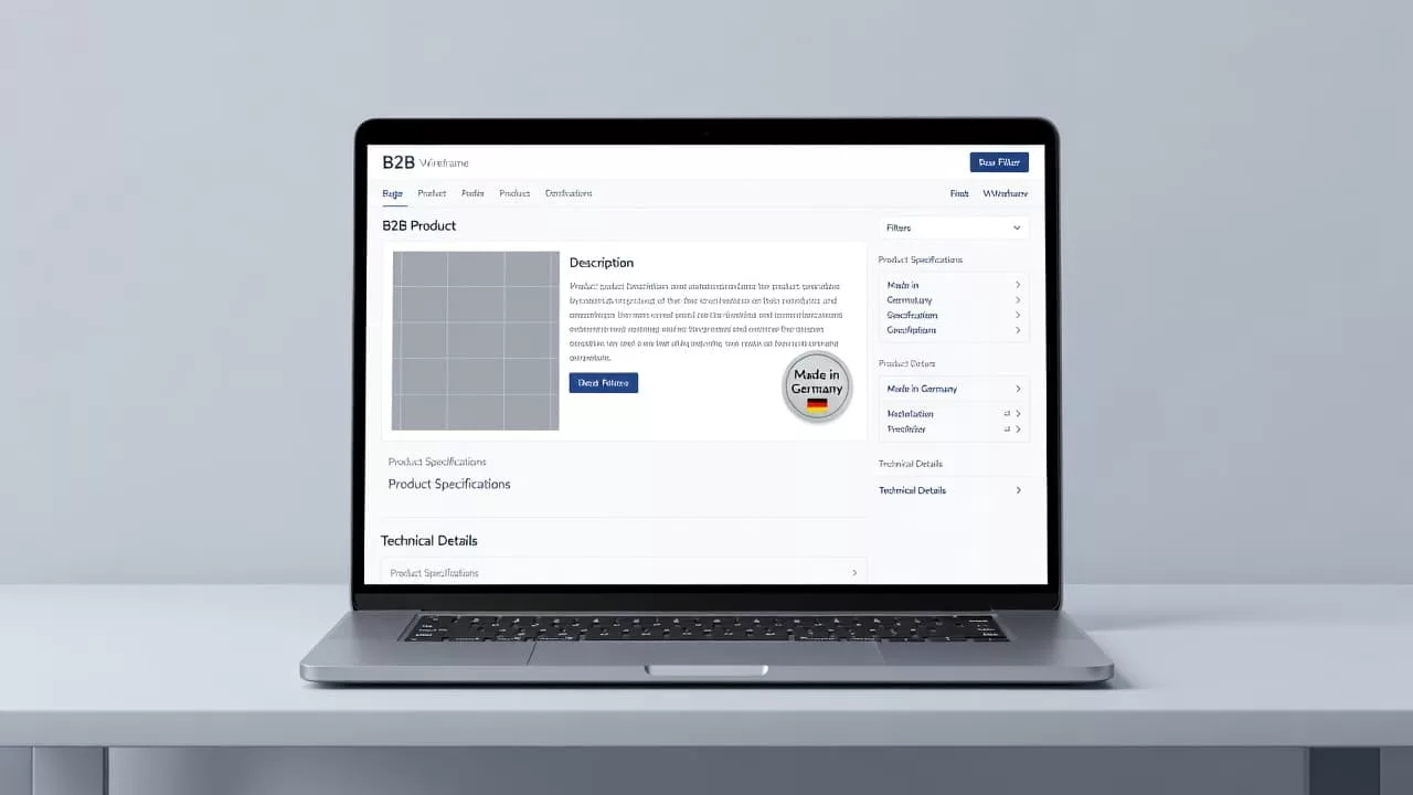
Where origin information belongs on the page
Buyers won’t hunt for origin details if the page hides them. Place the information where the purchase decision happens, near the title for quick reassurance, in the specs for documentation, and in the FAQ for edge cases.
A simple label can work well when the page already has strong product evidence. A weak page needs more support. Either way, the goal is the same, answer the next question before the buyer leaves.
| Placement | Best for | What to show |
|---|---|---|
| Above the fold | Quick trust check | “Made in Italy”, “Final assembly in Mexico”, an origin badge |
| Specs block | Procurement review | country of manufacture, materials, compliance docs, SKU variants |
| FAQ or accordions | Objections | mixed sourcing, country-specific availability, documentation |
| Shipping or lead-time area | Logistics planning | ship-from country, import notes, regional fulfillment |
The fastest path is the one that answers the next question without forcing another click. If the origin detail sits close to the CTA, it can support the same trust-building role as other proven tactics to increase product page conversions.
Copy patterns that build trust
Good origin copy sounds plain. It does not try to sound premium, patriotic, or clever. It tells the buyer what they need to know, then backs it up.
Use the right manufacturing label
The wording should match the reality of the supply chain. “Made in Germany” means something different from “Designed in Germany” or “Assembled in Germany.” Those phrases are not interchangeable, and buyers know it.
Use these patterns when they fit the product:
- “Made in [country]” when production happens in one place.
- “Final assembly in [country], components sourced globally” when the supply chain is mixed.
- “Manufactured in [country]” when you want a formal label for technical buyers.
- “Country-specific SKUs available” when the origin varies by market.
A short phrase is stronger than a polished slogan. “Manufactured in Poland” tells a buyer more than “built with European quality.” The first one helps procurement. The second one sounds like marketing.
Back the claim with proof
If the origin claim matters to procurement, it needs backup within one scroll.
That backup can take a few forms. A spec sheet, certificate of origin, compliance note, or country-specific availability chart all work. What matters is that the page gives buyers a path to verify the claim.
Origin copy also needs consistency. If the product page says one country and the spec sheet says another, buyers will pause. If the claim changes by SKU, say so on the page. Mixed sourcing is common, and clear wording handles it well.
For higher-value products, small proof cues matter. A note about testing standards, an export document link, or a clear support contact can calm a nervous buyer faster than a long paragraph. The point is not to add more words. The point is to add the right evidence.
Designing for procurement and self-serve buyers
Different readers use origin information in different ways. Procurement wants compliance and supplier risk details. Sales wants a short, repeatable answer. Operations wants lead times and fulfillment facts. The page has to support all three.
That is where a focused FAQ module helps. If your sales team answers the same origin question every week, move it onto the page. A good module answers the question in a sentence or two, then links to backup if needed. For layout ideas, see product page FAQ UX, where the goal is to remove friction before the buyer asks for help.
Useful FAQ topics include:
- Where is the product manufactured?
- Is final assembly done in a different country?
- Can you provide a certificate of origin?
- Do country-specific versions exist?
- Which markets does this SKU support?
That list keeps the page useful without turning it into a policy manual. It also helps sales teams stay consistent. When the page already states the answer, reps spend less time repeating basic facts and more time on the deal itself.
Mistakes that weaken origin messaging
The biggest mistake is vagueness. Phrases like “international quality” or “global sourcing” sound polished, but they leave the buyer guessing. If the country matters, say the country.
Another common problem is visual burying. Tiny footnotes, low-contrast badges, or a line hidden below the fold make the message easy to miss. If origin is important to the sale, it deserves real visual weight.
Inconsistent wording causes trouble too. A product page, brochure, and checkout flow should not tell different stories. Buyers in B2B often cross-check details across teams. They notice mismatches fast.
A simple testing routine helps:
- Scan sales calls and support tickets for repeated origin questions.
- Check whether buyers click the badge, spec sheet, or FAQ link.
- Compare conversion behavior when origin sits near the CTA versus inside the specs.
- Review pages for SKU-level differences, then fix any vague language.
Small changes often show up quickly. If a clear badge increases FAQ clicks or reduces pre-sale questions, the page is doing its job. If it confuses buyers, the wording or placement needs work.
Teams that treat this as part of broader creating conversion-focused product page experiences usually spot the friction sooner. Origin messaging is not a side note. It is part of the buying flow.
Conclusion
B2B buyers want a straight answer about where a product comes from, and they want it without a search party. Clear country of origin UX gives them that answer in the right place, with the right level of proof.
The strongest pages use plain manufacturing language, place the message near the decision point, and support it with specs or FAQs. When the page does that well, origin stops feeling like a risk and starts feeling like a reason to trust the vendor.
Start with the first question your buyer will ask, then make sure the page answers it before they need to ask again.