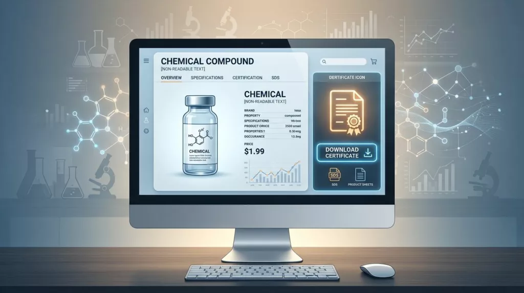

A COA download looks small on a product page, but it often decides whether a buyer keeps moving or leaves with doubts. In chemicals, people are not just hunting for a PDF. They want proof that the batch, grade, and revision match what they need.
That matters because a certificate of analysis does a different job than an SDS, TDS, or spec sheet. If those files sit in one vague download box, users waste time and trust drops fast. The right certificate of analysis UX makes the file easy to find, easy to verify, and hard to confuse with anything else.
Why the COA needs its own place on the product page
A COA answers a narrow question: does this specific batch meet the stated specs? That is why it should not hide inside a generic “Documents” section with every other file your team has uploaded over the years.
Buyers scan product pages in a hurry. QA teams look for batch evidence. Procurement wants to confirm the right document is attached to the right item. When those users land on the page, the COA should feel like a direct path, not a scavenger hunt.
Place the COA near the technical details or close to the main buy area. That keeps the file visible when users are already checking grade, pack size, and availability. If your product page also holds SDS and TDS files, give each one a clear role. The download area should answer, “Which file do I need for this task?”
If your document set is broad, the structure in product document UX for specs, manuals, and SDS downloads helps keep each file type in its lane without making the page feel crowded.
Use labels that tell users what they are getting
File names and labels do a lot of heavy lifting. A weak label forces users to open the file first, then guess whether it helps them. A strong label removes that extra step.
Use plain, task-based names. “Certificate of Analysis” is better than “COA file 2026-04”. If the document is batch-specific, say so. If it is current only for one lot, make that visible before the download starts.
| Document type | What the user needs | Better label on page | Best placement |
|---|---|---|---|
| COA | Batch results, test values, issue date | Certificate of Analysis (Batch 24071) | Near batch details or download area |
| SDS | Hazards, PPE, storage, first aid | Safety Data Sheet (SDS) | Safety or compliance section |
| TDS | Performance, applications, handling | Technical Data Sheet (TDS) | Technical specs or resource area |
| Spec sheet | Dimensions, purity, packaging, limits | Specification Sheet | Near the product specifications table |
The takeaway is simple. Users should know the document type, version, and relevance before they click. When they do click, the file name should match the on-page label so the download feels predictable.
Naming conventions matter outside the UI too. Internally, a file might follow a pattern like product name, batch number, revision date, and document type. On the page, show the human-friendly version first. Buyers do not want to decode a storage rule.
If you also present product attributes in a specs grid, product specification table UX can support the download area by putting the most important technical facts in view before the PDF opens.
Make batch traceability obvious
Batch traceability is the heart of COA UX. A user should not have to wonder whether the file belongs to the current lot or an old one. That uncertainty slows approvals and creates back-and-forth emails.
The page should show the batch or lot number, issue date, and document status near the download button. If a COA is only valid for one lot, say that plainly. If the same product has multiple active batches, let the user choose the correct one before downloading. A COA without a visible batch match feels incomplete.
A generic download button works for marketing collateral. A COA needs a path that proves the batch, version, and date in one glance.
A solid batch flow usually includes three things. First, default to the latest approved COA. Next, let users switch to other lots if they need history. Finally, keep archived files available behind a secondary link, not mixed into the main path.
That structure also supports audit-minded buyers. They want confidence that the file they send downstream is the right one, and they want to keep the page uncluttered while doing it.
The page should also show whether the document is current, superseded, or archived. That small badge saves time. It also reduces the chance that a buyer sends an outdated file to a customer or internal reviewer.
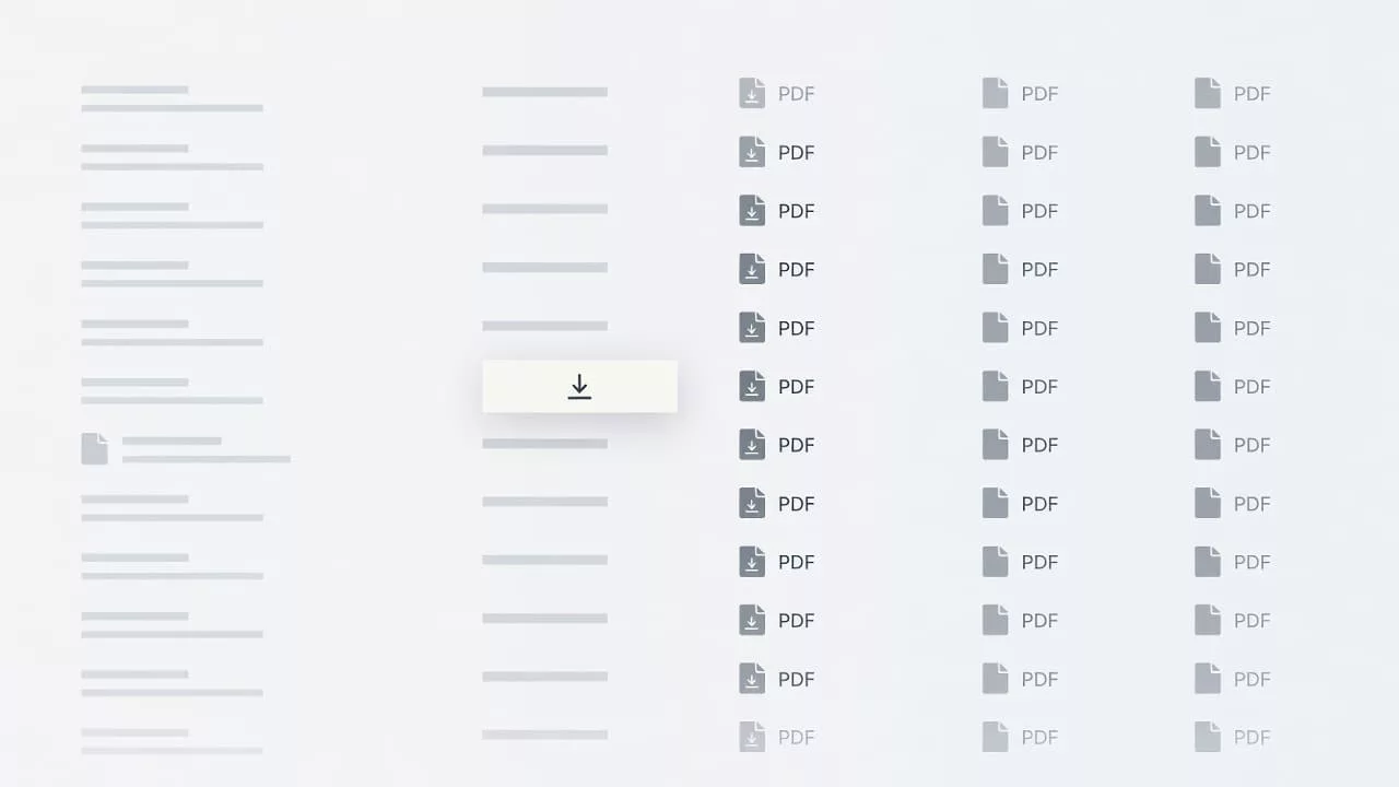
Help users search and filter documents without friction
A single download button works only when the product has one or two files. Chemical product pages often have more. That is where search and filters matter.
Users should be able to filter by document type, batch or lot, revision date, region, and language when those options exist. They should also be able to sort by latest version first. Most people want the current COA in front of them without reading a long list.
Useful filters for chemical product pages often include:
- Document type: COA, SDS, TDS, spec sheet, allergen statement, or other support file
- Batch or lot: especially for batch-controlled materials
- Revision status: current, superseded, archived
- Language or region: useful for global buyers
- Issue date: helpful when a user needs the latest approved file
Keep the search box close to the file list and let it search the visible document name plus the batch number. Many users remember the lot, not the exact file title. They should still land on the right result fast.
A good document panel also uses simple grouping. Group by task, not by upload date. For example, put COAs together, safety files together, and technical references together. That matches how buyers think. It also works better than a long list sorted by whatever happened to be uploaded last.
Reduce friction for buyers, QA, and procurement
Different users need different proof, but they all want less work.
Buyers want a quick answer. QA teams want the right revision and batch. Procurement wants a clean record that matches the order. The page should support all three without making anyone dig through extra steps.
A few details make a big difference:
- Show file size and format before the download starts, so users know what they are opening.
- Keep the download button visible on desktop and mobile, not buried below long product copy.
- Use a clear state when the file is loading or unavailable.
- If login is required, say so before the click.
- If access is restricted to approved customers, explain that near the button instead of surprising the user after the click.
Accessibility matters here too. Buttons need strong contrast, clear focus states, and keyboard access. A buyer reviewing documents on a laptop in a warehouse office should not fight the interface just to grab a PDF.
The best pages also pair the COA area with the core product facts. When users can see the spec summary, current availability, and document links in one view, they spend less time switching between tabs. That is where the page starts to feel efficient.
Build the document area around the task, not the archive
Many chemical sites treat downloads like file storage. That habit creates clutter fast. The better model is task-based. Ask what the user is trying to confirm, then place the right document in front of them.
A COA belongs in a visible, high-trust spot. The label should be specific. The batch number should be obvious. The file list should be searchable. The latest version should win by default. Those choices do more than tidy the page. They help the buyer finish the job without opening five tabs.
When the page respects the way chemical teams work, it feels easier to use and easier to trust. That is the real goal of certificate of analysis UX on product pages.
Conclusion
COA downloads work best when they feel exact, not generic. The page should tell users what the file is, which batch it belongs to, and whether it is current before they click.
Clear labels, strong batch traceability, and simple filters reduce friction for buyers, QA teams, and procurement users alike. When the COA sits in the right place and looks like it belongs there, the whole product page feels more reliable.