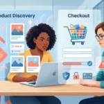
Online Store Launch Checklist for the First 30 Days
Opening an online store is only the beginning. The first orders can reveal broken payment flows, confusing product pages, shipping...
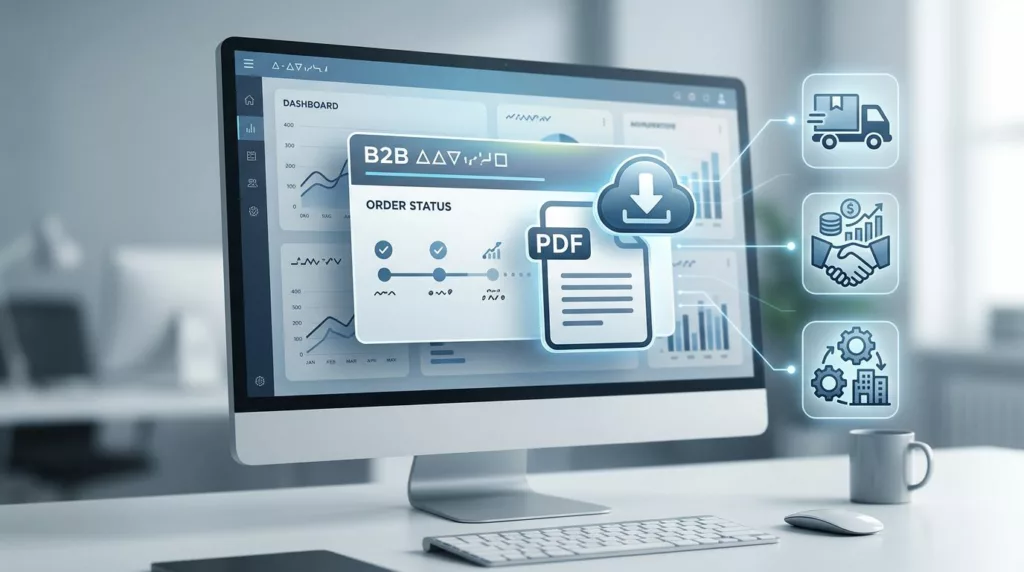
Order Acknowledgment Download UX for B2B Portals
When a buyer needs an order acknowledgment, they usually need it right away. They are checking a PO match, confirming...
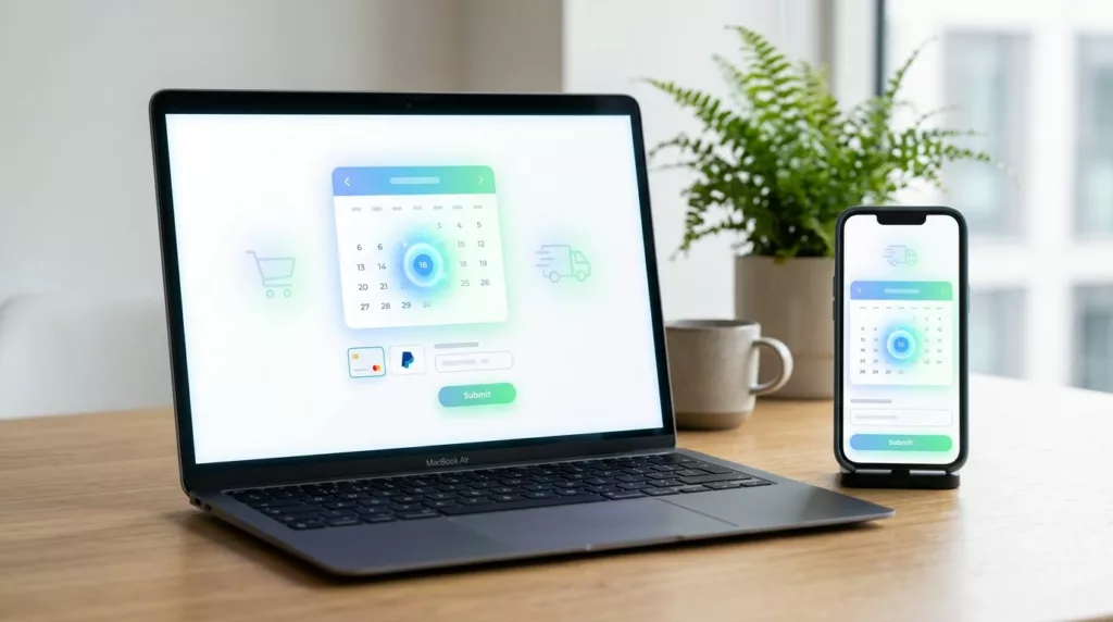
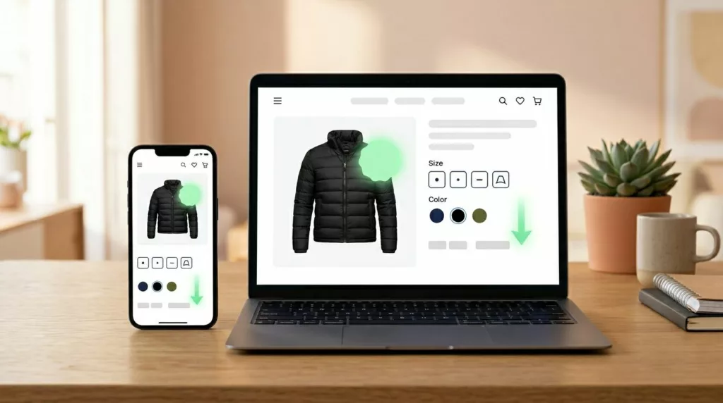
Delivery Date Picker UX for Ecommerce Checkout in 2026
A delivery date picker can do more than set expectations. It can decide whether a shopper feels confident enough to...
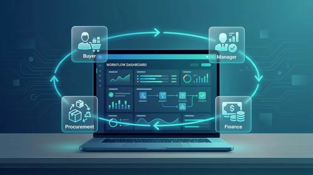
Order Approval Workflow UX for B2B Ecommerce Teams
A slow approval flow can stop a B2B order before it starts. The buyer may be ready, but the workflow...
Partial Shipment Tracking UX That Reduces Support Tickets
Partial shipments are where order tracking pages lose people. A shopper sees one box on the way, one item delayed,...

Warranty Page UX That Builds Trust on High-Ticket Stores
A warranty page can calm a nervous buyer or make them back out. On high-ticket products, that page often carries...
Price Drop Alert UX That Brings Shoppers Back to Buy
A price cut can pull a shopper back faster than most campaigns. Still, the alert only works when it feels...

Contact Page UX That Gets Shoppers to the Right Help Fast
A contact page can save a sale or stall one. When every shopper lands on the same generic form, pre-purchase...
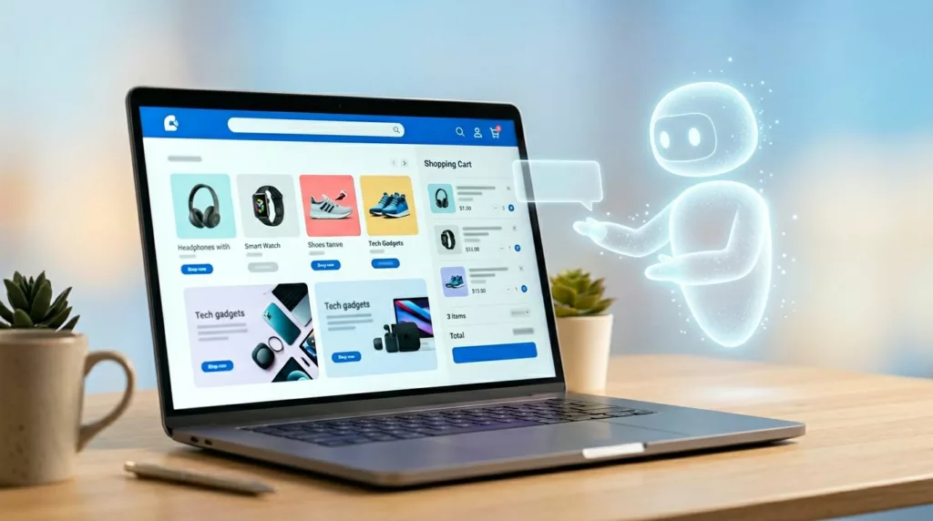
AI Shopping Assistant UX That Helps Without Taking Over
A shopping assistant that talks too much feels like a pushy sales clerk. One that acts on its own feels...
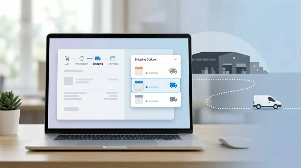
Shipping Option Selector UX That Prevents Delivery Mistakes
A shopper picks “Free Shipping” and expects it next week. Your warehouse treats that method as economy mail, the cutoff...