
A warranty page can calm a nervous buyer or make them back out. On high-ticket products, that page often carries more weight than a banner, a badge, or a promo offer.
People spending serious money want proof that the product will hold up and the brand will stand behind it. If the warranty page feels vague, buried, or hard to scan, trust drops fast. Good warranty page UX makes the promise clear before doubt turns into hesitation.
Why warranty pages matter more when the price is high
A buyer who spends $80 may skim your policies. A buyer who spends $1,800 reads them like contract terms. That’s because the risk feels different. The product may be large, technical, custom, or hard to return, so the warranty page becomes part of the purchase decision.
For premium ecommerce brands, the page does more than explain coverage. It answers a quieter question: “If something goes wrong, will this company take care of me?” That question shapes confidence at the edge of checkout.
This is why the page should not sit in a legal corner of the site. It should feel like a buying aid. The tone, layout, and structure all need to reduce effort. Shoppers should find the answer in seconds, not after three scrolls and a support email.
When your warranty page is clear, it also supports the rest of the funnel. It lowers pre-sale anxiety, reduces repeat questions, and gives sales and support teams a shared source of truth. That consistency matters, because trust breaks when the site says one thing and support says another.
The page elements that make warranty details feel believable
The strongest warranty pages are easy to scan and hard to misread. They use short blocks of text, clear labels, and plain terms. They also put the most important facts near the top.
A helpful warranty page usually includes these pieces:
| Page element | What it reassures | Good pattern |
|---|---|---|
| Coverage summary | What is protected | One short paragraph and 3 to 5 bullets |
| Time frame | How long the protection lasts | Plain language like “2 years” or “lifetime frame coverage” |
| Claim steps | What happens if there is a problem | Simple step list with one clear action |
| Exclusions | What is not covered | Direct wording, placed near the summary |
| Contact path | How to get help | Visible email, form, or service link |
The summary does the heavy lifting. It should answer the first question fast. What is covered? For how long? Who handles the issue? If a buyer has to hunt for those answers, the page feels weak.
Icons can help, but only when they support the text. A repair icon next to “free parts replacement” adds clarity. A wall of decorative icons adds noise. The same goes for accordions. They work well on long policy pages, but the top of the page still needs a clear overview.
If the buyer can’t tell what the warranty covers in one glance, the page is already working too hard.
The best pages also use honest detail. If only certain parts are covered, say so. If labor is included but shipping is not, say that too. Clear limits often build more trust than broad claims.
Write warranty copy that answers the buyer’s real questions
The copy should sound like a helpful specialist, not a legal notice. Use short sentences. Replace vague phrases with concrete ones. “Protected against manufacturing defects” is stronger when paired with an example. “Covers defects in the frame, motor, or stitching” gives people something they can picture.
A warranty page also works better when it uses the same language buyers already saw on product pages and FAQs. If your product page FAQ for conversion lifts explains returns, shipping, or care, the warranty page should not introduce new terms for the same ideas. Consistency lowers mental load.
That matters for high-ticket products because buyers compare details. They want to know whether the warranty starts at purchase or delivery, whether registration is required, and whether repairs or replacements come first. Answer those questions before they email support.
Here are a few copy moves that help:
- Use one term for each idea. If you say “coverage period,” keep using that phrase.
- State the claim process in steps. “Submit photos, wait for review, receive next steps.”
- Name the exceptions early. Final sale items, misuse, and normal wear should not hide at the bottom.
- Show examples. A single line like “Scratches from delivery are covered if reported within 48 hours” feels real.
- Match the page tone to the product. A luxury furniture brand should sound calm and exact, not salesy.
You can also borrow trust from nearby policy pages. If your trust signals that work on ecommerce pages already show payment security, shipping clarity, and support options, your warranty page should echo that same directness. The buyer should feel one brand voice across every trust touchpoint.
Put warranty details where shoppers already look
A great warranty page loses power if shoppers never reach it. Placement matters. On high-ticket stores, the right move is to surface a short warranty summary in a few key places, then link to the full page.
The product page is the first place to look. A compact summary near price, reviews, or shipping details can answer common fears before the shopper scrolls away. For bigger purchases, a short line like “2-year limited warranty on frame and hardware” can do a lot of work.
Checkout matters too. If a warranty affects confidence, it should not appear only after payment. A short reminder in cart or checkout can reduce second thoughts. This is especially useful when the item is expensive, custom, or shipped in a way that creates worry. For related guidance, checkout UX fixes that reduce abandonment shows how small trust cues can protect the final step.
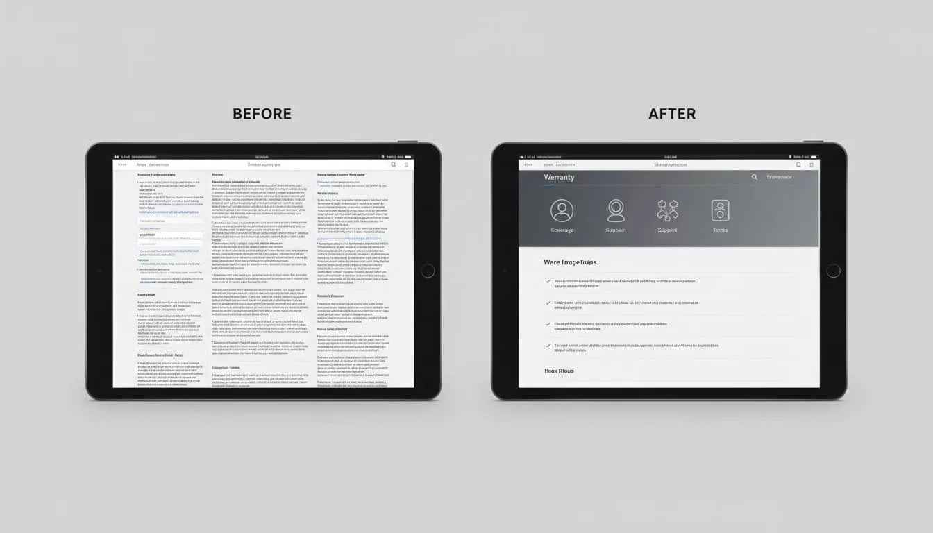
Mobile needs extra care. Most warranty pages are hard to read on a phone when they are built like legal documents. Long paragraphs, tiny type, and weak spacing make people bail. Instead, keep the summary first, use tap-friendly accordions, and make the claim action obvious.

On mobile, the page should feel calm, not crowded. One short summary, one main action, and one clear path to full details are usually enough. If the page fights for space with a sticky button or a long policy block, the design is working against trust.
A warranty page also works better when it sits near related policies. Shipping, returns, and warranty details often belong in the same mental bucket. If your returns and shipping policy page design already explains edge cases clearly, use the same structure and vocabulary here. That way, the buyer sees a single, coherent support story.
Common warranty page mistakes that push buyers away
Many warranty pages fail in the same ways. The problems are small on paper, but they feel big to a shopper with money on the line.
One common mistake is leading with legal language. If the first screen reads like a contract, people stop reading. Another is hiding exclusions deep in a dropdown. That feels like a trap, even when the policy is fair.
A third issue is page clutter. Too many badges, too many icons, and too many side notes can make the page feel uncertain. Clarity is a trust signal. So is restraint.
The comparison below shows the difference a clean warranty page can make:
| Weak pattern | Better pattern |
|---|---|
| Dense paragraphs at the top | Short summary first, details below |
| Hidden exclusions | Clear exclusions in plain language |
| No claim steps | Simple, visible process |
| Tiny mobile text | Large, readable sections |
| Decorative trust badges only | Trust badges plus real policy detail |
The fix is usually not more content. It’s better ordering. Put the answer first, the proof second, and the edge cases close behind. If the warranty page still feels flat, compare it with the rest of your purchase flow. A weak policy page can undo the work done by strong product copy and polished checkout design.
Conclusion
High-ticket buyers want proof, not promises. A strong warranty page gives them both by making coverage easy to scan, easy to understand, and easy to trust.
If the page answers the main questions fast, matches the language across your site, and works well on mobile, it lowers friction right before the purchase decision. That’s where warranty page UX earns its place, not as a legal page, but as part of the conversion path.