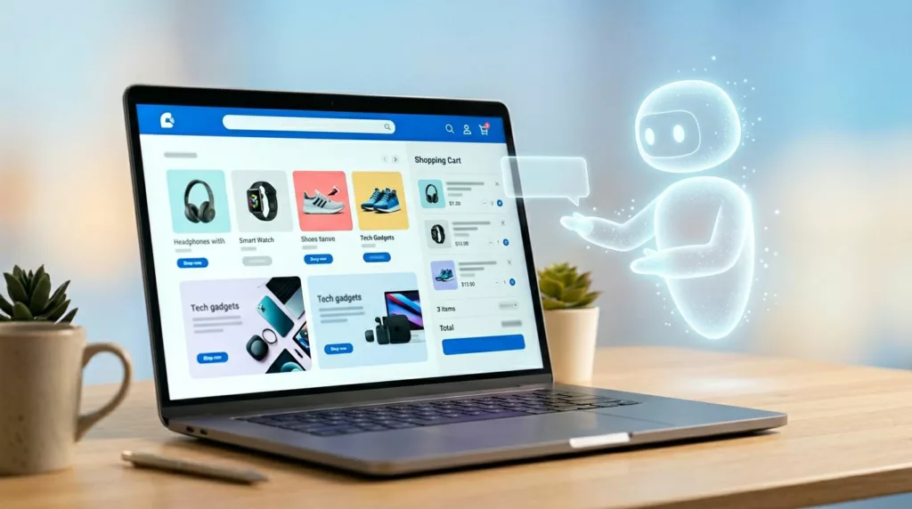

A shopping assistant that talks too much feels like a pushy sales clerk. One that acts on its own feels worse.
The best AI shopping assistant UX in 2026 doesn’t run the journey. It removes friction at the moments where shoppers get stuck, then steps back. For ecommerce teams, that means designing help that is assistive, visible, and always under user control.
The hard part isn’t adding AI. It’s giving it a narrow job and clear limits.
Give the assistant a job description, not the wheel
Autonomy sounds strong in demos. In commerce, it often breaks trust. Shoppers don’t want a bot steering them toward a higher-margin item, changing the cart, or hiding other options.
Good AI shopping assistant UX reduces decision effort, but it never takes ownership of the decision.
That principle shapes when the assistant should ask, suggest, summarize, or stay quiet. If you treat every moment like a conversation, the UI turns into noise. If you wait for the right moment, the assistant feels more like a smart layer over the store.
This quick framework keeps the role clear:
| Assistant move | Use it when | Best pattern | What to avoid |
|---|---|---|---|
| Ask | Key context is missing | Short chips or one-tap prompts | Open-ended chat at first load |
| Suggest | Intent is clear, risk is low | Inline recommendation with reason | Auto-adding items or auto-selecting options |
| Summarize | The shopper is comparing or hesitating | Side panel, comparison strip, or recap card | Long text blocks or vague claims |
| Stay quiet | The shopper is moving smoothly | Passive availability | Popups, repeated nudges, or forced prompts |
The rule is simple. Ask only when missing context blocks progress. Suggest when the user can accept or ignore the help in one tap. Summarize when the assistant can shrink cognitive load. Stay out of the way when the shopper already has momentum.
That is also where many generic chat widgets fail. A floating “How can I help?” message rarely matches intent. Algolia’s virtual assistant UX guidance makes a similar point: context beats generic prompts because shoppers need relevant help, not another greeting.
Interface patterns that guide discovery without hijacking it
Guided discovery works best as a short path, not a blank chat box. On a category page, the assistant can ask one or two focused questions such as use case, size range, or budget band. That keeps shoppers in browse mode while reducing the set. For professional teams, this is usually a filter layer with natural language support, not a full-screen assistant.
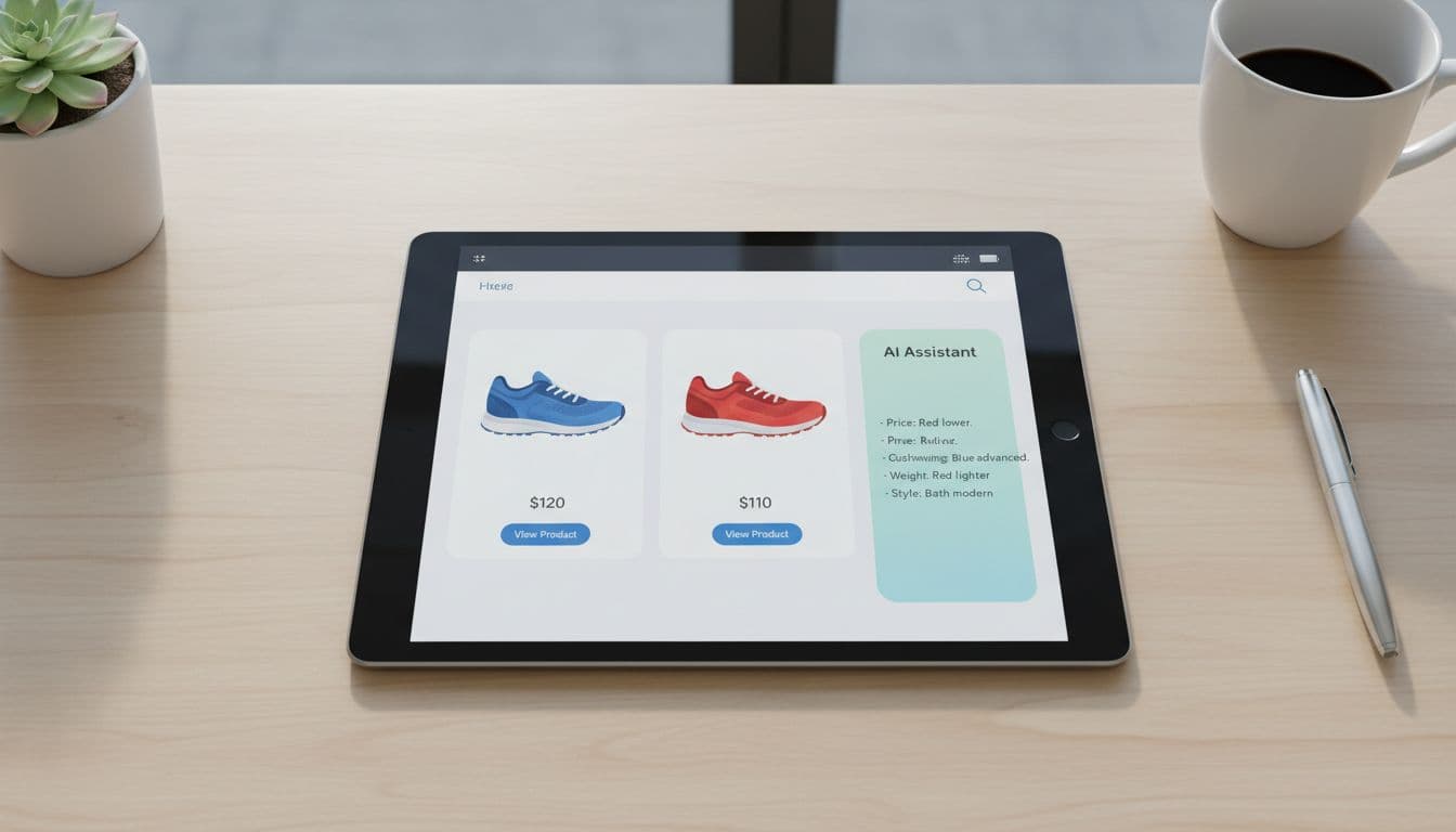
Comparison help is where AI earns its keep. Product grids force shoppers to bounce between tabs, specs, and reviews. A better pattern lets users pick two or three items, then shows a plain-language summary of the biggest differences. Keep the source data visible nearby so the assistant doesn’t become a black box. The same logic behind contextual product suggestions applies here: relevance should be obvious at a glance.
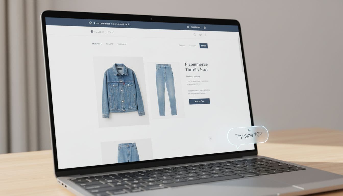
Fit and size help is another strong use case, but only if the system explains itself. “Recommended size M” isn’t enough. Show why, such as past purchases, brand sizing patterns, or customer return data. Ask permission before using order history or body-profile inputs, and make the recommendation easy to override. Recommend, don’t lock.
Teams should also tighten the product page itself. If attributes are messy, the assistant can’t explain differences well. Oddit’s take on product pages for AI shopping assistants is useful here because structured product content improves both discovery and assistant output.
Budget-aware help, checkout support, and the trust layer underneath
Budget-aware recommendations can feel thoughtful or creepy. The difference is consent. If a shopper sets a price cap, the assistant can respect it across search, comparison, and cart. If the system infers a budget from behavior and pushes “smart savings” without asking, trust drops fast.
Checkout support follows the same rule. The assistant should answer, confirm, and reduce risk. It can flag duplicate items, explain shipping tradeoffs, remind the shopper about return windows, or point out that a lower-cost variant meets the same need. It should not restart discovery once the shopper is trying to pay. The restraint seen in good cart upsell UX strategies applies here too.

Trust depends on a few plain rules. Tell users when AI is active. Explain why it suggested something. Offer an easy off switch. Keep privacy controls close to the feature, not buried in account settings. For accessibility, make prompts keyboard reachable, announce updates for screen readers, and never rely on color alone to show state or confidence.
When the model is uncertain, the assistant should admit it. That is better UX than bluffing. A graceful fallback might say, “I may be wrong here,” then hand the shopper standard filters, a size chart, or human support. Research in UserTesting’s guide to AI-powered shopping experiences points to the same pattern: people accept AI help more easily when they can see what it knows, what it doesn’t, and how to stay in control.
Shoppers don’t want an AI co-pilot gripping the wheel. They want faster choices, clearer tradeoffs, and a safe way to say no.
That is the bar for AI shopping assistant UX in 2026. The teams that meet it will design AI as helpful infrastructure, not as the star of the screen.