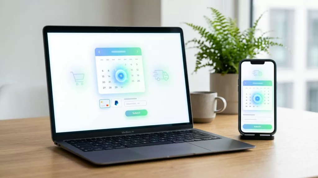
A delivery date picker can do more than set expectations. It can decide whether a shopper feels confident enough to finish checkout.
In 2026, people want clear dates, not vague shipping promises. They also expect the date to update when shipping method, inventory, or location changes. If that experience feels uncertain, cart abandonment rises and support tickets follow.
The good news is that delivery date picker UX is one of the clearest checkout fixes you can improve. Small changes to timing, clarity, and mobile behavior can lift conversion without adding friction elsewhere.
Why delivery dates now shape checkout performance
Delivery dates sit close to the final buy decision, so they carry a lot of weight. Shoppers often compare two stores with the same product and price, then choose the one that tells the truth about arrival.
That matters because uncertainty is expensive. If your checkout hides delivery timing until the last screen, people hesitate. Some leave. Others complete the order and contact support when the package does not arrive as expected.
This also affects the rest of the checkout flow. A weak delivery step can make the whole path feel unreliable, even if the payment form is clean. That is why delivery date design belongs in the same review as your other proven checkout UX fixes.
A strong picker helps in three ways. It gives shoppers confidence, reduces last-minute surprises, and lowers the number of “Where is my order?” emails later. That is a direct business win, not just a design polish item.
What a good delivery date picker has to show
The best pickers answer a simple question fast: when can I get this, and can I trust that answer?
A vague label like “Standard shipping” leaves too much open to interpretation. A clear date, such as “Thu, May 23,” sets a real expectation. That shift is small on the page, but large in the shopper’s mind.
Here is a simple way to think about the difference.
| Weak pattern | Better pattern | Why it matters |
|---|---|---|
| “2 to 5 business days” | Exact delivery date | Gives a concrete promise |
| Hidden cutoff time | Visible cutoff message | Reduces surprise and regret |
| Dates shown only at checkout | Dates shown on product and cart pages | Builds confidence earlier |
| Disabled dates with no reason | Disabled dates with plain-language reason | Cuts confusion and support questions |
The stronger pattern is usually the one that feels honest. If a date is unavailable, say why. If a faster option exists, surface it early. If a shopper changes ZIP code or shipping method, refresh the date right away.
The best picker answers three questions fast, when can I get it, can I choose that date, and why not if I can’t?
This is also where defaults matter. Preselect the earliest valid date or the most common option. That saves taps and keeps the flow moving.
Design patterns that work on desktop and mobile
A good date picker does not need to look fancy. It needs to be fast to scan and hard to misuse.
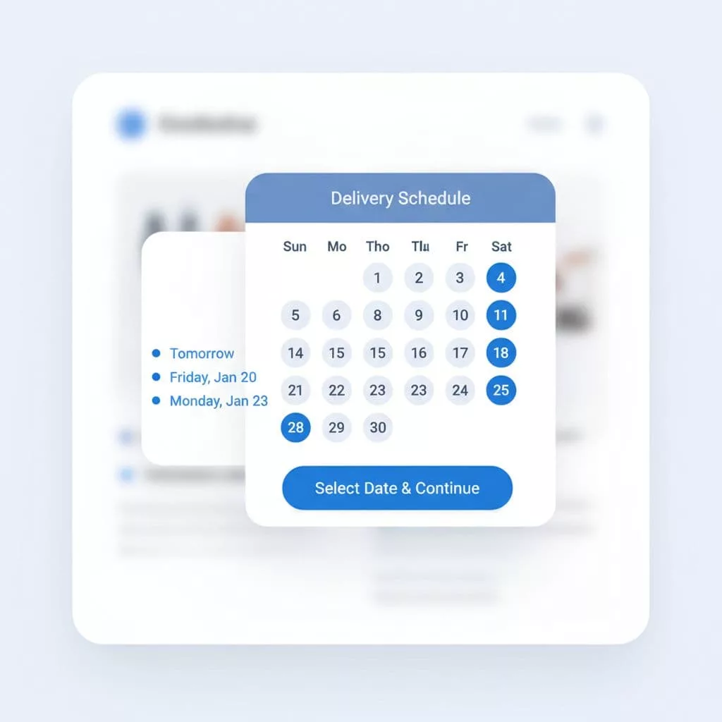
On desktop, an inline calendar works well when shoppers have a few clear choices. On mobile, a compact list of date chips often performs better because it reduces scrolling and tap errors. Both patterns can work, but each one needs a different level of restraint.
Use the simplest pattern that fits the order type.
| Pattern | Best for | Watch out for |
|---|---|---|
| Inline calendar | Orders with many valid dates | Can feel crowded on small screens |
| Quick date chips | Fast choice between a few options | Needs enough spacing for touch input |
| Delivery window selector | Home delivery with time slots | Too many slots can slow the decision |
| Pickup and delivery toggle | Stores with mixed fulfillment | Must update dates as soon as the mode changes |
Cutoff messages deserve special attention. A short note like “Order in 2 hours for delivery tomorrow” works better than a long explanation. It gives urgency without sounding pushy.
This is also where placement matters. If the date promise appears on the product page, cart, and checkout, shoppers feel less risk. That helps the whole flow, especially in checkout formats covered in one-page vs multi-step checkout.
A strong mobile experience needs big tap targets, short labels, and no tiny calendar cells. It should feel easy with one thumb, not with a mouse in mind.
Accessibility and edge cases that can break trust
A delivery picker can look fine and still fail real users. Accessibility issues are easy to miss because they often hide in the details.
Keyboard users need a clear focus state and a logical order. Screen reader users need dates announced in plain language, along with whether a date is available or disabled. Color alone should never carry meaning, because many users will not see the difference.
Mobile shoppers need the same care. That means enough spacing between dates, readable text, and a layout that doesn’t jump when the calendar opens. If the chosen date moves the page around, people tap the wrong thing.
You should also handle edge cases with the same clarity. Holidays, weather delays, and warehouse cutoffs all affect delivery promises. When that happens, explain it in simple language. Don’t hide the rule behind a system message.
Timezone handling matters too. Local delivery and pickup need a clear timezone, especially if your store ships across regions. A shopper should never wonder whether “tomorrow” means their local day or your warehouse’s day.
If your checkout also shows order totals and delivery timing on the same screen, mobile users get a better sense of the full cost and schedule. That is why improving mobile checkout summaries often pairs well with a better date picker.
How to measure whether the picker is working
You do not need a giant research project to see if the new flow helps. You need a few clean measures and a baseline.
Start with these metrics:
- Checkout completion rate: Watch whether more shoppers finish after the date picker changes.
- Cart abandonment rate: Look for drops after you make delivery timing clearer.
- Date selection error rate: Track how often users pick an unavailable date or change it later.
- Support contacts about delivery: Measure tickets tied to arrival dates, missed windows, or unclear timing.
- Time to complete checkout: A better picker should not slow people down.
A/B tests work well here if you keep the change focused. Test one date flow against another, not a pile of unrelated checkout edits. If you change copy, placement, and default logic at once, you will not know what helped.
The best result is not just higher conversion. It is fewer shoppers stopping to think, fewer support messages later, and fewer abandoned carts caused by uncertainty. That is a clean business case for the feature.
Conclusion
A strong delivery date picker gives shoppers what they want most in checkout, certainty. It shows a real date, updates when conditions change, and works well on mobile and for assistive tech users.
That clarity pays off in higher conversion, fewer abandoned carts, and less delivery-related support. In a checkout where every click matters, the date picker should feel like a reliable answer, not another point of friction.
If the opening line of your checkout still feels uncertain, this is one of the first places to fix.