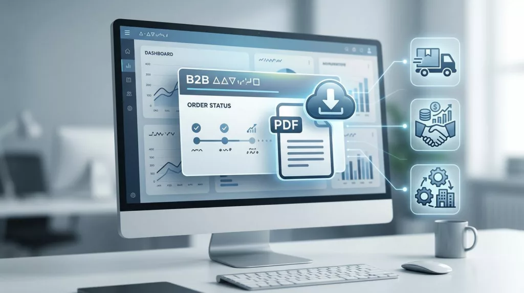

When a buyer needs an order acknowledgment, they usually need it right away. They are checking a PO match, confirming ship details, or sending proof to finance.
If the file is hard to find, the portal loses trust fast. A strong order acknowledgment portal makes the document easy to locate, easy to verify, and easy to share across procurement, AP, and account teams.
Why order acknowledgments need first-class placement
An acknowledgment is not a nice extra. For many B2B accounts, it is part of the daily workflow. It confirms what was ordered, what was accepted, and what is moving through the process.
That means the download should sit close to the order status, not buried in a generic documents area. Buyers often think in order numbers, PO numbers, ship-to locations, and dates. If the portal mirrors that logic, people move faster and support gets fewer “where is my PDF” tickets.
General B2B ecommerce guidance still applies here, and 7 ecommerce UX best practices for B2B businesses is a useful reminder that clarity matters more than decoration. The same idea fits document access. Users want the right action in the right place.
Acknowlegment access also affects trust. When a portal gives quick access to order proof, buyers feel more in control. When it hides the document, they assume the portal is incomplete.
Put the download where people already work
The cleanest pattern is simple. Put the acknowledgment on the order detail page, near the status, tracking, and line items. If a user can see the order, they should be one click away from the file.
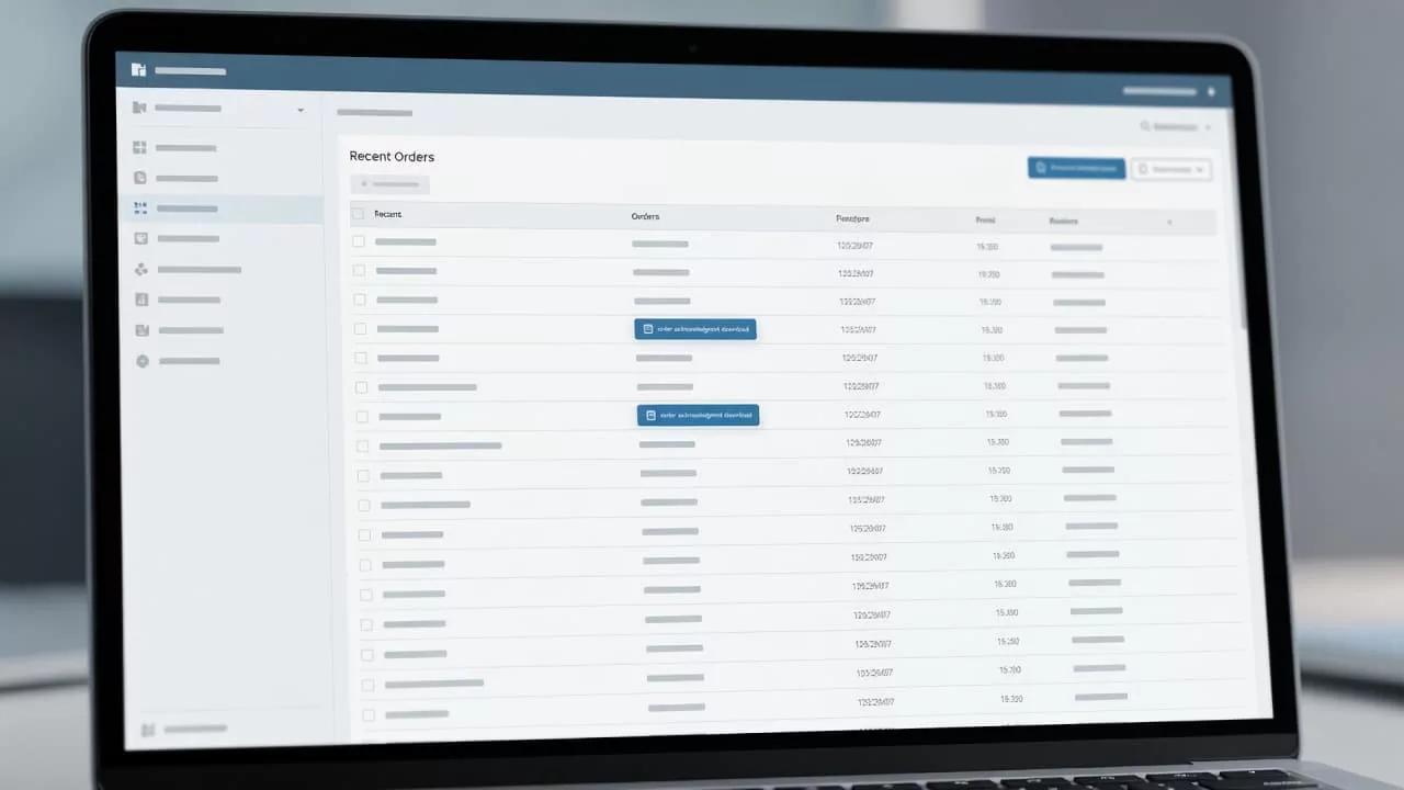
That layout works because it follows the user’s intent. They came for one order, so the portal should not send them hunting through tabs. A visible “Download acknowledgment” action keeps the task short.
The download should also explain itself. A small label such as “PDF acknowledgment” works better than a vague file icon. Add the order number, acknowledgment date, and version if the document can change. That way, users know they have the current copy.
A search bar helps too, but only when it supports real B2B behavior. People may search by PO number, partial customer name, or ship-to site. If the portal only searches by its own internal order ID, it will miss how teams work in practice.
Creating effective repeat purchase experiences is usually discussed in retail terms, yet the same principle applies here. The most useful account pages answer a basic question fast, then get out of the way.
Build a download flow that feels predictable
A good acknowledgment download flow feels plain in the best way. The user clicks, the file opens, and the name makes sense when saved.
That sounds simple, but many portals still get it wrong. Some hide the file behind three menus. Others open a blank page first or force a second login. A few generate a file name that nobody can tell apart later.
Here is a quick comparison of common patterns.
| Friction point | What the user experiences | Better UX pattern |
|---|---|---|
| Hidden download action | Users hunt through menus | Place the button on the order detail page |
| Vague file name | Files get lost in downloads folders | Use order number, PO number, and date |
| No feedback after click | Users wonder if the file worked | Show a clear loading state and success message |
| No filters in order history | AP teams waste time scrolling | Add PO, date, ship-to, and status filters |
The takeaway is clear. The best flow reduces doubt at every step. Users should know where the file is, what it contains, and whether the download worked.
That matches B2B eCommerce UI/UX best practices, where fast access and clear hierarchy matter more than visual noise. For order documents, every extra click feels bigger than it looks.
A good portal also offers more than one path when it makes sense. For example, the order detail page can show the main download button, while a document history panel keeps older acknowledgments available. That helps teams compare versions without sending email back and forth.
Role-based access keeps the portal useful
B2B accounts rarely belong to one person. Buyers, approvers, AP staff, and admins all need different views. The person who places the order may not be the one who archives the acknowledgment.
That is where permissions matter. If everyone sees the same buttons, someone will eventually download the wrong file or share the wrong account data. Clear roles protect both the user and the business.
If your portal already handles access logic, designing B2B account permissions is a good reference point. The same thinking works for acknowledgments. Let each role see the actions they need, without exposing tools they should not touch.
If a buyer has to email support for a PDF, the portal has already failed the job.
Procurement and account-management teams also need context. Acknowledgments often sit beside invoices, shipment notices, and payment records. If those documents live in different systems with different labels, people spend their day cross-checking instead of working.
Teams that focus on invoice payment portal UX already know how much this matters. The document itself is only part of the job. The account structure, legal entity, and approval path matter just as much.
That is why document access should respect branch-level and account-level rules. A multi-location business may need acknowledgments grouped by site. A parent company may want all copies in one place. The portal should reflect that structure instead of forcing one rigid view.
The friction points that trigger support tickets
Most support tickets around order acknowledgments come from small design failures. Each one feels minor on its own. Together, they create a clumsy portal.
- The file name changes in every download, so users cannot find the right copy later.
- The acknowledgment opens in a new tab with no download confirmation.
- The portal hides the document behind a status page with no clear label.
- The system forces users to re-authenticate mid-task.
- The order history has no filters for PO, date, or ship-to location.
- The portal gives no explanation when an acknowledgment is unavailable.
A good order acknowledgment download UX prevents these issues before they become tickets. It should also handle edge cases with clear language. If the document is not ready yet, say so. If the order was split, say which part is attached. If an acknowledgment was revised, show the latest version first.
Small details also help self-service. Add a resend option for procurement teams. Show a copy-to-email action for AP users who need to forward the file. Include a short note if the order is still pending final confirmation. Those touches save time and cut down on internal email chains.
The goal is not to make the portal flashy. It is to make it reliable. When people trust the document trail, they stop calling support for routine tasks and start using the portal the way it was meant to work.
Conclusion
A strong acknowledgment download experience does one thing well: it gets the right document to the right person without friction. That means clear placement, predictable file names, role-based access, and a path that matches how B2B teams search.
The best portals treat the acknowledgment as part of the order record, not as an afterthought. When that happens, self-service improves, support tickets drop, and procurement work moves with less noise.